A Fresh Ballgame

Spring is upon us. The acorns have fallen from the trees, and it’s time to decide if they will create new trees or feed the earth as they are crushed by travelers walking by. It’s also time for my favorite sport—baseball. Last May I wrote a post about snowflakes—how each one is unique, and how I see that uniqueness to be inherent in the equity market. One may see patterns that repeat themselves, but the final outcome may not be the same.

Just like snowflakes, every game of baseball is unique. Pitchers craft their skill to the highest level, but it’s almost impossible to throw the same pitch twice. Velocity, spin, the manner in which the pitcher falls off the mound almost never allow for any two pitches to be the same. Hitters facing those pitches can try to control their swing to put the ball play, but their individual ability, the dips and rises in the grass and the positioning of the fielders hardly ever create similar outcomes to the ball off the bat. As each individual does his job, his thoughts and ability to live in the present moment comes into play. You can assume outcomes based on past performance, but you can never be sure that you will get that force out at second base, that the runner won’t beat the throw, or that a struggling fielder won’t make the catch of his lifetime. That is where the ability to compartmentalize the past and look towards the future becomes imperative.

In Terry Laundry’s Introduction to Magic T Theory, he explains how his Marine training prepared him to hit a beach with minimal support and weaponry. It creates a mindset of only success. It’s the only outcome you can foresee because failure is death, and no matter how foolish it may seem to others, one must have full confidence in success. The ability to focus on the present and the future must be the driving forces.

So it is with the lines on an equity price chart. Charts may look like a single outcome is evident, but as time progresses one must prepare for alternatives. We can have our preconceived thoughts, we can come up to bat with our own idea about what the pitcher is going to throw us, but we must react to the moment. I have shown a personal bias over the last few posts in my search for Positive Outcomes. This too harkens back to that May 2022 post where I wrote:

“For those who were following my blog or my posts on elliottwavetrader.net, I have been noting that we have not had bullish or positive outcomes in Price since January 22.  We had setups in Price that resembled potential positive outcomes, but they failed to ignite.”

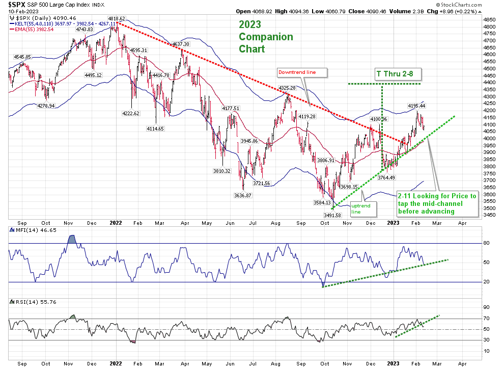
There is a difference between now and then. We are still having failures to lift off from potentially positive situations, but we are not experience the broad failures that led to the October 2022 low. Over the last 9 months we have basically stayed inside of a trading range.

A longer term view of the situation since January 2022 period showed descending tops and lower bottoms through last October, but since the October low we have had ascending highs and higher lows. We can’t assume that this situation will continue, but as usual, support is called support for a reason. Yesterday we broke through the first two levels of support–the ascending lows since October, and the middle Keltner band. The Frog jumped from the top Keltner, but the speed of that drop since early February may have caused the Frog to move slightly below that middle Keltner support, just as it did in December, rather than presage his movement to the lower band.

What is the next support area? On the daily chart, the next critical support would be based on a phenomenon I’ve noticed in the past–the line of descending lows from January 2022 now becomes the next level of support around 3850– prior to the daily Keltner support line at 3723.

I would love to be have a more positive view than “we are just living in a trading range”. We are just living in a trading range. We have to find out if the pitcher is on his game or he’s struggling. The next few days on the daily chart should clarify the situation.

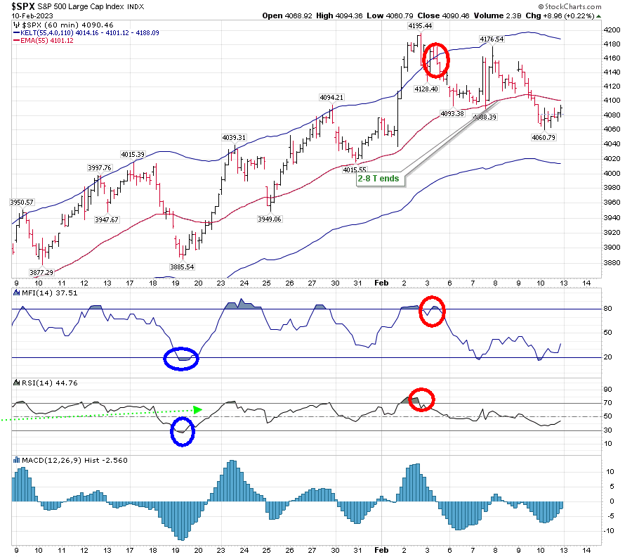
But the Hourly Chart is showing a deteriorating situation.

Since February 2, the hourly chart has been on a descending course, and on February 16 it dropped below the middle Keltner without any attempt by the Frog to “land” there. While it has tried to stay above the descending lower Keltner band, and attempt to rally from there, it never has the “strength” to make it up to the middle Keltner before reversing back to the lower Keltner band. Additionally RSI failed twice to move over the 50 RSI line this week since moving up from the 30 level.

I initiated a short term Trading T on Wednesday, only to see that fail yesterday. For those who follow me on elliottwavetrader.net, I warned that those failures to rise above 50 RSI on Thursday were signs of greater risk, and that I had taken some profits at the close. The notes to that VO and its failure can be found on the hourly VO chart shown in the menu:

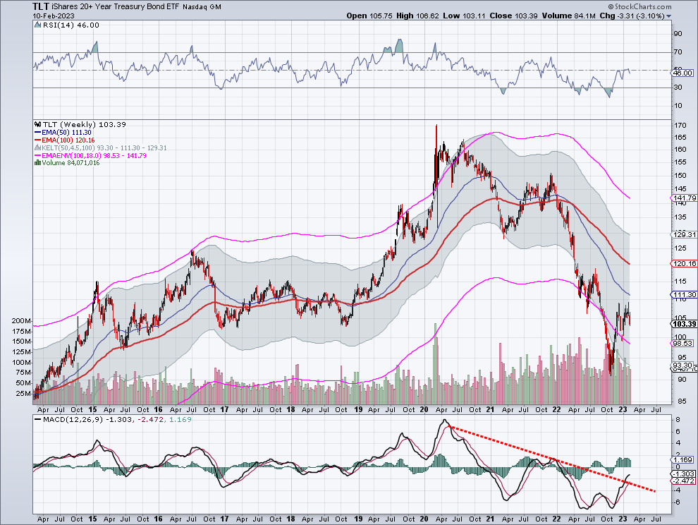
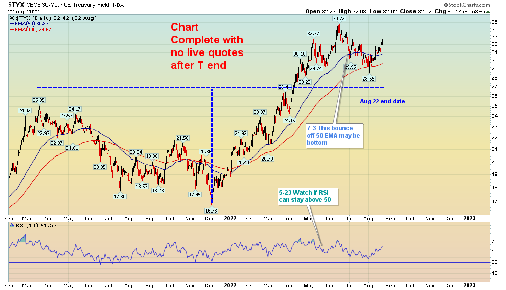
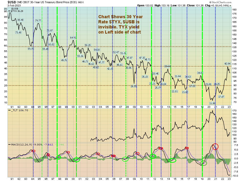
Sometimes you have to believe what you see. This is still a treacherous area. We haven’t created a deep enough low on Price to reach any daily support, and the hourly is dragging its way along the bottom Keltner band. The failure of that last hourly T, leaving the hourly VO in no-man’s land is not heartening. Investment funds have been in short term treasuries–not ETF’s, but the bills themselves.

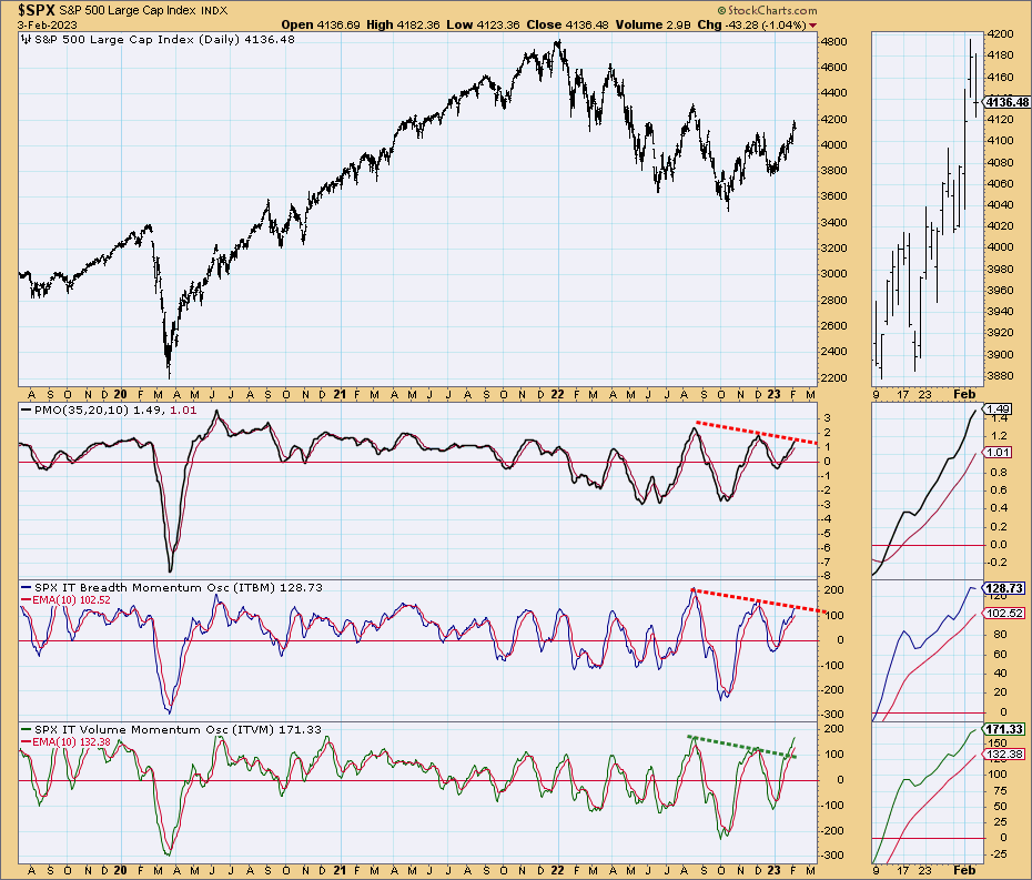
Other signals aren’t committing to a change in direction or a move out of the trading range soon.

The BPSPX has just grazed the lower band. While it is moving toward the area I call SUPPORT, keep in mind that until October, this support line was breached for long periods of time.

The Simple Chart is only reaching the zero line on Intermediate Breadth and Volume Momentums. If you are looking for a swing move, the indicators need to at least turn to initiate a buy. You can see that I’ve drawn in some support green dashed lines. These are leading me to believe that we will get some important action in the first half of March, rather than before.

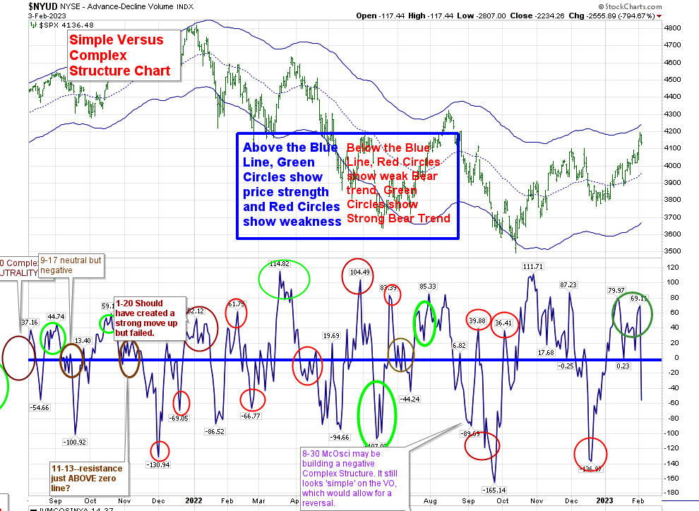
The Complex/Simple Structure chart has created complex lows below the zero line. This is not a sign of imminent change of direction. Right now it’s lower.

Since last December I have been expecting a high in January, to be followed by weakness leading to a better low to come in February or March that I could invest in. The basic unmarked T-Theory chart is showing that probability is forthcoming if not an immediate possibility. While the low in the VO and McOsci which showed up on Tuesday has since failed to create a T, both are approaching levels from which that new T is possible. I expect the VO to be corrected Monday to a higher reading, but both it and the McOsci are heading towards lower lows than the previous low, which should create a T-Theory period of strength eventually.

But we aren’t there yet, and any projection of a move higher from here is not substantiated by my charts. There won’t be an update next week.

The Frog Hits the Lily Pad

Today we hit that middle Keltner band, as proposed 10 days ago. Where will Price go now?

The BPSPX isn’t giving us a new buy signal, but is heading towards the support area:

The Simple Chart has turned down, and still has some distance to go to get to that zero line, which is the first level of support:

The unmarked T-Theory chart shows an exaggerated Volume Oscillator, and the McOscillator hasn’t been updated for today’s closing action yet. But when updated, it should give us that lower lower on both of them that we need to proceed with a new T. We can see that the last movement higher on the VO and McOscillator began below the zero line, and was stopped at the zero line. Keep in mind that usually gives us one more push lower (as it did) before forming a new T. The question is how deep will it go before it makes a bottom and turns higher. I suggest you check these in real time on the charts in the menu as I won’t be sending out an update on that.

Before confirming a new T, I would like to see the Hourly SPX chart show a turn up in MACD, and for RSI to rise up from below a 30 reading.

The Hourly Volume Oscillator Chart is in an area from which it can stage a rally:

But while the Blue Volume Oscillator is in an area where it can create a rally, the NYUD itself (which represents Up/Down Volume) needs to break through that middle Keltner line and stay there, which it must do before the VO does. That is because the VO represents the MACD of NYUD, and as that MACD, it needs for the actual NYUD to spend time above the middle Keltner before the VO can move above the zero line. (Please check on the Concepts regarding Volume Oscillator T’s to make sure you understand that principle.)

Timing wise, we are a little early for me to be ‘happy’ with hitting the middle Keltner. I was looking for that to happen sometime between the last few days of this month and the middle of March. It’s been noted on the T-Theory chart here since February 9.

Even while expecting more positive outcomes, I’ve been overly conservative in the last year, and it has served me well. I may be doing so now, but I’d like to get final readings on today’s VO and McOscillator before making a positive call. Keep an eye on the charts for updates.

Where is the Frog Heading?

As I stated in last week’s update, I’m beginning to see more evidence of positive, or at least neutral outcomes for Price. In philosophical terms, humanity strives for success, and is at its best when it overcomes adversity. While we may have developed some self-destructive tendencies, survival is a basic trait in life. We watch as Lucy takes the football away from Charlie Brown just as he is about to kick it. We may know that she will do that over and over again, but we know that Charlie (and we as onlookers)  hopes that this time things will be different. 

The concept of Price being drawn to Moving Averages and the edges of envelopes is truly a simplistic one. Taking a look at the present T-Theory Companion Chart, we can see that the shape of the Price envelope has begun to curve upwards. We see a trend in Price that moved from the lower band in October, to middle band resistance around the end of 2022, to finally reaching the peak of the bands as the February 8 T ended. Price strength ended, and we began a reset. But we haven’t moved down to the major support for Price that exists at the mid-channel of the Keltner, which is presently located at 3982. My present expectation is that Price hits that support and then resumes a move higher.

The hourly chart Price is just about reaching the 55EMA mid-Channel line. Should it hit that before dropping further, Price will have to make a new directional choice. Support on that chart is at 4014, and mid-Keltner resistance is at 4101.  RSI is below 50, but rising. A more productive bottom occurred on January 19, when both RSI and MFI reached a low below their support levels, and rebounded at the same time. I’ve mentioned this type of formation in the past as being very constructive. From there Price moved above the mid-Keltner line, to the top of the range, and it never sank below that midline until the end of the T. That is what a Positive Outcome T looks like. 

You can see that by February 2 Price had exhausted itself in conjunction with overbought readings on the technicals, and when it slipped back into the Keltner bands after rising above them, we were ripe for the pullback that I suggested was upon us (on elliottwavetrader.net). Let’s get this new temporary weakness out of the way, and wait for a new T formation. Right now, this new T seems set to form possibly at the end of the month, or sometime early March. Right now the descending trend lines (Cash Buildup Lines) have crossed below the zero line and are creating the cash needed for the next move higher.

The present weakness was also confirmed by a sell occurring in the BPSPX chart on February 7. (You can find that chart in the site menu.)

The Simple Chart, which refers to intermediate term Volume and Breadth momentum, reached points of technical resistance, and turned down. But they have yet to cross the zero line. It’s my feeling that they will reach that point before possibly reversing higher again.

Peeking in on the Advance/Decline line Weekly chart, we can see that while it lost some ground this week, it bottomed at the October SPX low, and quickly moved back above its 20 and 50 EMA’s. More importantly, the 20 EMA kissed, but did not cross below the 50 EMA, and they are both arcing higher. Technicals are beginning to improve as well:

+++++++++++++++++++++++++++++++++++++++++++++++++++++++++++++++++++++++

Since we have recently arrived at what is known as a Golden Cross on the SPX, I’d like to point out an article posted recently by Tom McClellan relating to both Golden and Death Crosses. In the article, he suggests there may be 2 types of GC. In one type, Price may be far away from the where the two Moving Averages cross. This type of crossing of the Moving Averages creates a reversal of direction on Price, rather than a continuation. The second type of GC occurs when Price is close to the the Moving Averages as the GC occurs. In this instance, Price may initially move above the GC then retreat back to it before continuing higher. That may be what is happening now.

For a fuller explanation of the article, I suggest you go to this link:

The timing of this article coincides with my discussion of the Frog jumping from extremes and then to a central point before deciding on its next move. These Golden Cross Moving Averages are attempts to find Moving Averages that exact an influence on Price. The OMA (in contrast) is looking for a Moving Average that is most often touched by Price, not just creating support or resistance to Price.

++++++++++++++++++++++++++++++++++++++++++++++++++++++++++++

In my last week’s post, I suggested that we would reach 102 in TLT, as the pendulum in rates had exceeded my expectations. But I didn’t expect the move to be as quick as we’ve seen. We’ve reached an area where there may be some support.

It’s a very rare occurrence to have the outer edge of the envelope move inside the gray area, but that’s what we have now. In my opinion, the violent moves we see in TLT reflect that unusual situation:

MACD on the weekly chart is starting to turn down. 

The good news is that because of all this churn in rates, I don’t have a T (period of strength) in either rates themselve, or TLT. We should just get our footing between 102 and 109 for a while, in my opinion. 

I have to say that T-Theory’s record on rates over the years has been spot on. We had the 2021 TLT T from March through October.

We caught the new concept “Inverse T” on TLT 2021.

In addition to TLT, we successfully distinguished 3 ten year rate T’s, and found the 30 year bond T which began in December 2021 shown below:

Where we haven’t been successful is in understanding why the relationship that Terry called his Confidence Index has been so stubbornly above its normal boundaries. High Yield rates don’t show any lack of confidence in relationship to Treasuries. The question is how much longer can this go on before it returns to its mean area of around .86? 

This tug of war has gone on for the last year. At some point, it has to end, and I’m concerned that the longer it stays this elevated, the worse calamity we will have when it reverts to the mean, causing the Frog to have a Wile E. Coyote moment.

But that doesn’t appear to be the case at this time. 

The Hopping Frog

One of the later additions to Terry Laundry’s T-Theory was the concept of the “Hopping Frog”.

At a seminar he hosted in his hometown of Nantucket in 2011, he told a story about a frog who could jump from lilypad to lilypad, but very rarely landed between the pads and sank. Of course, the frog wouldn’t drown, but he didn’t want to get wet either. In regards to the market, the lilypads represent the three lines on Terry’s chart–his upper Keltner band, the mid-channel, and the lower channel. 

If one creates channels, bands, or envelopes using the correct Optimum Moving Average as a mid-channel, one can theorize that the frog will jump up from the lower band to the mid-channel. At this point, the dilemma is whether or not he moves further up or returns to the lower band.

We can see that in the following charts of SPX.

Looking at the hourly chart, we can see that for the most part the “frog” has been jumping between the upper and mid-channels since the start of this year.  this is exactly the performance that we would like to see, since we were in an equity T period of strength, . Until this week, there were only 2 instances where the mid-channel was severely penetrated, but didn’t make its way to the bottom “pad”. That’s still a characteristic of an equity T.

You can see that since the T ended, we have slipped below the mid-channel, but as the day progresses we are heading back up to put our head above water.

The following daily chart of SPX during the 2020-2021 Bull market shows similar tendencies. (Keep in mind that the T that accompanied this chart lasted until January 2022).

Over the last year, we have spent most of our time within the lower to mid-channel. And with the last move above the mid-channel we made it all the way to the top of the channel (again, during the T that ended February 8). Where will the frog jump next? This post is about frogs, not the future.

Having the correct Optimum Moving Average for an asset class allows you to construct envelopes that work in similar fashion. For long term Treasuries, Terry used VUSTX as his vehicle. The weekly chart shows that for the most part, it lived between the mid-channel and the upper level. At the beginning of 2022, it decisively moved below the mid-channel, and has been hugging the lower band. The move below that band, followed by a move above it should lead to a hit of the mid-channel.


I’ve moved away from VUSTX, and use TLT instead. In posts discussing TLT, I suggested to Terry that for me the OMA is not 100 but rather 50, as it received more hits:

Mid-channel support broke in 2022, and TLT made a new home below the channels. Once it moved back inside the channels, the frog attempted to go back to the middle channel. It came close to hitting the 111 (reaching a high of 109.35 before moving lower again). The middle channel is moving lower, and at some point the frog will make another attempt to cross that middle channel. It doesn’t appear to be anytime soon.

On the daily chart, the frog has just slipped off the mid-channel, and needs to recover quickly to continue its recent strength (which is still within the weakness shown above by the weekly chart).

The QQQ, a different asset class, seems to live inside the more standard settings for the Keltner Bands. They are noted on the chart:

A move above or below the Keltner bands followed by a move back within them seems to insure a move back to the middle Keltner, where the frog must again decide which way to go.

For more information on the envelopes used by Terry Laundry, you can find his public charts located on Stockcharts. The site is kept up by Paula Burke, who used to work with Terry. Here is the link:

https://stockcharts.com/public/1172710

This post will be added to the T-Theory Concept page for reference.

Positive Outcomes?

There are times when it’s best to remove old chart markings and look towards the future. For me, we’ve reached that point.

We had the first glimmers of hope back in late September. I was looking for a mid-October T, but was unable to confirm it until my October 23 post. It still had 100 points further to go until its November 8 conclusion. 

We now have another T which has its center point at the end of 2022 and an end date of February 8. Personally, I invested in VCIT, a corporate bond fund instead of equities.

(Terry Laundry’s Best Bond investment method called for being invested in Corporate bonds during equity T’s, and Treasuries when a slowdown was expected. I didn’t use bonds as an investment fund tool over the last few years, as their yield was held in check. That’s changed since early 2022.)

At this point I am expecting some weakness in the market, but the charts are no longer showing the extraordinary weakness that was a constant through most of 2022. 

First off, we can see that even with the action of Friday’s move lower, the McOsci is still above the zero line. (More on this later.)

The Companion Chart has developed RSI and MFI strength. 

BPSPX has just climbed into the area from which it can create a sell signal, but it hasn’t crossed below the upper Keltner.

The Simple Chart is hitting resistance in PMO and Intermediate Breadth, but Volume momentum has broken through the previous top. While it can fade from this level, it would need to move below that green dashed line to be a problem.

Reviewing the Complex/Simple structure (as noted above in the McOsci), both the VO and the McOsci have created complex positive structures. More on this can be found on the Concepts page of my site.

The charts seem to show that strength is growing. While now is a time when we should get a pullback from the recent high, we should then build another new positive, constructive investment period. Timing that next move higher is evasive right now.

Strength may come from unexpected sources. I believe that we shouldn’t look for it to come from the last group of market leaders. History tells us that after a Bear Market, old leaders rarely maintain that title.

+++++++++++++++++++++++++++++++++++++++++++++++++++++++++++++++++++

Moving to bonds, the 30 year has had quite a movement down from 42. While this was expected in my earlier posts (as it hit that resistance), the size of this move has been larger than I expected. It reminds me of a pendulum, that will find its equilibrium point somewhere soon. 

My personal feeling is that it will do so with TLT around 102, per this long term chart:

Keep in mind that this chart has dividends removed. Actual pricing of TLT would be higher. My personal feeling is that dividends dilute the underlying instrument by removing the ability to compound that dividend–in this case interest. Stockcharts would seem to agree, as that is their normal method of displaying Price. For those interested in using Stockcharts and including paid dividends in price, simply add an underline before the ticker–“_TLT as opposed to just “TLT”

Staying safe may now become easier. We can only hope.