Reprocessing Information

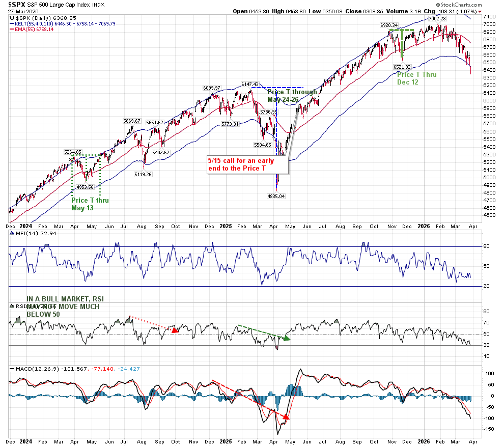
One of the main features of T-Theory is that it offers the ability to find low risk entries after periods of weakness. As I mentioned last week, the entry at 6600 may not have been made at the recent low, but it was still low enough to offer 800 (12%) profitable SPX points.

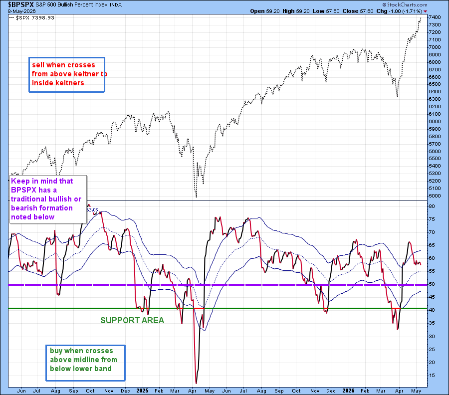
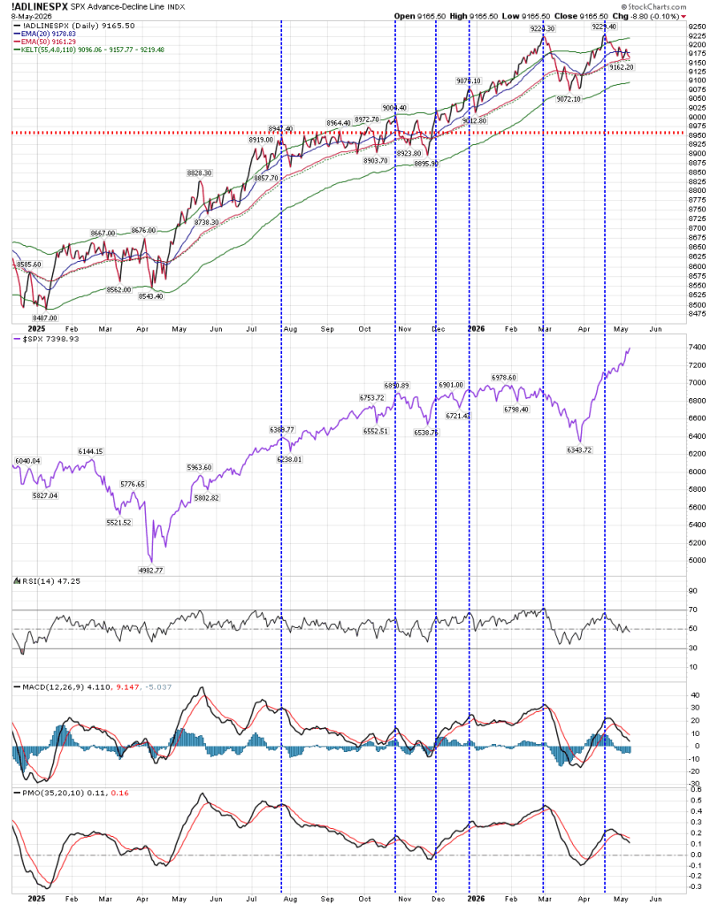
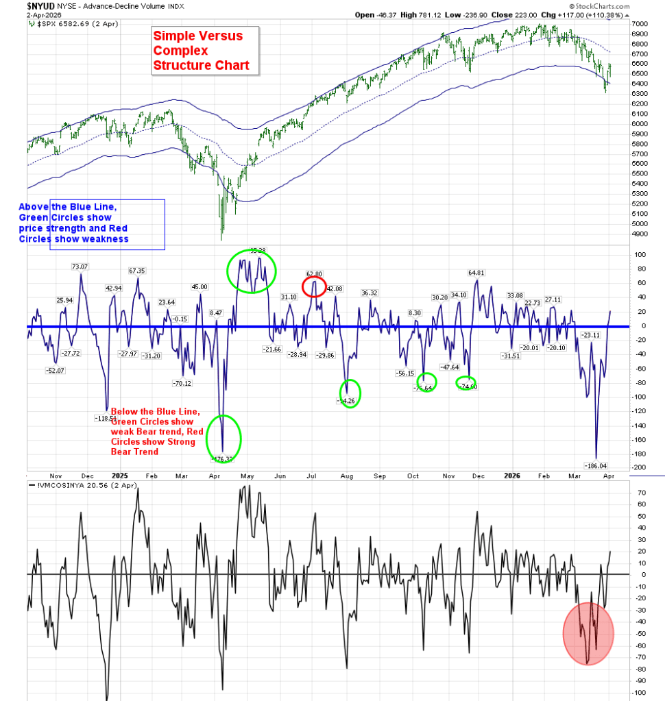
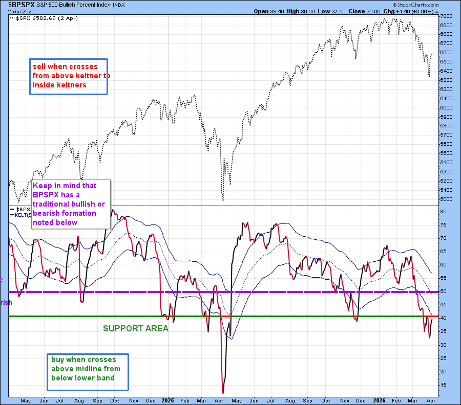
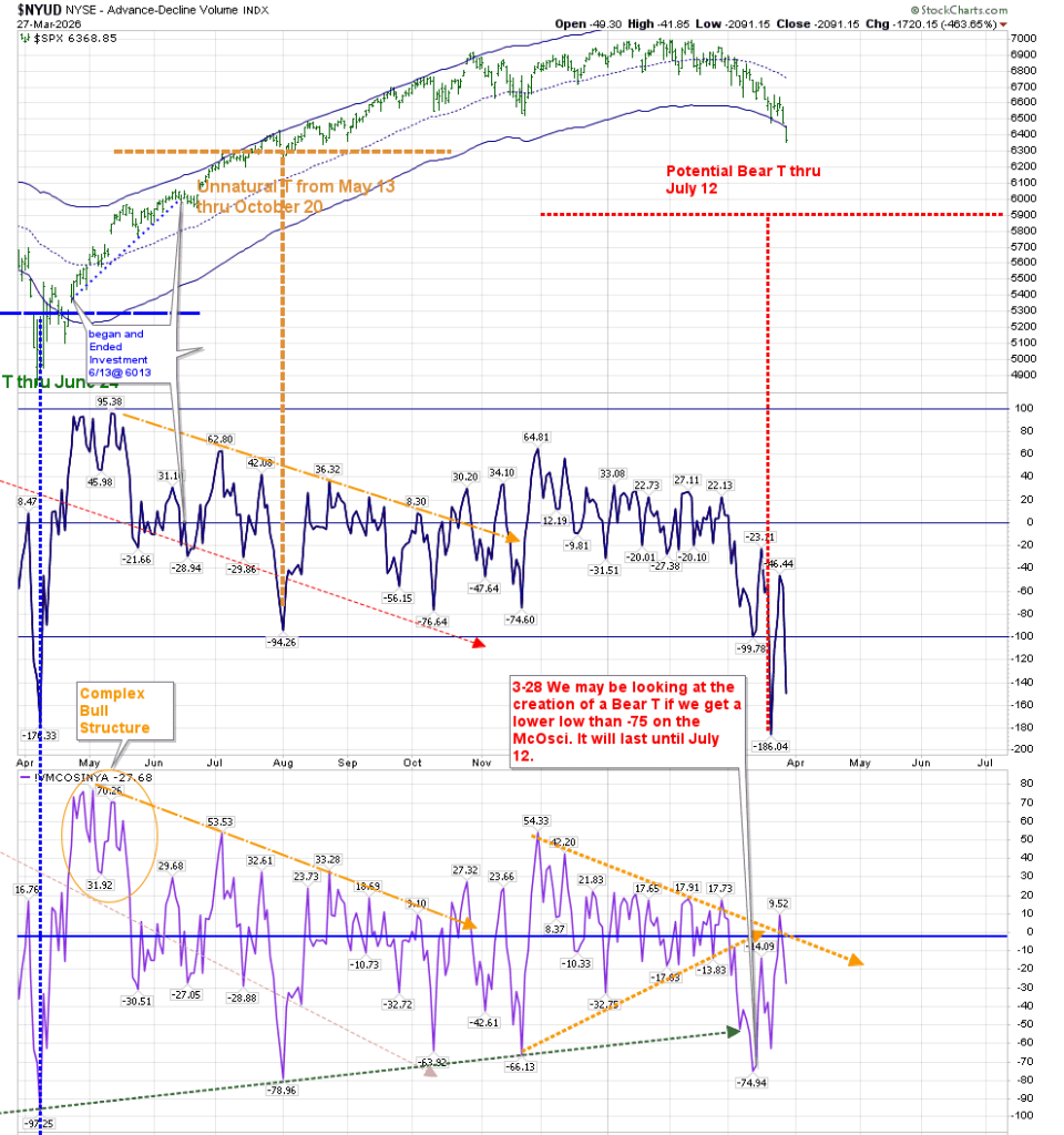
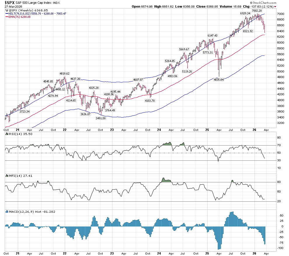
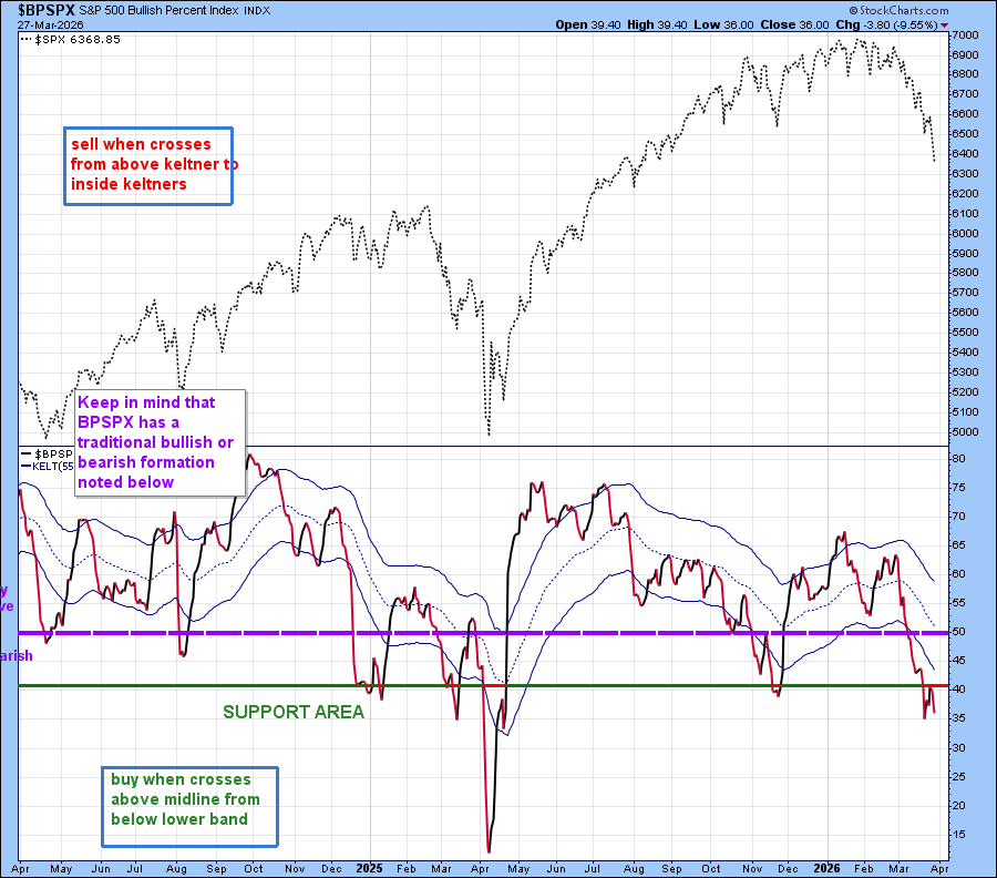
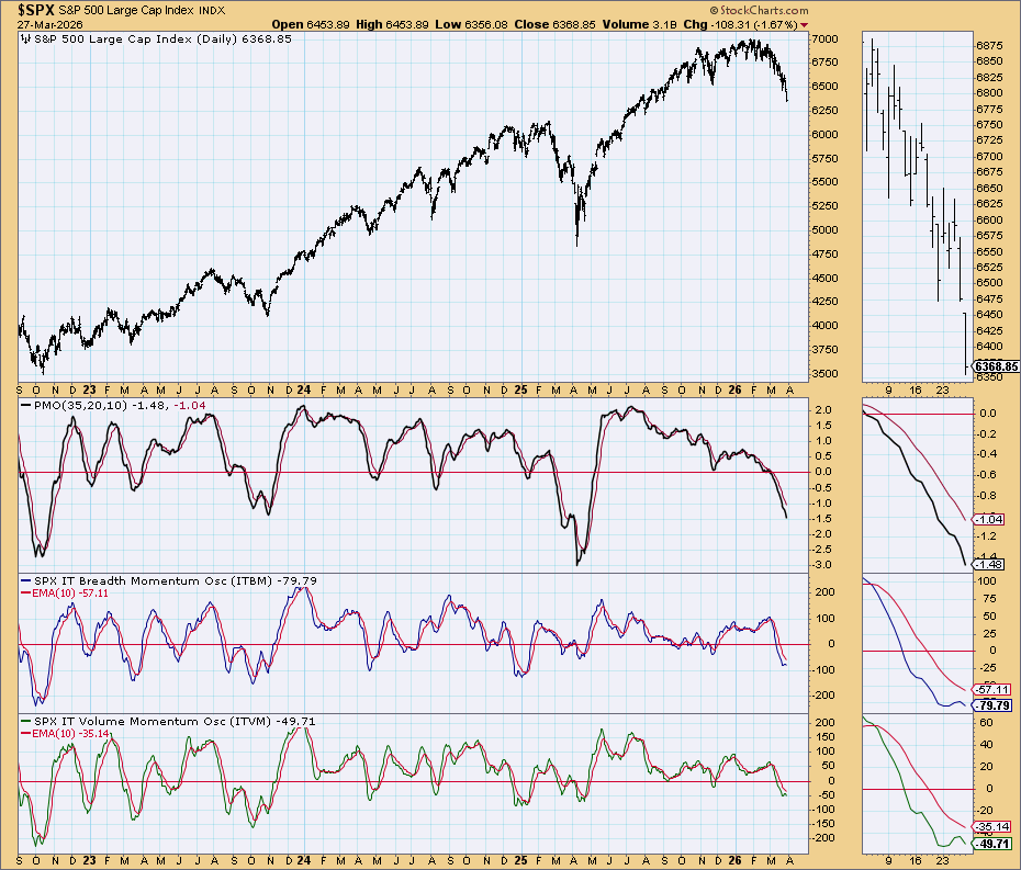
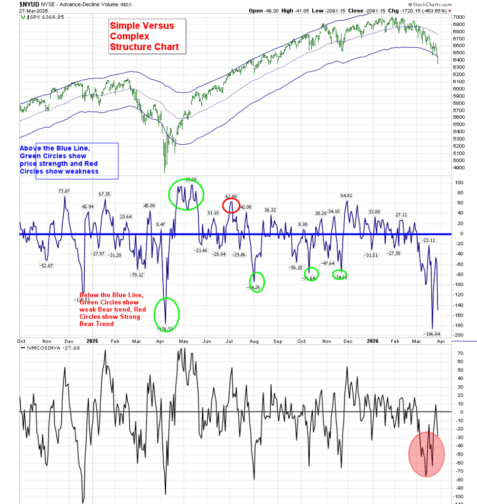
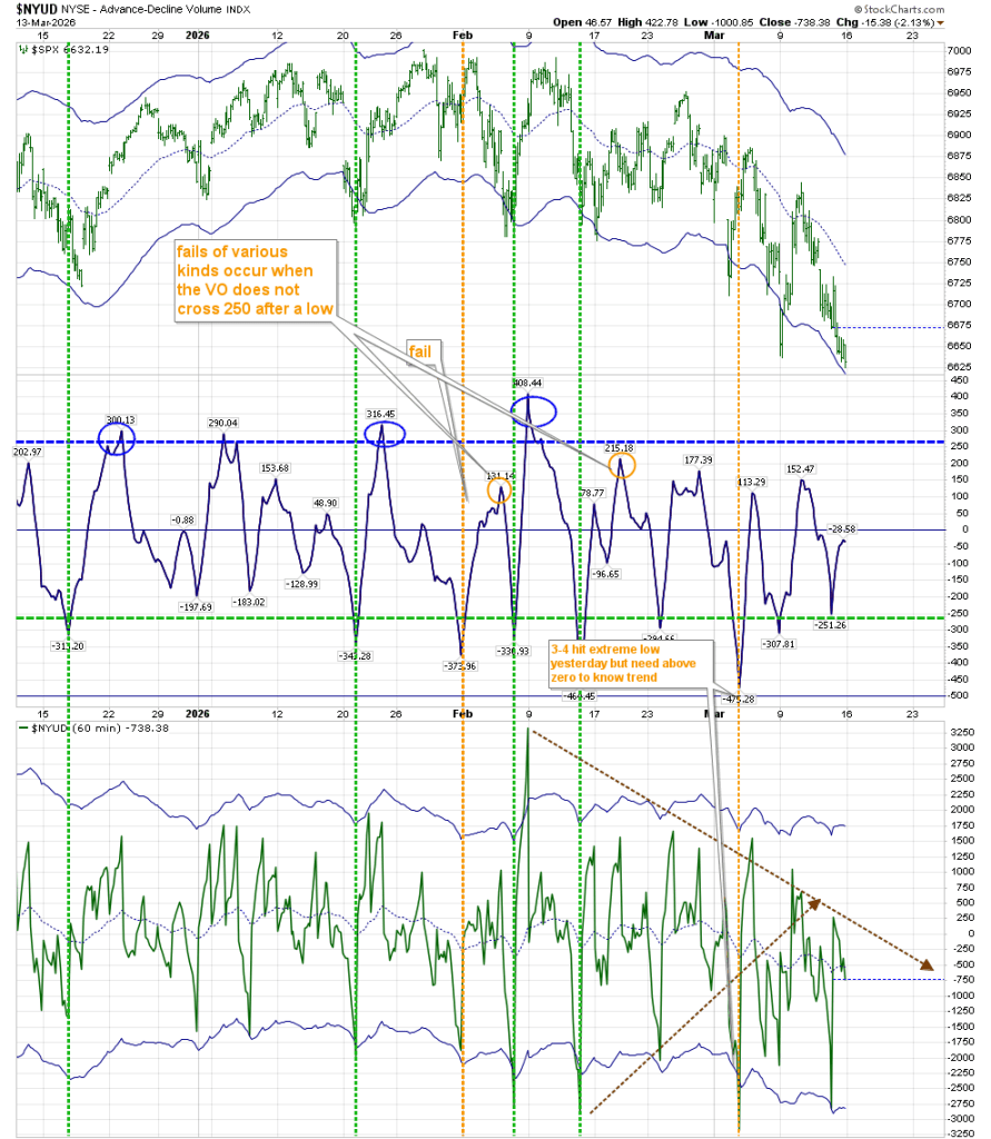
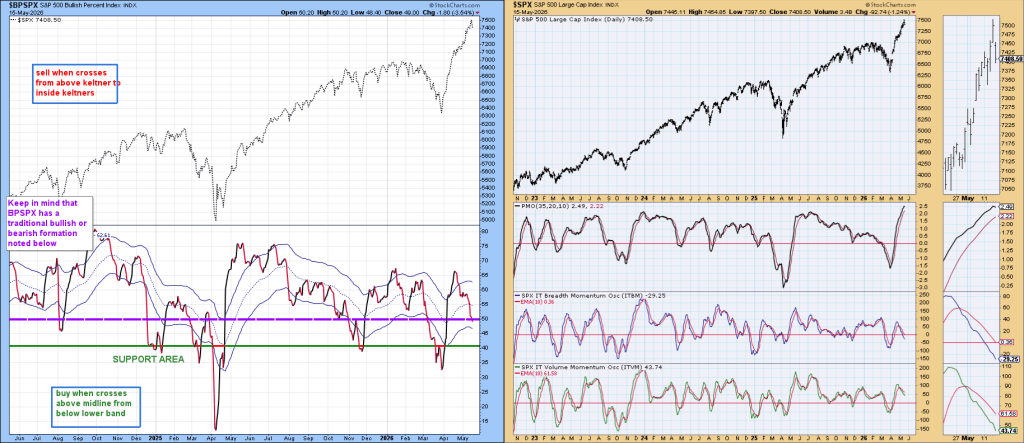
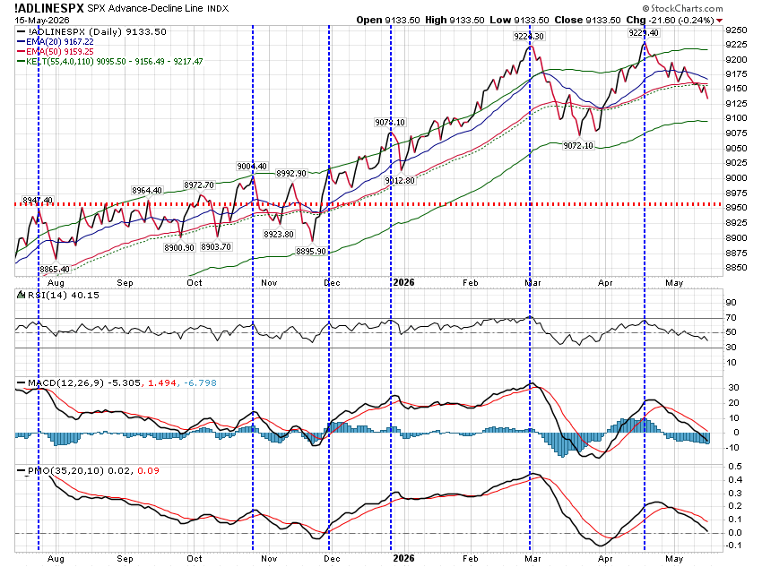
That being said, there were some problems that developed this week, which followed concerns which I mentioned last week regarding my personal indicators–the Bullish Percentage SPX chart was in sell mode, the “Simple Chart” agreed, and the Advance/Decline line broke support.

Early on Thursday, I made an executive decision to hedge my investment account when we were up about 30 points. As we continued to rise Thursday, I removed those hedges. It was only a few hours later that I regretted that decision, and became angry with myself for being on such a short leash. I used the pre-market hours Friday to put that hedge back on, and during the day I replaced the hedge by removing all funds from the market. The average price at which I closed out the trade was 7430.

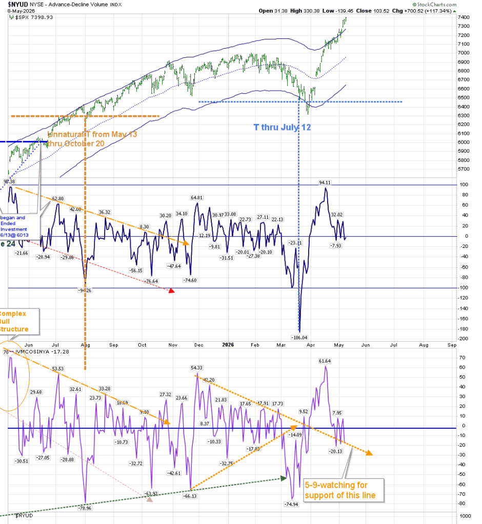
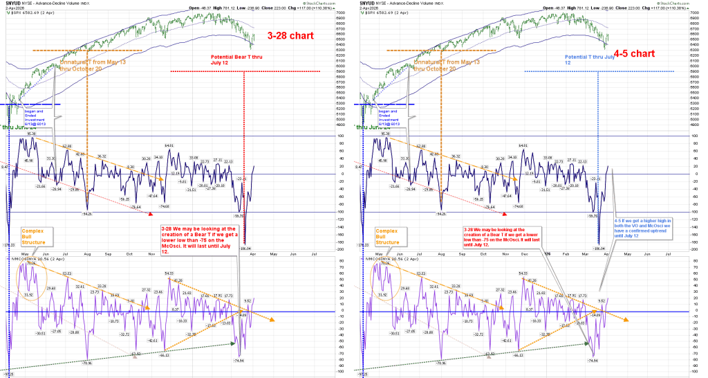
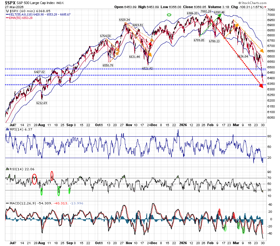
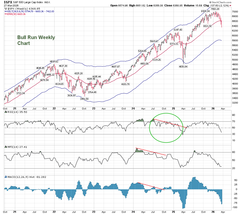
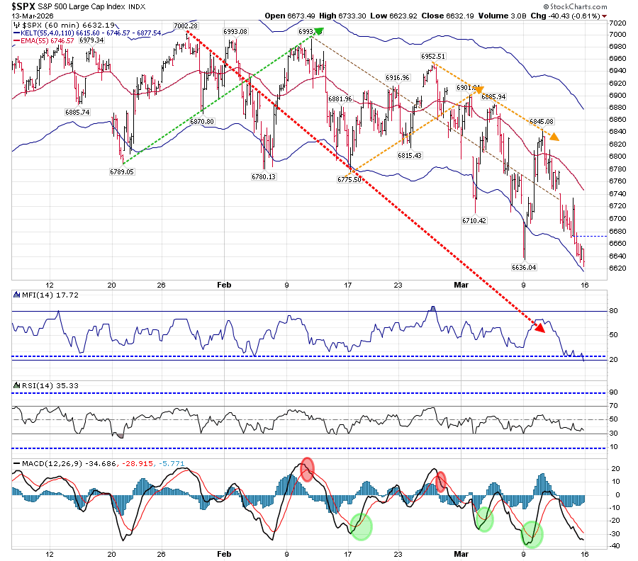
The T-Theory Chart broke the orange trend line on the McOsci, which I noted last week:

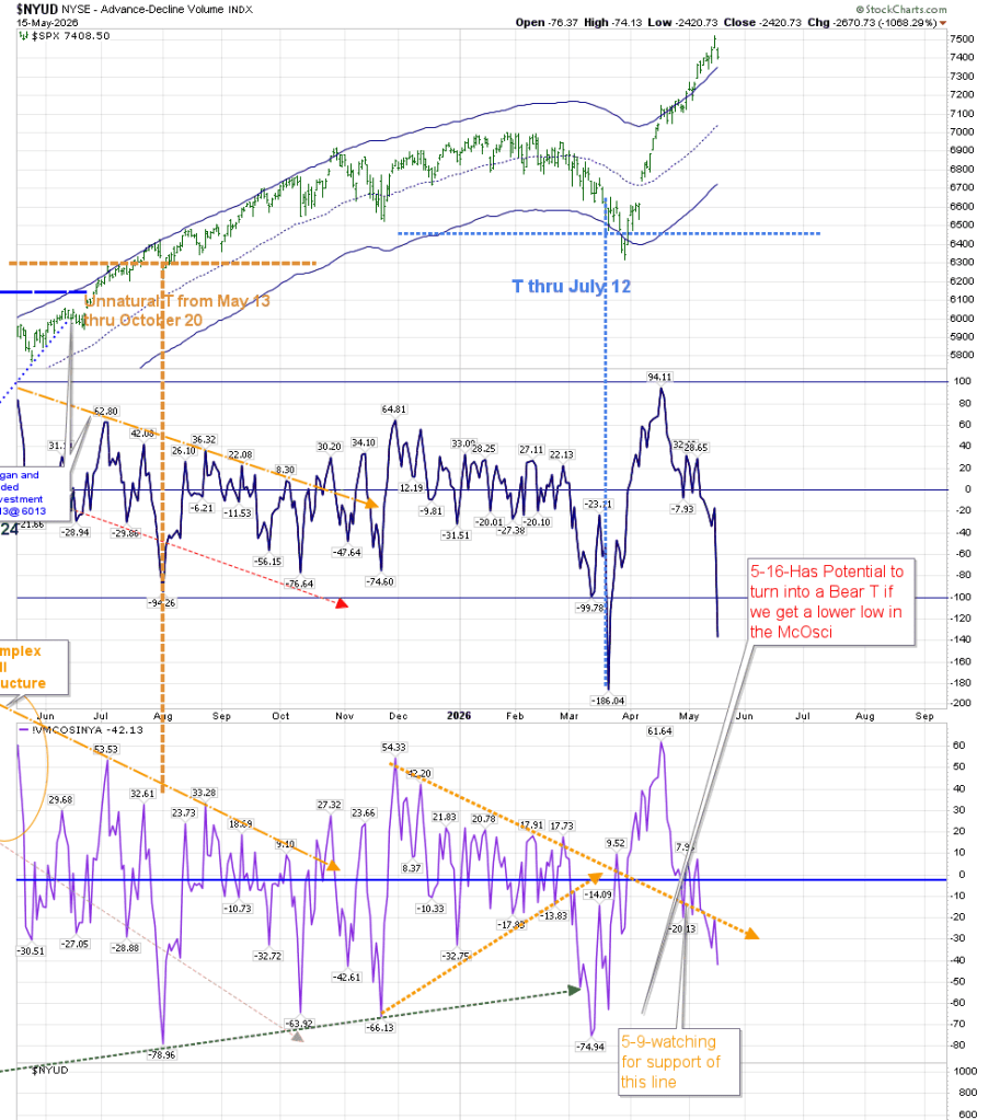
We need to disregard the Volume Oscillator’s low from Friday, as Stockcharts will only provide an accurate update on Monday. However, the McOsci broke the trendline, and has the potential to create a Bear T by breaking below -75.

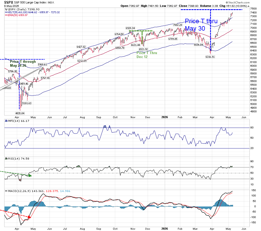
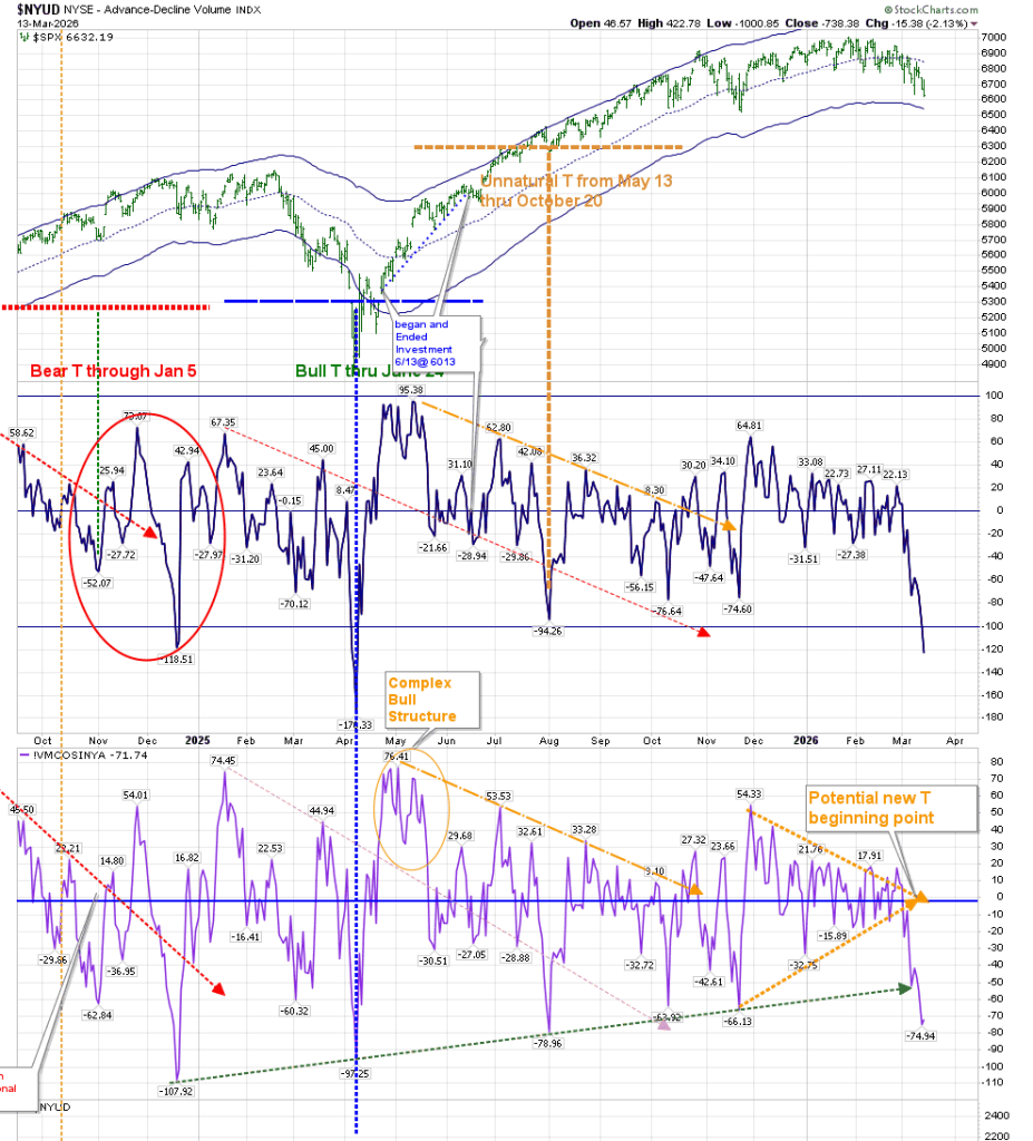
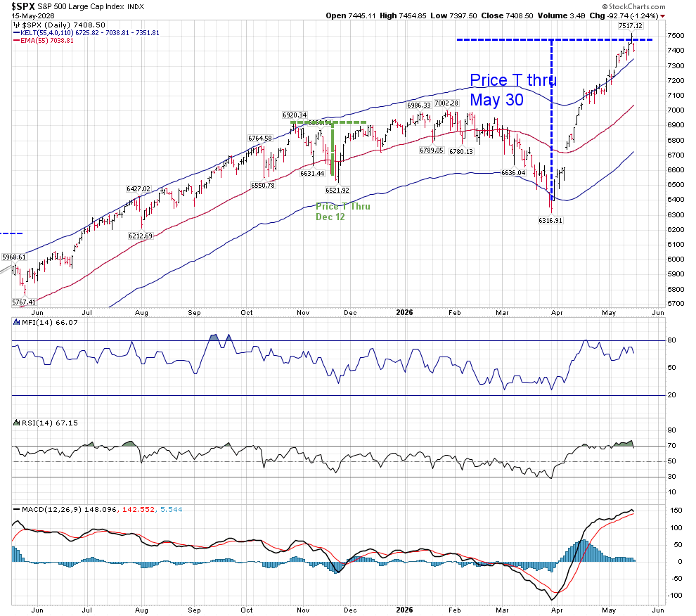
My Companion T-Theory chart has a Price T that continues two more weeks, until May 30. Support will either be found at 7350, or it will break below that to have the next “safe” support at 7038. I have previously mentioned on elliottwavetrader.net that I would remove my investment if we moved below 7350. That statement is now moot, as I have closed my position. RSI and MACD do not show great weakness but seem to be turning lower.

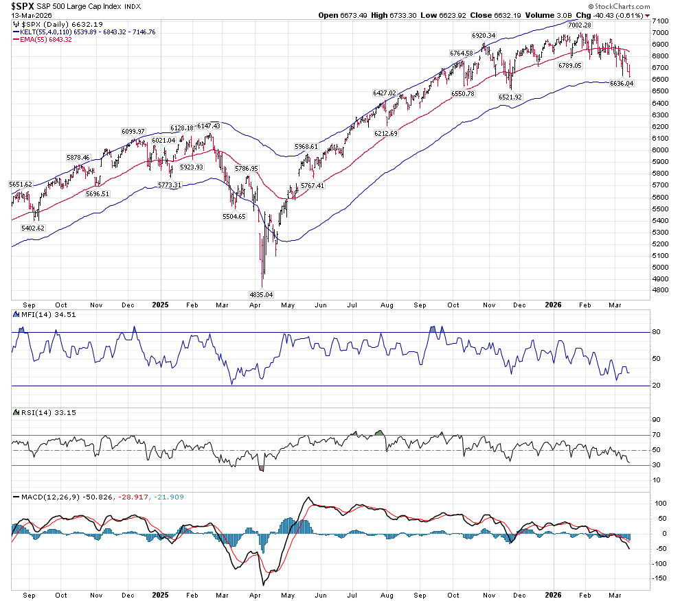
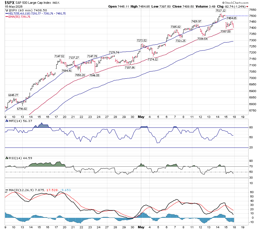
The hourly chart is reaching for support at 7390, which is the same support as the upper Keltner band on the Daily Chart. There is a possibility that both will hold. RSI is at the neutral line, and MACD is negative.

I’ve closed out my T-Theory investments early in the past based on my personal indicators rather than relying solely on T-Theory with mixed results. I will not have FOMO if I am wrong and this is just a one day event. My investment goal is to capture “safe” investment periods and to avoid periods of weakness. Your tolerance for risk may be greater.

Earlier this week I posted on elliottwavetrader.net my concerns that the IWM:SPY ratio might reverse, with IWM faring worse than SPY. This is a chart I have posted here before, as I used that ratio to create low risk trades:

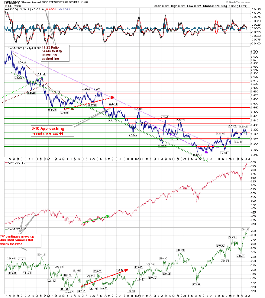
Let’s see if a sticksave can be made at 0.37. My thoughts are that won’t hold.

Best to your trading.

Price And Time Are Moving Together

In my previous post of April 5, I noted that we were one step away from confirming the Volume Oscillator T which would extend until July 12. We received that confirmation on Monday April 6, when the VO and McOsci moved above their last peaks (prior to sinking below the zero line) and on Tuesday April 7 we opened at 6600. While that wasn’t the recent price low of 6316, it was a very safe entry into a very volatile market. We are now at 7398, and have captured 800 points or 12%. Our previous T ended October 20 of last year at 6735. Using the simplest form of T Theory, this produced higher returns than that of the SPX by 135 points, or 2%. Instead, investment funds were in short term bonds which improved our return. Using this system, we avoided the downturn from the January 30 high of 7002, if we did nothing else over the last 6 months. There were no concerns of FOMO or its opposite, which would have led us to buy high and sell low. While I presented a case for the possibility of a Bear T, there was never confirmation of that outcome. The present T-Theory Chart looks as follows:

The Volume Oscillator and the McOsci acted exactly as it is supposed to act inside of a T–after reaching a high of 94, the VO returned to the zero line. That is standard procedure. The McOsci has been trying to stabilize similarly, and I am watching that orange trendline as important support.

The Companion Chart dealing with Price and technical indicators has had parabolic movement. It has created a Price T that should last through May 30.

There is considerable strength showing in both RSI and MACD. While RSI is at overbought levels, it has remained there. MACD is positive until the fast black line crosses below the red slow line. Its height is inconsequential, even at this extreme. In fact, the strength in this chart has made me return to the 2024 Bull Market chart regarding Price Keltner band levels. The chart below uses the Nasdaq 100’s Keltner bands, and also comments regarding how RSI acts in a bull market:

The Price T is within the Volume Oscillator T, and may mean a lull around May 30 while the VO T continues.

Other indicators are not as sanguine as stated above. The Simple Chart is showing a lack of Breadth and Volume momentum on an Intermediate time frame. But as we approach the zero line in Breadth, it is possible to reverse up again.

The Bullish Percentage BPSPX chart has moved from above the upper band to inside the band. That is a negative, but the Daily Price chart does not agree, as shown above.

The Advance/Decline line has been retreating recently, which may also be seen as a negative. However it has reached a support level, and not broken it. We will worry more about it should it continue and break below 9160.

To summarize, I am expecting this period of strength to last until July 12, with a potential pullback around the end of this month. Right now, the charts are supportive of this outcome, but there are things to watch.

Best to your trading.

A Different Perspective

Let’s begin by acknowledging my viewpoint last weekend was incorrect. While my perspective was one where a Bear T was imminent, we actually had a strong rally to put that idea to rest last Monday. In fact, it has the potential at this point to lead to a Positive T until that same date, July 12. But it hasn’t fully developed yet.

While we have an extreme bottom with the move above the zero line on both the McOsci and the Volume Oscillator, we are missing the final confirmation of higher highs (prior to the move below their respective zero lines). Normally, we would expect an extreme move higher on these two indicators after such a strong rally early this week.

Last week, I emphasized the point that we had made a “Complex Structure” below the zero line, which created a bearish formation. Later that day, I emailed Tom McClellan regarding this structure, as in his weekly post he projected a bullish outcome with his article on the Summation Index crossing the neutral level. In response to my question, Tom indicated that while we did have that “Complex Structure”, it was “negated” by his view of the Summation Index cross.

After receiving his email, I advised those on elliiottwavetrader.net regarding his stance, with a link to the above-mentioned article. When we were at 6322 I posted a chart referencing this to be a line of support (noted in last week’s report) which dated back to last August, adding that Pension funds and insurance companies usually have to buy into the market on the last 2 days of the month, and withdraw amounts the next 2 days based on their institutional needs.

None of these acts detract from the fact that the premise of last week’s post was totally off base.

That being said, Price action has been very strong, without similar sharp strength being shown by the VO and McOsi as noted above–the last T-Theory clue will be a further move higher in the Volume Oscillator and McOsci. BPSPX also needs to cross back through the lower Keltner band and move above 50:

It’s interesting to note that in this week’s article on Tom McClellan’s site, he is also waiting for a move higher on the McClellan Oscillator to confirm the uptrend. As he puts it on his site,

The Oscillator can next give us additional confirmation of a bullish change by zooming up to a really high positive reading. Very low negative readings are usually conclusive in their nature. But a very high positive reading is a sign of strong initiation of an uptrend. We have not yet gotten that piece of confirmation. It will be something to look for in the days ahead.

Best to your trading.

Sculpting an Elephant

There’s an old joke that someone once asked Rodin how to sculpt an elephant, and his reply was “You take off everything that doesn’t look like an elephant.” That might be true, but life tells us something different. There are no two elephants that are exactly alike. The best we can hope to achieve is the outline of that universal elephant, with our own interpretation of reality. Would an elephant sculpted by Rodin be the same as one done by Dali? I’ll leave it to the reader to find images of a Dali elephant.

Charting is not a science. Those of us who stare at charts, trying to find their meaning will use their own experience, and add their own biases to their conclusions. Sometimes the simplest explanation is best. I have spent the last 15 years utilizing the tools of Terry Laundry (as I have interpreted them) as best I can. I know my biases, and try to fight them. I know sentiment can skew a conclusion. Chartists try to make sense out of reality, but sometimes reality makes no sense. You have been warned.

We are facing the possibility of building a Bear T. The Marked T-Theory chart now suggests that we have the possibility of getting a lower low in the Volume Oscillator and McOsci. This would create a Bear T that will extend until July 12.

The daily T-Theory Companion chart is posted below. We’ve moved below the lower Keltner band support of 6446.

RSI has reached the 30 level, which is barely oversold, while MACD is approaching a low similar to that seen last April. But there is a difference this time–the rate of change is much slower than it was a year ago. In my opinion, this may result in less of a sharp reversal. In fact, neither the MACD of 2020 and 2022 had this slow trend lower as shown below:

The Hourly chart shows a continuously deterioration of MACD with lower highs and lower lows:

Let’s compare the charts of the March 7 post with today’s:

An interesting note is that the dashed blue lines that were showing in the MACD on March 7 were actually lines I drew last August on the Price line of the hourly chart as shown here:

Those blue dashed lines represent what I expected to hold as support and resistance areas at that time. We are now near the lower support line, just as the red dashed line is approaching that same area. Temporarily, I’m expecting this area to be support. The above chart also makes it easier to see how different the recent movement in MACD is to its past.

However true support may lie just a bit lower than that at 6280, based on the Weekly Companion Chart that uses Terry Laundry’s 76 EMA Keltner bands:

Over the past few years, I have been using different parameters to my Keltner Bands. These were called the “Bull Run” weekly and daily charts. The Keltner parameters for the weekly bull run chart were half of the ones on the above chart. They are no longer valid, unless we are facing a situation where true support lies at 5800:

Other charts in my library are not offering an inkling of reversal.

The BPSPX chart declined below 50 (which is its traditional neutral area), and has since tried to reverse from about 35, but was turned lower when it tried to move above 40.

The “Simple Chart” is not showing a change of direction at this time either:

In fact, we have created what I call a Bearish Complex Structure, based on the following chart:

A Simple Structure allows for a quick reversal. A Complex Structure means we can stay in this downtrend longer.

As I’ve pointed out in the past, T-Theory is looking for periods of investment that offer increased strength and positive outcomes. That is not what these charts are showing me. While we may get that “bounce around 6280-6340, the structure of these charts does not make me anxious to put investment funds back to work.

The potential Bear T is a very real outcome at this time. Let’s hope my “artistic” interpretation is wrong.

It’s Now or…

Let’s begin this week by reviewing the main premise of T-Theory–it is the search to find periods of significant “extra” strength in Price. These are relatively safe entry points for investing funds. As Terry Laundry put it himself in his 1997 paper on T-Theory:

“It takes a special state of mind to “sign up” for a short boat trip, in a flimsy landing craft, to a beach completely controlled by hordes who have anticipated your arrival and have set up every imaginable way to do you in. Buying into major market opportunities presents a similarly discouraging picture. You may have good reason to anticipate profits, but if a great opportunity does indeed exist, nearly everyone will be against you, including your friends, and the predominant opinion expressed by your peers, including people you respect, will be that you are embarking on a foolhardy enterprise.”

Have we reached such a point at this time? Price is indicating we are near major support, while many internal technical indicators have resisted bottoming, and may move deeper before we find a meaningful low.

We’ve reached the period in Time where I have been expecting to see the formation of a new T, as shown on the main T-Theory chart:

It should be evident that when we have reached levels this low in the Volume Oscillator and McClellan Oscillator (McOsci) in the past, we should expect a rally.

In last week’s post, I noted that the McOsci had reached the extended green dashed line, and it might coincide with a turning point. The following Monday was the start of a 200 point rise off the low, only to fail later in the week. You can see what a minimal event that was to the McOsci as one day later it reversed course lower.

The unmarked version of the SPX Companion Chart shows us to be approaching major support at 6540. RSI has room to go a bit lower, should Price decide to move to that major support. MACD has not reached the extreme levels we saw at the significant bottom of last April, and it may not make it down that low before it reverses. But it isn’t giving an inkling of turning up at this point.

I am also watching the Advance/Decline line. We’ve barreled through support of the 20 and 50 EMA, and are heading to the lower end of support. It should be noted that this lower Keltner band line of support held during last April’s SPX low in Price. The red dashed line represents old resistance, which I now consider to be support.

On the SPX Hourly chart, RSI is at 35. A reading below 30 followed by a rise above 30 should give us a good indication of a change of direction. MACD on this shorter time period chart seems to be ready to turn up as well:

Keep in mind Terry Laundry’s notion of “frog jumping”. If we have set our envelope properly (in this instance Keltner Bands at 55, rather than the standard–based on the Optimum Moving Average), we can expect a change in direction to lead us to at least the mid-line. While we are not there yet, it is something we should be on the lookout for. As noted above, last Monday’s morning low created that “frog jump” to the mid-line before reversing right where Price had resistance.

I have had to revise the placement of the upper brown dashed line on the hourly Volume Oscillator chart. The resistance level has been moved up, which means the timing of resolution here has extended to the last week of March. At the same time, it broke through the support of the lower brown dashed line. It is another thing giving pause to making that “short boat trip in a flimsy craft.”

As I won’t be posting next week, you can find the Daily McOscillator at McClellan’s site: https://www.mcoscillator.com/market_breadth_data/

You can get most of the other information from many chart programs.

While some things on the above charts may be fairly evident, there are points that are clearly my critical interpretation. Timewise, we should see an investable low very soon. Watch those shorter term technical indicators for confirmation.