The Key is Consistency

When you utilize a system that works you should continue to use it. That is a pretty straightforward statement. My personal returns have been less than optimal in the last month, but it’s not the fault of T-Theory itself. When using a system that is entirely invested in an asset during a T, the individual’s level of acceptance of risk is extremely important, and mine has been extremely low. We may be near the end of “Outcome Failures”, but being conservative certainly aided in strategy this year.

Since my October 1 post, I was looking for a bottom around middle October. We achieved that.  

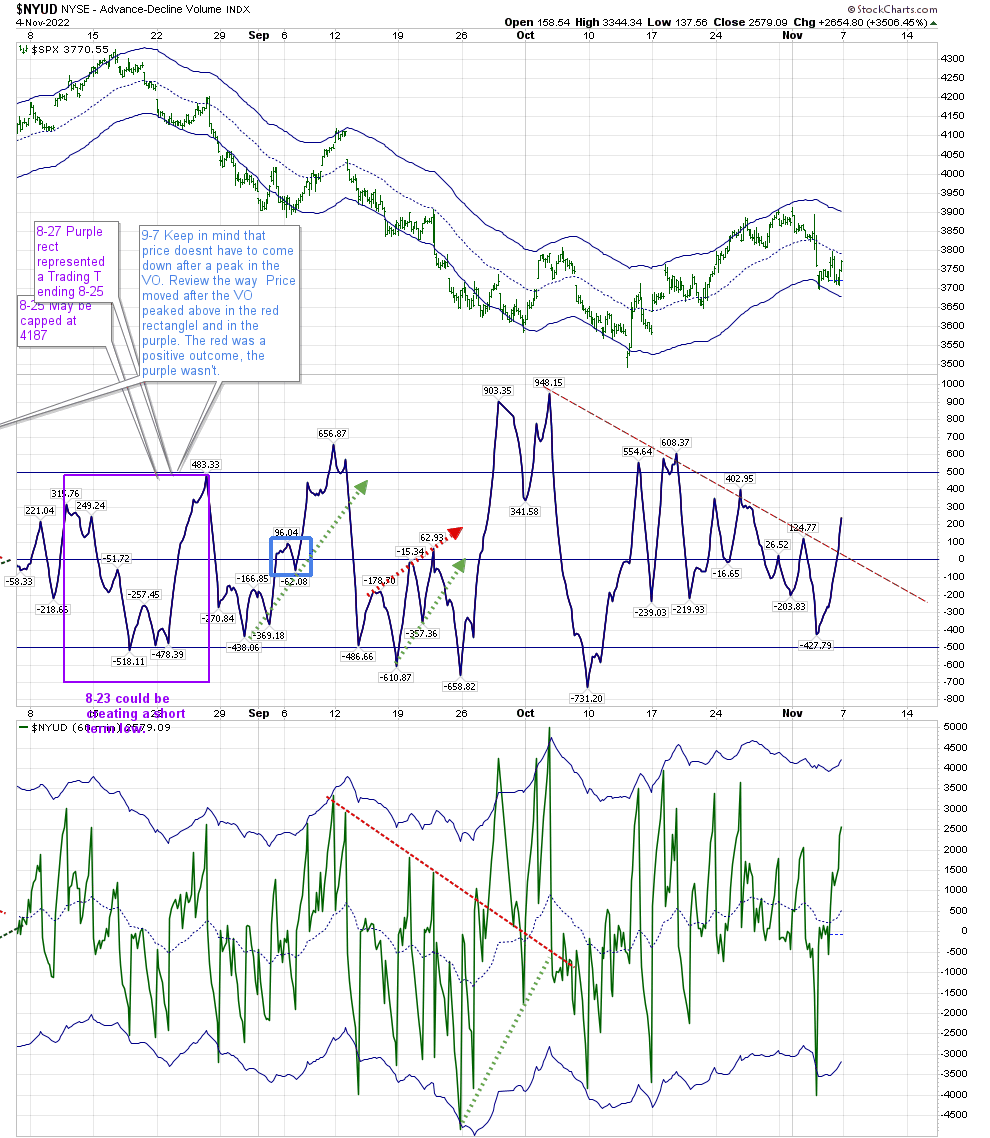
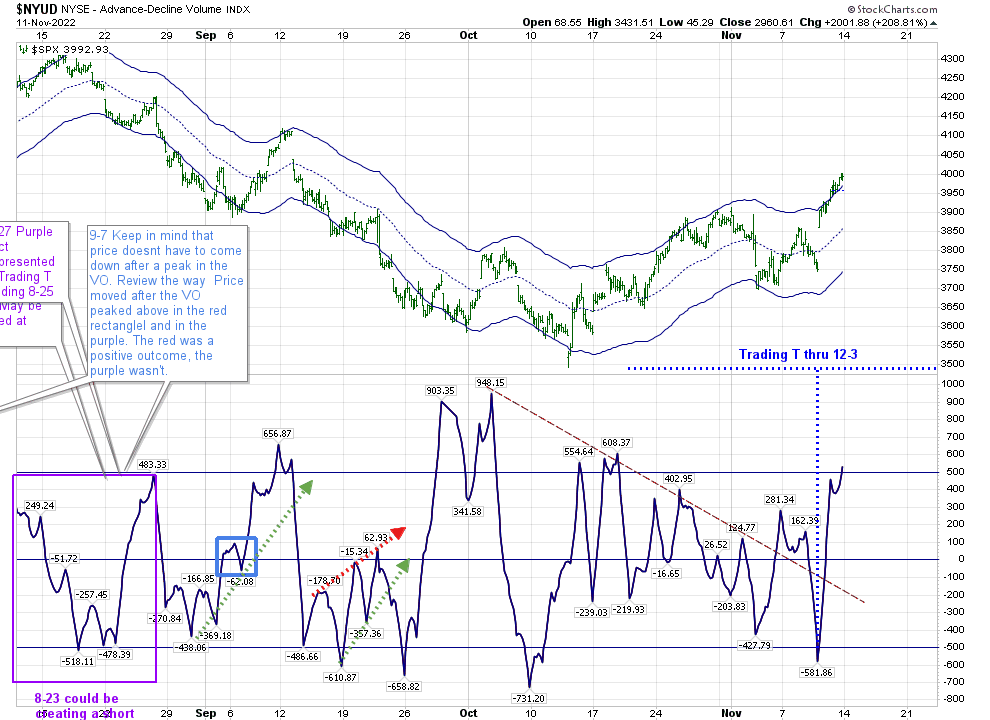
By the middle of October we went above the zero line, and stayed there, even with all the 150-200 point moves both up and down that have occurred almost every week for the last 3 weeks. The end of the November 8 T gave us a peak at 3860, before losing over 100 points to 3744. But a surprising thing happened. RSI has not gotten much below 50 since early this month, following through on last week’s post.

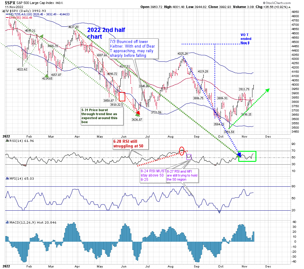
That very sharp drop on November 9 didn’t create a negative outcome. The VO didn’t cross below the zero line when we hit 3744—it reversed.

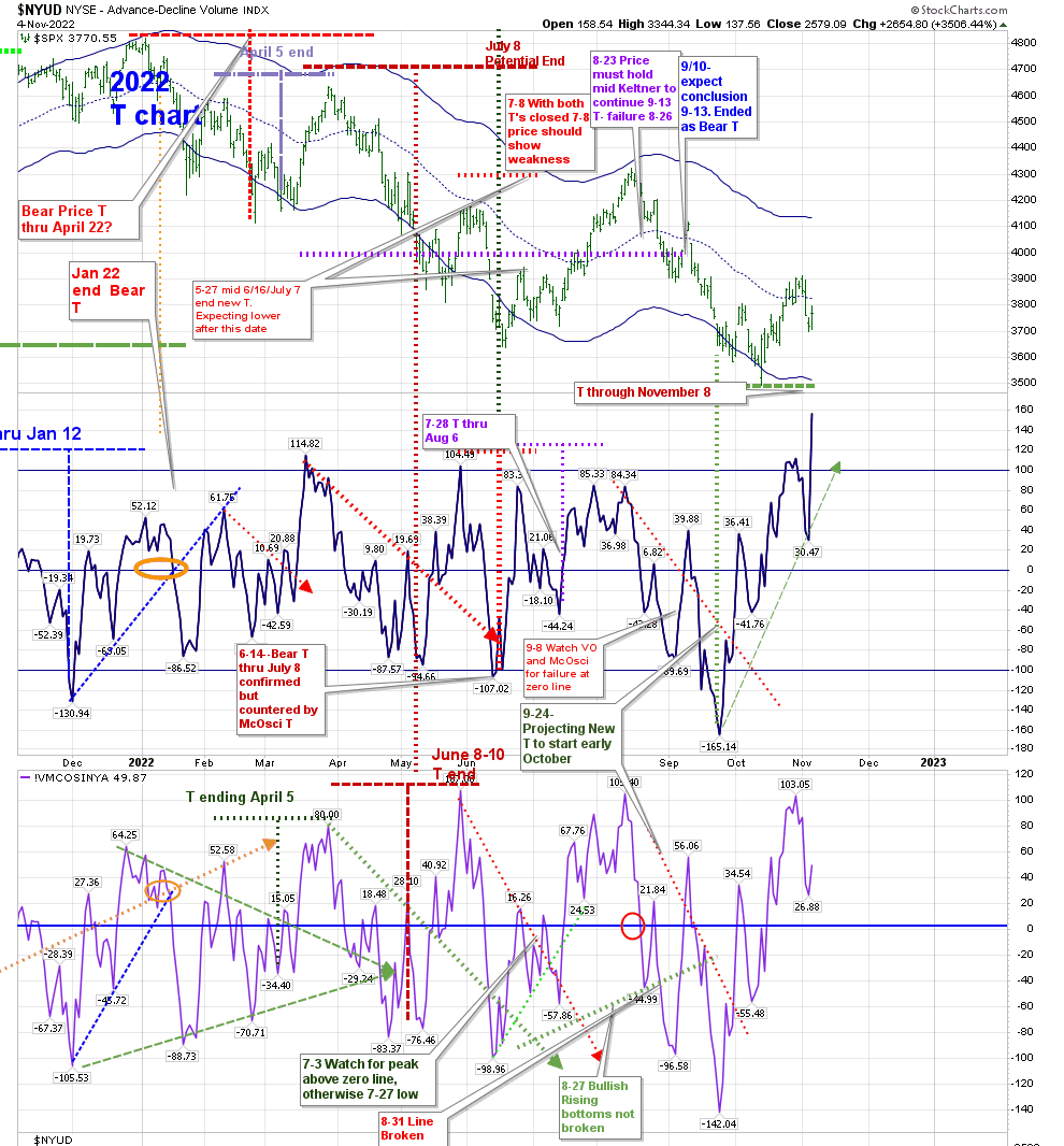
This creates the possibility for an extended period of strength in the market. The possibility is that we have a T that lasts through January 22. I am not marking that on the official T Chart at this time. It is created by beginning the left side of the T on May 27, with a center point of September 23, and a concluding date in January. 

The two Bear T’s that occurred during this T (shown on the marked T-Theory Chart) lead me to reject it at the moment. 

But that doesn’t mean we aren’t in a Positive environment. We have a Trading T that extends through December 3, as noted on the hourly Chart:

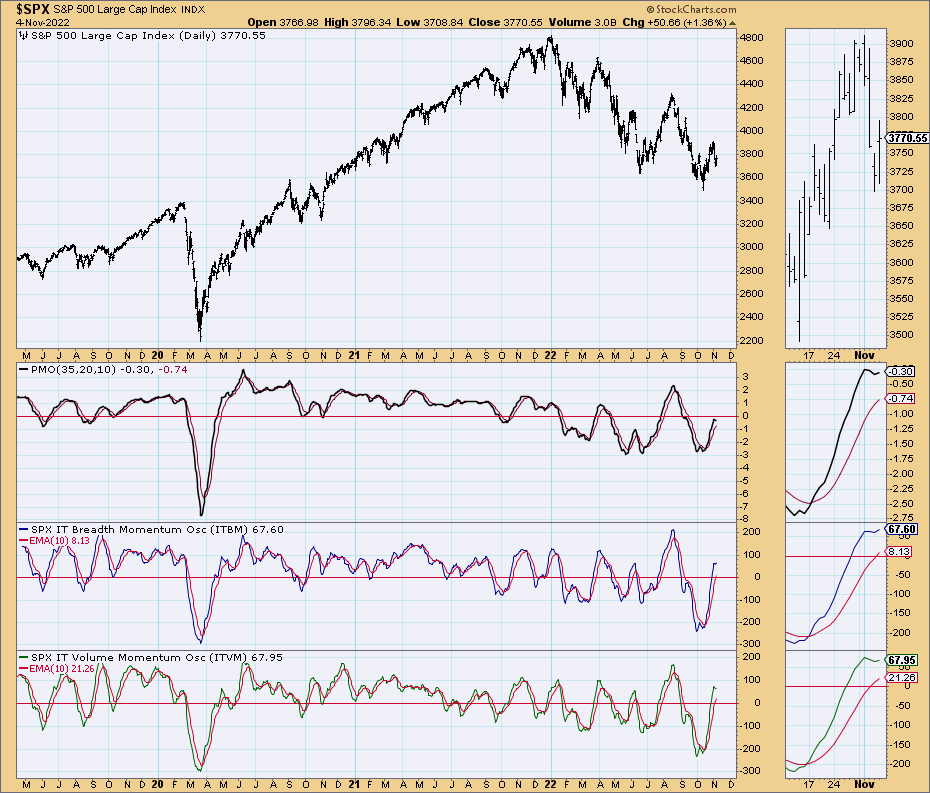
Support for this T is 3857. We are above the upper Keltner of 3970, and that is acting as our first level of support at this time. RSI should manage to stay above 50 as additional support. A failure of 50 to hold on the hourly rate would create caution.

Back in May, I posted regarding the concept of Snowflakes–market moves being unique, but perhaps with ‘cousins’. Most people look at the 1929-32 market as being one 89% move down. Carl Swenlin pointed out in an article there were really 6 bear and five bull markets inside that drop, if you take a move of 20% as representative of those nomenclatures.

A pasted image

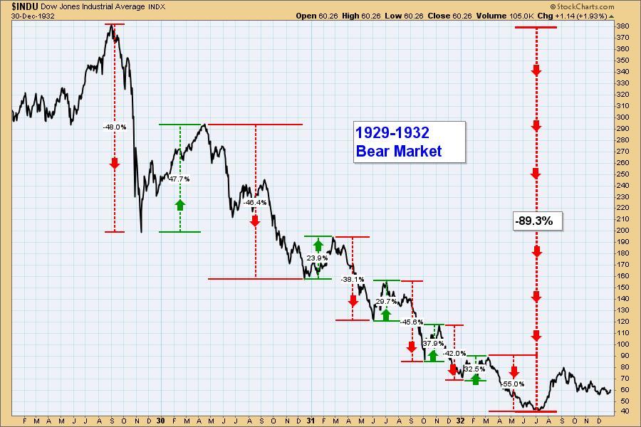
The article can be found here:

https://stockcharts.com/articles/decisionpoint/2022/05/those-who-do-not-learn-from-hi-954.html

Are we in one of those Bull moves within a larger Bear? While the question has to be asked, I can only give you my personal point of view–we can have Positive Outcomes within a longer term Bearish scenario. Right now, we’re in that Positive Period whether it’s long term or short term. I’ve been wary of this market since January, and that served me well, as I hope it’s done for you.

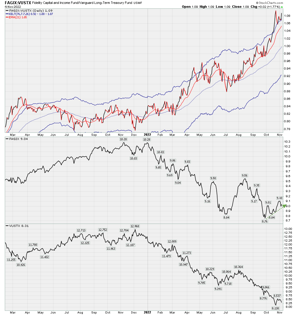
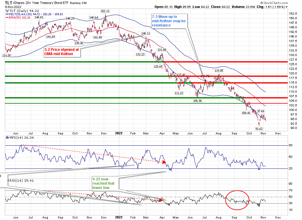
I am ‘trading’ this T using VCIT, a corporate bond ETF as my surrogate for equities. It was common practice (until yields went to ridiculous lows) to be in either corporate or treasury funds rather than equities for the duration of a T. Terry Laundry called this the “Best Bond” strategy. Now that rates have increased substantially, I am utilizing that strategy for this particular T. The T on this can be found in the “Existing T” portion of the site menu.

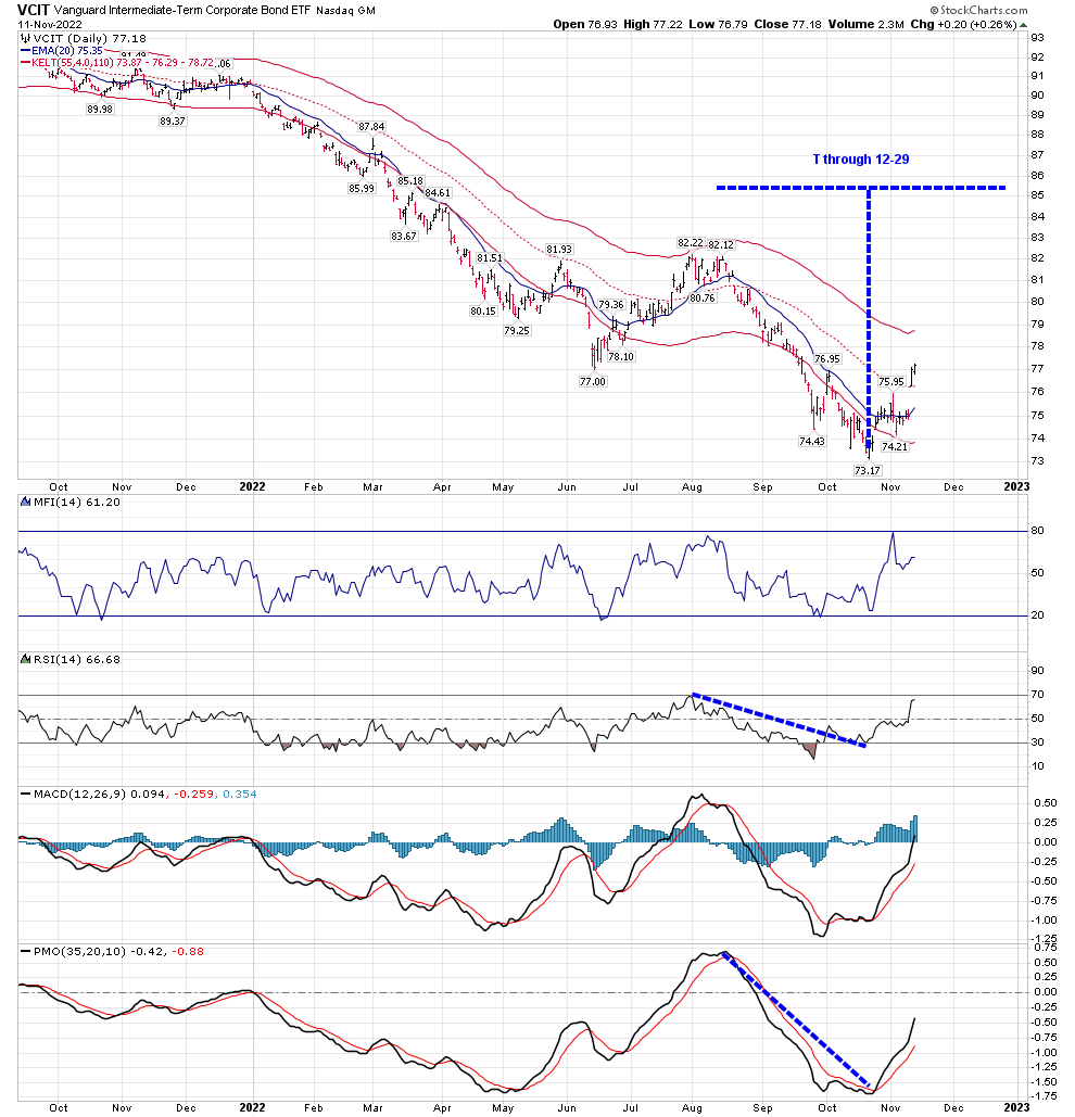
The fact that I am invested in Corporate bonds may appear to be in conflict with my comments regarding the Confidence Index being overbought. But the chart of many of the Investment Grade Corporate bonds look so much better than those of similar Treasury Bond ETFs.

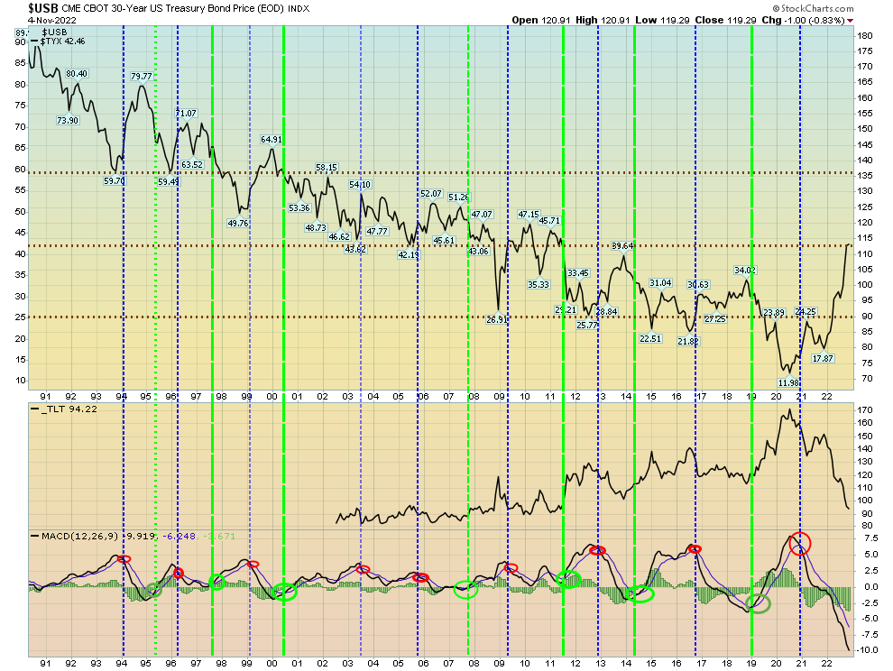
The 10 Year is back where it was a month ago. In my October 23 report I outlined the peak in rates also created peaks in RSI and MACD. They have since been followed by lower peaks, as noted on the chart. I expect one more swing higher in rates as we come to the culmination of this T in 2 weeks. 

Rates are normally very slow to move, and slower to turn directions. This recent period of bond volatility should stabilize soon.

Leading That Horse to Water

Well, you were warned that I am old and slow. And I still remember some phrases that may not be relevant now. You can lead a horse to water, but you can’t make him drink.  

We have a T that ends on Tuesday, November 8. When you follow a system, you must recognize what it is telling you, whether you act on it or not. Earlier this week some readers sent me questions regarding whether or not this present T was a Bear T. A Bear T would have required lower lows in the VO than (-165), and lower lows than (-142) in the McOscillator. Neither of those two events occurred, and Price was nowhere near a lower low than 3600. This is a fear driven market, but when you follow a method you shouldn’t let fear change your perspective. Price and Time? Yes. Sentiment? No. I’ve quoted Mr. Laundry’s views on hitting a beach with a pop-gun against overwhelming odds before. To find the center of a T, one must remove Fear from the equation. 

I say this as a voyeur rather than a participant in this recent T. As I wrote on October 23, I was not going to participate in it with investment funds for a T that in my opinion would last only 2 weeks from recognition. Depending on what happens when this T ends we could be on a recovery path that continues for 5-6 months, taking the March peak in the VO to the perhaps decisive low at the end of September (in the Volume Oscillator).  That would be utilizing the strict VO tool created by Terry Laundry. As I’ve pointed out, I’ve developed a few of my own tools over time, and even though we have the shoots for an optimistic conclusion to a T, the overall situation is unclear.

In the past week, we have had a 200 point gyration that left us close to the middle of that range.

RSI may finally be attempting to obtain a positive resolution. The hourly chart is hovering around 50, with a 2 days left to the Positive T. 

While I would disregard the beginning of the hourly VO trendline in early October (due to its October 10 low), we may have an hourly T that continues to move Price higher after the Daily November 8 T ends. If we are moving into a more positive regime, we could have another week of positivity based on the October 18 hourly VO high to the November 2 trough, which would continue hourly strength through November 18. We should know by Thursday if that is the case for this trading T.

The Bullish Percentage chart is still on a buy signal, even with the mid-week selloff.

The simple chart is ambivalent as fast technicals are wavering. But the slower red lines are finally above the zero line for Breadth and Volume.

As I noted 2 weeks ago, it may be time to start looking for Positive Outcomes, rather than just failed Initiations. But…

I’ve mentioned Terry Laundry’s Confidence Index a few times. Since February, I’ve been insisting that Corporate rates are too low compared to Treasuries. I’ve been waiting for a reset. That hasn’t happened. In fact, the CI has continued to move higher. According to Terry Laundry, that shows increasing confidence in equities. And yet, this has continued even as the SPX is down over 20% this year. 

Historically viewing this chart, there were 5 years where it exceeded .85 for any length of time prior to 2020. These 5 years culminated in a level of .99, leading to the long Bear Market in equities from 2000-2003.

Have credit conditions changed so much? I’ve marked on the chart those times when we’ve peaked above .86, and bottomed below .55. Those bottoms created exceptional long term investment opportunities, while peaks mostly allowed for a gentleman’s exit from the market. We’ve had no such Exit sign to date. It’s quite overdue, unless the world has really changed.

And that brings us to Interest Rates, where the T ends on November 22.

I’ve posted the following Long Term Interest Rate chart before. It represents major MACD turns on the $USB Price (which is invisible on the chart) that can be used as a guide to buy or sell Long Term Treasuries. $USB (again, not shown on the chart) moves higher when rates move lower, and Sell points are in blue while Buy points are in green. These buy/sell areas give you recognition of which way the market will continue for long periods of time. I’ve added TLT to this chart beginning with its inception about 20 years ago. The brown dashed lines show areas of support and resistance in rates. We’ve reached the middle of that area. At this point, rate move direction becomes unpredictable, until the MACD turns. While it appears deeply oversold, my belief is that Price has basically reached a point where it can remain materially static for some time. 

A pasted image

As this mid-line has formed, credit as a whole–both governmental and corporate–has expanded, and regardless of the value of that debt it has been purchased by lenders as offering an acceptable rate of return on borrowed funds.

While in many cases it seems that Central Banks follow a rate curve based on what is defined by the enormous bond market, the recent move in rates has occurred due to Central Bank action. And perhaps that is why this move in rates has been fought so hard by both the bond and equity markets–they are the ones who usually push rather than get shoved. In any event, Price is what matters, and debt as an asset class has been made more desirable by the rise in yield. 

Those dealing with the ETF’s mimicking rates may have a different point of view, as the value of their asset has depreciated as rates have moved higher, but their lower price is actually what makes them more desirable as an asset class as they have developed room to once again move higher. Interestingly, TLT last year at this time had about $6 Billion in Short Interest, and its latest short interest is less than $2 Billion. The move lower in TLT is a historic one in its sharp and almost continuous descent. Those following my blog for the last two years are aware of the accuracy of my forecasts on rising rates, while still being able to capture the move higher in TLT in 2021 from March through October. (Those T’s can be found in the Recently Completed T’s section in the menu of my site.) The T’s were not based on fundamentals, but strictly on the principles built by Terry Laundry.

Looking at a Daily Chart of TLT we have yet to see a rebound other than to once more move within the lower Keltner Band. 

We know that TLT has a duration of roughly 17, which means for every 1% move in rates, TLT can be expected to move 17%, which is about 17 points. Do we expect a 3% move in long term rates over the next 2 years? Remember, the last 2 years have had an historic reversal from extremely low rates. Looking at the USB chart above, this is how rates moved the last time they were in this vicinity:

Including 2008’s Great Recession, and the 2011 sovereign debt crisis, we rarely had an annual move of more than +/-1%. You can pick any area within 2 blue sell lines and see how rates move within the borders of one box between sells or buys to see that minimal change, with the exception of the current period.

I suggested above that the USB chart has reached what may be strong resistance to further yield increases. If that’s the case, where do rates move now? My personal opinion is that we may be stuck in this area for a while.

This rate environment is where we may be living for the next few years.