Expecting the Worst?

It’s been a while since I’ve written a full post, and I know some who read these posts want the main question answered near the top of a post, rather than being forced to read this in its entirety. With that in mind, let me say perhaps expecting the worst is not the best course. Presently, most of the indicators I watch (that are not T-Theory related) are giving off neutral readings.

For those who have access to my elliottwavetheory.net posts, my posts regarding support were on June 10 (regarding the daily SPX), August 17 (regarding TLT), and August 21 (regarding the Nasdaq Composite). Those daily supports have all held, or been breached very slightly for a day or so. In T-Theory terms, one should not expect equities to perform better than the 10 Year Treasury when there is not a T, but in this instance equities have decidedly done better.

There’s an old adage–“when you worry in advance, you worry twice”. There are times when it’s important to worry, but those should be visible within the framework of the technical indicators one follows. Right now, the Richter scale is beginning to show initial signs of a changing market, but nothing has broken. That remains true until at least the earliest levels of support are breached. While you should have a plan based on the possibility of that happening, I don’t believe we are at that point yet.

For those without access to those elliottwavetrader.net posts, I suggested last month that I expected to see a T develop in September. That has now changed.

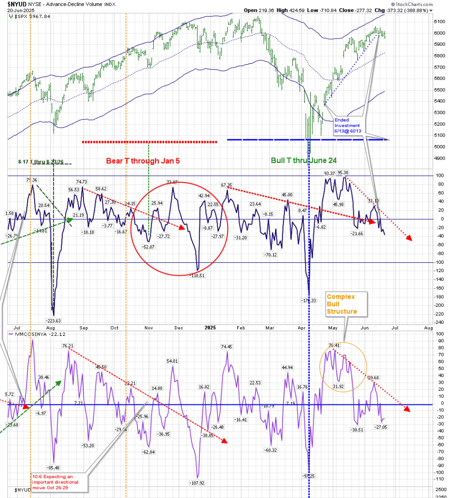
The following chart is the main T-Theory chart. The most recent dashed red line on the Volume Oscillator and McOsci shows where I had initially thought we would get an important low, marking the beginning of a new T. It has been superseded by the orange dashed lines, which now expect that low to occur in October. These descending trendlines–both red and orange–represent Cash being removed from the asset. These funds that are being removed will re-enter the asset in the next period of strength. To arrive at a safe entry point, we would require this line to decline to a deep low similar to the April low. (For those unfamiliar with T-Theory, the August low had the potential to form a daily T, but it has failed to move above the low that preceded its movement below the zero line. This would have been 42 on the VO and 33 on the McOsci.)

On August 25, I posted that there was still no new daily T, and that we may have increased the time until we get a new equity T.

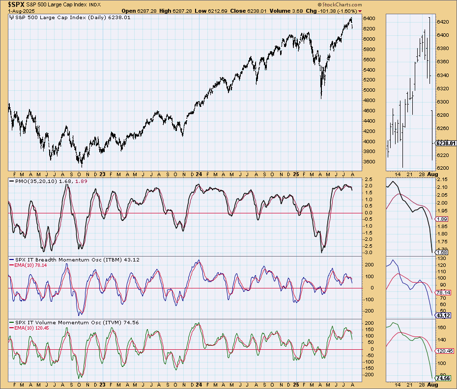
One interesting point to mention is that even though Price moved down yesterday, both the VO and McOsci moved higher. Due to the fact that they are ranging near the zero line, they are not forming a complex positive or negative structure.

Additionally, even though there is no Daily T, I’ve hesitated to expect a major correction, as I mentioned in last month’s post (and in June on elliottwavetrader.net) there is the possibility of the creation of a Weekly RSI T. This is something Terry Laundry investigated at the end of his career, and I am still hesitant in following it without a Daily T. That being said, it is progressing. The weekly RSI T I posted formed its left side in July 2024, and ends at the end of December. It now looks like this:

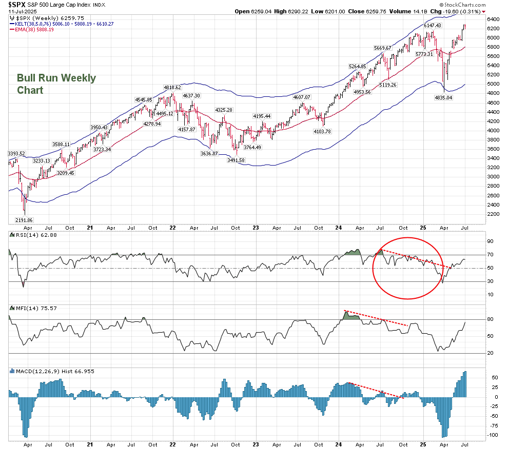
The Daily Companion chart confirms that so far we have been in a Bull phase. The chart does not use the Keltner Bands used by Terry Laundry, but ones that represent the present Optimum Moving Average (OMA) of 35 rather than 55. This shows that support has consistently held even when we corrected since the April lows, just as resistance held until those April lows.

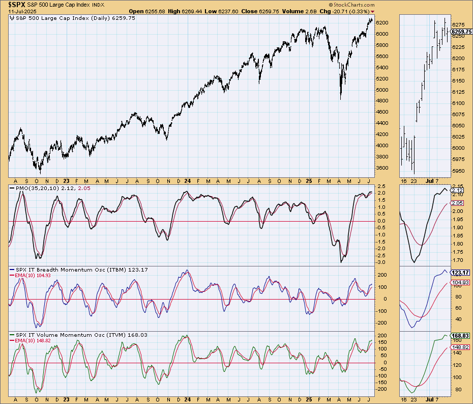
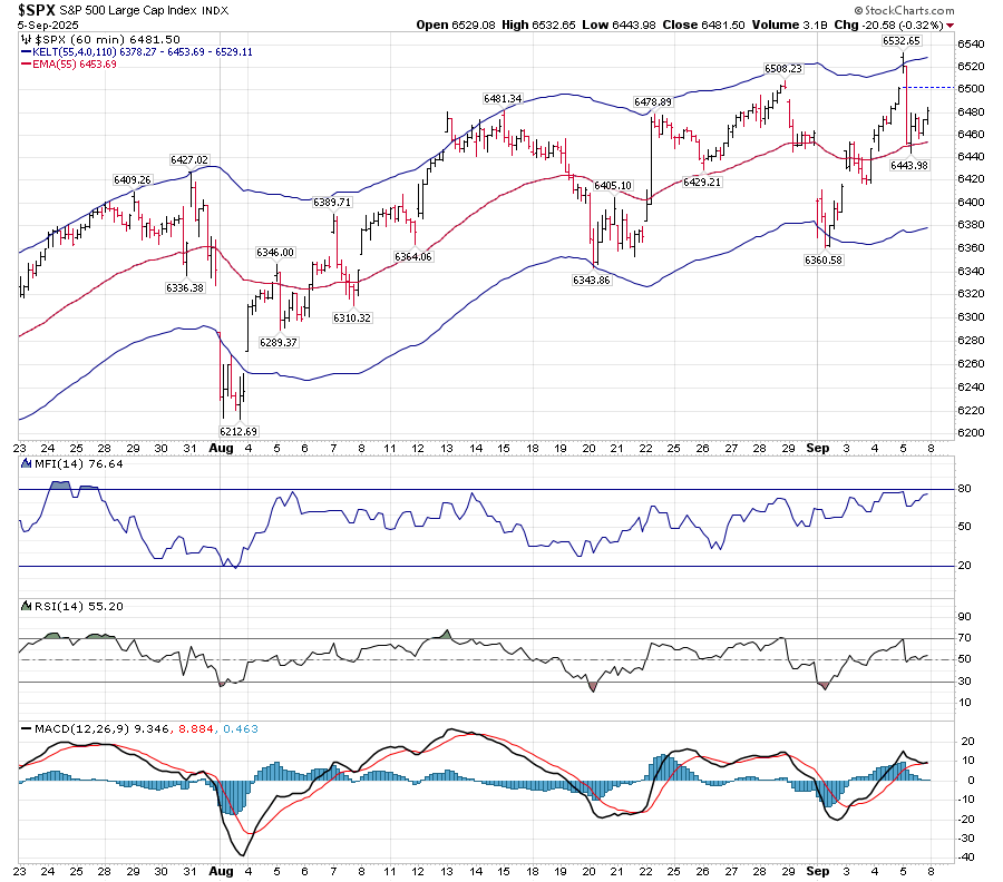
Technical readings on the above chart show an indecisive MACD, which has been receding from its May high. MACD becomes clear when the fast line moves through the slow line. The MACD histogram is maintaining a neutral stance near the zero line. RSI has bounced from an overbought position to the neutral area support, as has MFI.

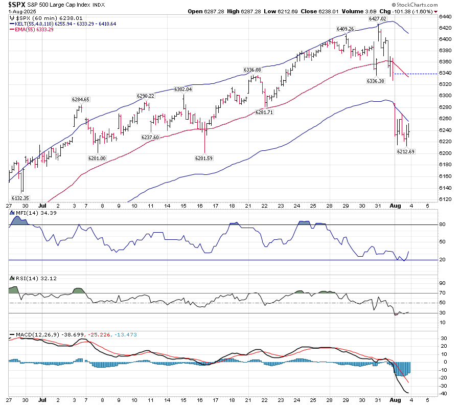
On an hourly basis, Price has shown more volatility, but the Keltner bands show a gently upward trending slope. This upward-sloping movement is a positive in a neutral market. RSI shows that there have been periods where it has been oversold as well as overbought, both causing reversals to the mean. MACD is kissing, and has not crossed up or down.

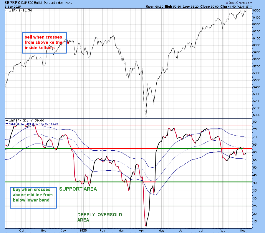
My personal indicators are showing a lack of enthusiasm for this recent move higher. The BPSPX has failed to cross back above the middle of the Keltner Bands. While this is an indication of the weakness of the present trend, the fact that it is still above 50 signals a bullish environment.

The Simple Chart (from Carl Swenlin) shows no momentum in Breadth or Volume. (But we know the Volume aspect from the Volume Oscillator.)

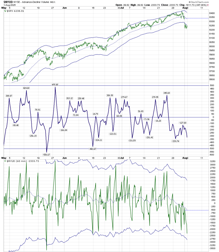
The Advance/Decline line has been bounding off high level support, and its RSI has held the 50 neutral area:

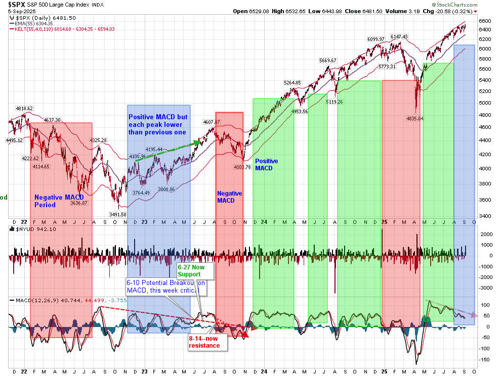
MACD, is giving us a neutral reading at the moment as well. It’s similar to the period of early 2023, where it was positive, but each peak was lower than its prior peak.

This neutral yet positive structure can also be seen in the following chart also developed by Carl Swenlin.

Low risk entry points appear when the Common Stock Only Volume Momentum Oscillator has a critical low below 100, as shown on the following chart:

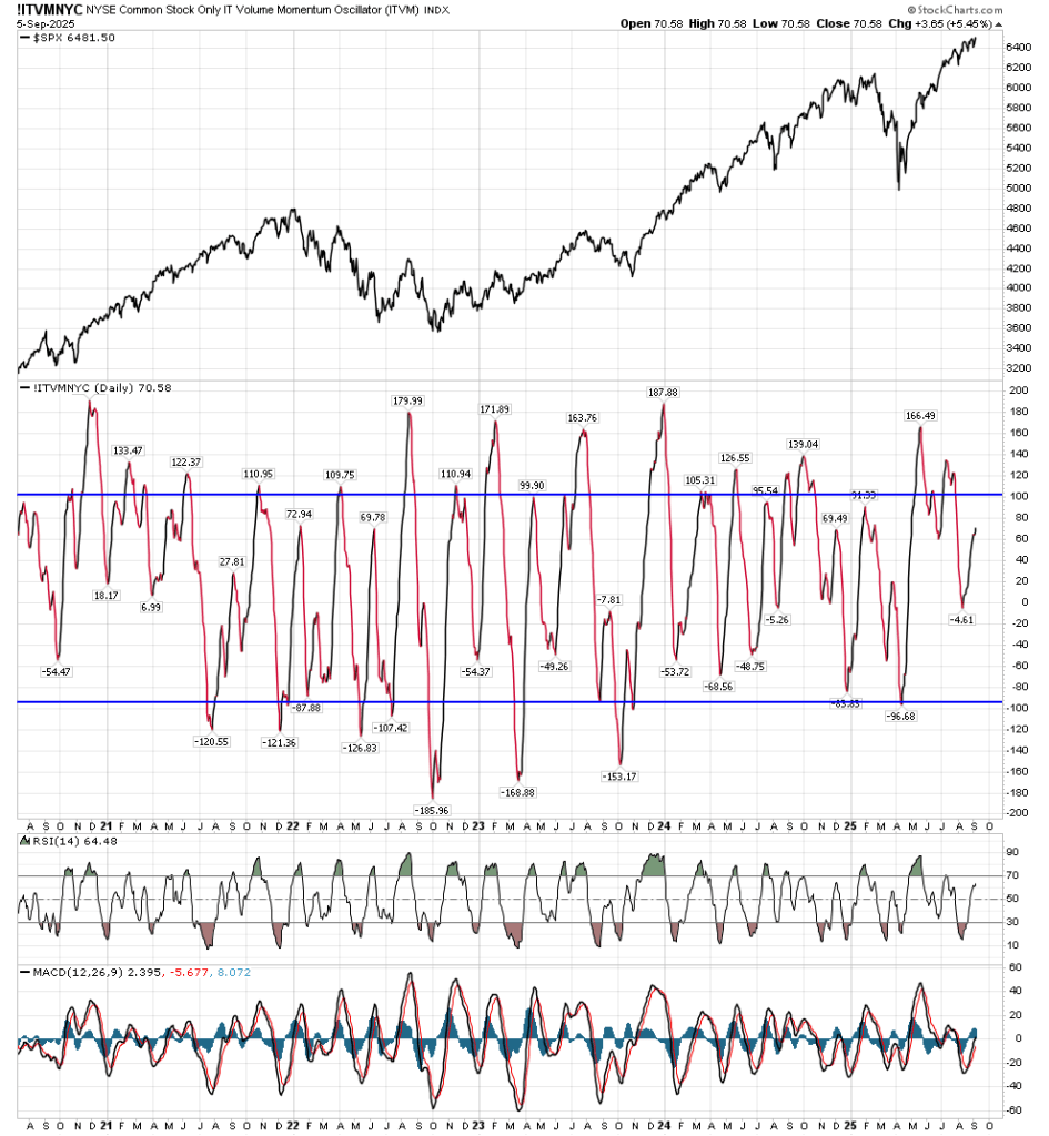
As this is an intermediate time frame chart, combine the view of the indicator with the RSI and MACD status. When an RSI below 30 regains and bounces above 30 at an !ITVMNYC low, it represents a fairly low risk environment. The fact that it bottomed recently at the zero line indicates a market that is still not showing substantial weakness.

I will be searching for a future entry point into equities based on my Daily T-Theory chart, as well as the above personal indicators.

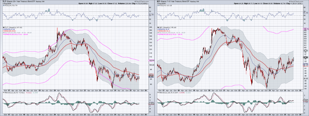
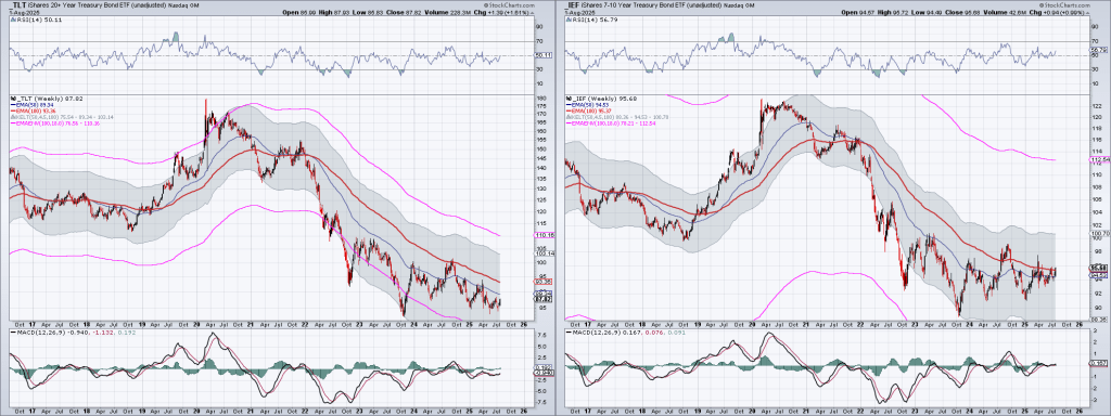
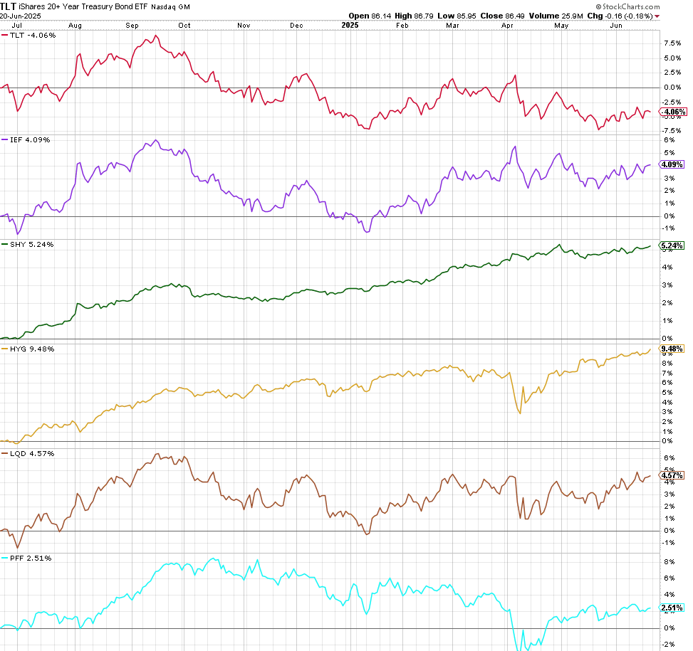
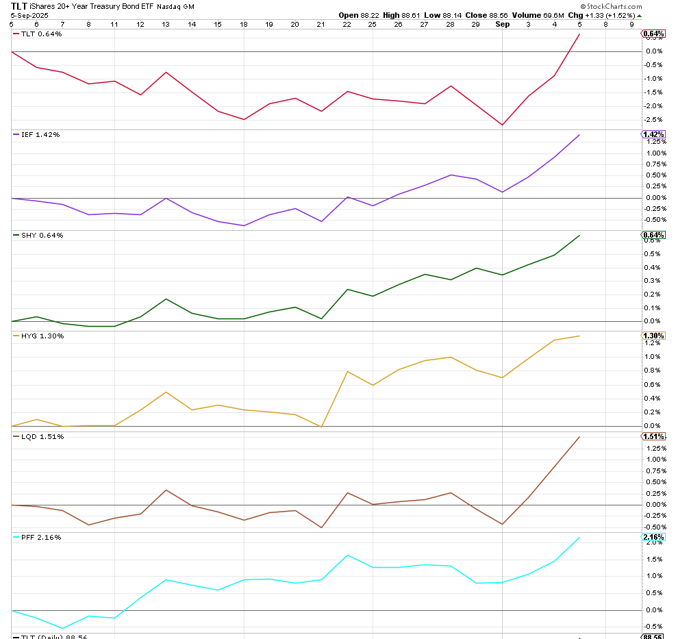
On another note, the bond situation is still an issue. I discussed my opinion that IEF would be a better choice than TLT at that time, and that has been the case. It has even exceeded the movement of the junk bond ETF HYG since then.

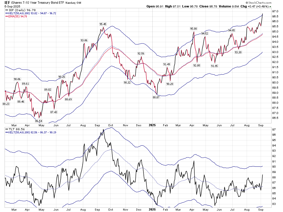
The above chart shows the difference between an upward sloping Keltner band and one that is basically level.

I am still leery of investing in long term bonds, and have most of my bond assets in short term bonds that roll over, or ETFs that don’t extend beyond 7 years, with most of that in the 1-3 year range.

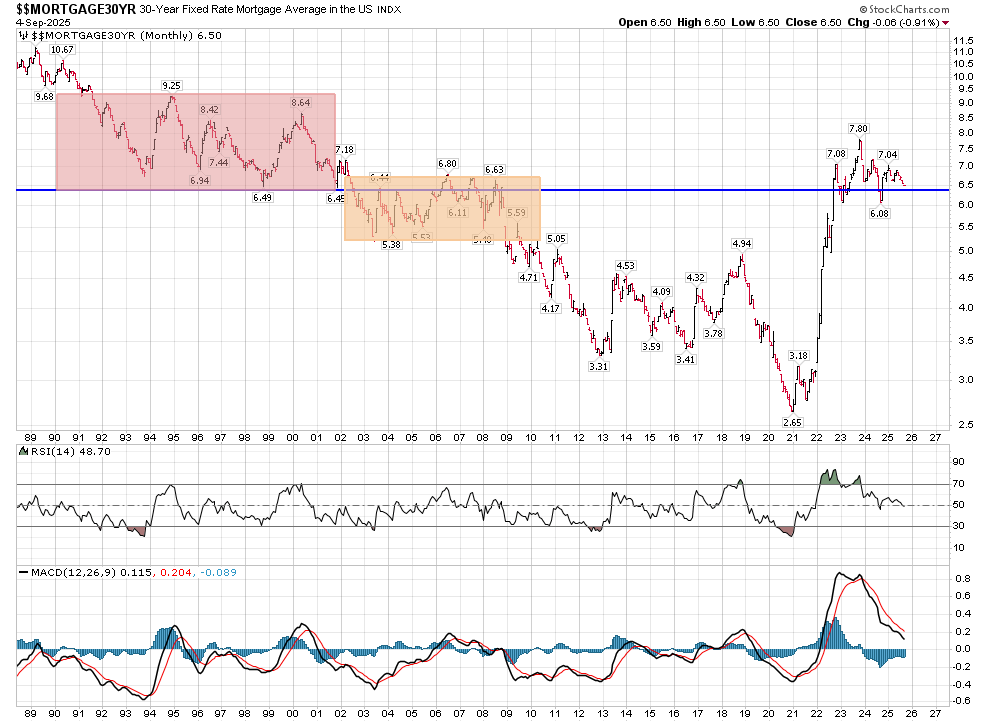
I could write more regarding what I see in the bond market, but perhaps I’ll do that next week. But I will leave you with a Mortgage chart that suggests we are at a level in Mortgage rates that could bring us back to a lower regime similar to 2002-2009, or stop moving lower as we are at support. Time will tell, and it’s near a critical decision.

Till then,

Stay safe.

Is It Safe?

There was a movie released in 1976 called “The Marathon Man”, which had a scene where a diabolical dentist held a drill in the mouth of the protagonist, and asked “Is it safe?”. When he got an answer that he felt was untruthful, he drilled a hole in the hero’s tooth until he hit a root. The hero had no idea what the dentist was talking about, and tried to give the answer that he thought would stop the pain.

Bonds

The returns in the US bond market over the last year is shown in the chart below. The chart includes dividend distributions, which in this case, shows Price and Yield.

The winner in the above chart is HYG, which is a high yield bond ETF, but for the balance of this post, I’m going to disregard it and other non-Treasury ETFs.

The loser is TLT, which is an ETF that is based on bonds with at least a 20 year maturity. It holds 42 different bonds, with a duration of about 16, and an average maturity of roughly 26 years. A duration of 16 means that it should move 16 points with every one percent change in interest rates. In contrast, the SHY ETF holds 114 different Treasuries, with a duration of 1.87 years, and an average maturity of roughly 2 years. The middle ground in the above chart is held by IEF, a 7-10 year ETF. It holds 14 different Treasuries, with a duration of 7, and a maturity of roughly 8.5 years.

Looking at Price alone over the same period as the above chart, but removing their dividends, their Price performance is as follows:

A fundamental concept of the Price and Yield of a debt instrument is the risk premium–the value of the return of principal. In periods of high inflation, or principal devaluation, the risk premium on longer maturities will rise, relative to the risk premium on shorter based maturities. This becomes even more important if you are a foreign purchaser, who will have to convert the dollars into a different currency. And that brings us to the following chart:

Since January, there has been a roughly 10% loss in the dollar’s valuation. In January it was up over 5% from 12 months ago, but since then it has fallen almost 5.5% from its value a year ago. If you’re buying a bond with a maturity of a decade or longer, your loss on your holding has not been covered by the interest you have received.

From a May 2025 Congressional report, we learn the following:

As of December 2024, there was $28.1 trillion of Treasury securities outstanding, up from $20.9 trillion in December 2020, a $7.2 trillion increase (figures are rounded). During the same period, foreign holdings of debt increased by $1.2 trillion to a total of approximately $8.5 trillion. After staying relatively flat in dollar terms for several years, overall foreign holdings increased in 2019-2021, fell in 2022, then jumped in 2023 and 2024. Because the total debt has increased faster than the debt held by foreigners, the share of federal debt held by foreigners has declined in recent years. In December 2024, foreigners held 30% of the publicly held debt. Interest on the debt paid to foreigners in 2024 was $230.6 billion.

The link to that report shows the top 10 foreign holders of debt, and how it has changed over the last 5 years.

While I hope I’ve given you my perspective on the relationship between Time (maturity) and Price (value), I’m sure that you’d like to know what this is all about. It’s about confidence. To buy a long term debt instrument, one must have confidence that the future value of your principal is insured by an adequate yield to protect any potential loss in the value of your principal. But in addition to charts, one must think about the perceived future value. If you’re concerned that the value of your principal is being hidden from you by false narratives from the statistics you are given, you will want a higher return. It doesn’t matter what rate the seller of the debt offers to pay, you won’t pay 100 cents on the dollar for that debt if you can’t look at the books. Unfortunately, based on the killing of the messenger in Friday’s bad news regarding the jobs market, this is a variable that must be added to risk premium. Bond buyers (as opposed to bill and note buyers) will require greater yield to support their return of principal.

The Fed may suggest short term rates, but the bond market looks beyond that. The Treasury has been trying to weaken the effects of the cost to the government of high rates by issuing more short term bills and notes. They are in effect, trying to time the market. (In retrospect, more long term debt should have been issued in the 15 year’s preceding 2022.) Offering fewer Treasuries with longer maturities does keep the interest paid on them lower based on supply. But the risks of inflation and misleading information have increased recently. Spreads between short and longer term issuances will probably rise, in my opinion. I am heavily invested in 1-3 year Treasuries.

That being said, we must look at the charts to see where Risk and Reward offer potential.

Here are the weekly charts of TLT and IEF using the Optimum Moving Average created by Terry Laundry:

The following chart shows Price movement, removing the Yield:

All Treasury maturities do not show the same potential, and it’s my opinion that IEF will give a better return based on Risk to Reward. IEF has the potential here to break above its Optimum Moving Average, while TLT is still floundering. Why am I not invested in either one? My risk tolerance at this point is low, and a chart of SHY over the last year looks like this (the left side is Price including dividends, while the right side is Price alone):

********************************************************

As far as equities, are concerned, on July 17 I suggested one hedge equities with the following post:

I believe we’re getting close to a nice sized pullback, but not tomorrow. The bpspx is in a precarious spot, and breadth and volume intermediate momentum is negative. RSI and MACD are close to overbought and turning down, respectively.  

I’m not suggesting anyone short, but in my opinion we have about 1% upside from here. Tomorrow might be a good time to hedge. Nothing is shouting SELL now. It’s whispering hedge. Volatility is cheap right now. 

On Thursday, I noted the key reversal that occurred. Immediate resistance is 6255. I would like to see at least 2 bars above that (the lower Keltner band) before I would expect a bounce to hold.

Daily support is at 6122. Until that is broken, and RSI moves deeply below 50, one should be wary of a quick reversal. As I’ve pointed out, in a bull market, RSI tends to remain above 50.

Looking at this from a T-Theory perspective, my thoughts are that we won’t get a good bottom until September. The longer it takes to get to this bottom, the longer the T will last after it forms.

The hourly Volume Oscillator is showing complex, persistent selling. The NYUD itself is unable to get above that zero line, while the VO of that indicator has created a Complex bottom. This leads me to expect further weakness. (Yes, I have to keep the above comment regarding the daily RSI bull perspective in mind, but the below chart is a negative.)

BPSPX was one of two indicators that created caution. It is now below the lower keltner band. 50 is support, and until it breaks 50 it is a positive indicator. It can be a positive indicator but until it breaks back above the middle keltner it is not on a buy.

The Simple Chart is also an indicator that gave me concern 2 weeks ago, and has continued to move down. It has further to go before it hits the zero line, but its present high position is based on that extremely strong April move. It created a perch that has become a precipice.

The weekly chart I have been using for the last year is not based on Terry Laundry’s channels, but on the Optimum Moving Average for the NDX. I mentioned on elliottwavetrader.net about a month ago that this had the possibility of giving us a weekly RSI and MFI T into early next year. But it is receding from overbought. It needs to hold 5880 to maintain this possibility, and of course we can have shorter term daily T’s within it.

In contrast, I show Terry’s weekly chart, which can have us move all the way to 5616 before support on a weekly level is met, while still having that T through early 2026.

My present thoughts are that we continue lower for a while to create a better short term T. Investing at T bottoms and removing longs at a T’s end has allowed for positive additions with minimal downdrafts for the many years I’ve practiced and reviewed this concept. It kept me out of the 2020 and 2022 downdrafts, and even allowed for a more than double digit return in 2022 based on the short term T’s that were created. It’s hard not to have FOMO but the consistency of this technique’s returns have been worthwhile.

Stay Safe

Missing a 4% Rally

I closed out my long trade based on T-Theory at 6013 on June 13, which was 2 weeks before the T was scheduled to end. Had I waited until June 24, I would have ended with Price at almost that level. But I had no angst regarding the 2% drop and recovery that followed.

There are a few things that can happen at the end of a Magic T. With an end to strength, the market could fall precipitously (more likely at the end of a Bear T), The market can continue a slow chug forward (as Terry Laundry expected the end of a T period of strength to create returns no greater than that of the Ten Year Treasury), or it can do what we’ve done here–continue on an accelerated path. Sometimes the least probable course is what occurs.

June 20 marked a low in the BPSPX, and it has since recovered to be back above the Keltner bands. Whenever it is above 50, it represents a positive environment. My personal thoughts are when it falls below the upper Keltner band (after being above it), it’s time to lighten positions. A cross below the middle Keltner channel might have given reason to short, but it never reached that level.

The Simple Chart (from Carl Swenlin) is an Intermediate Term chart showing Breadth and Volume Oscillators. This chart shows Breadth and Volume momentum slowly turning lower, after an amazingly sharp move off the April lows.

Both of the above tools are in my repertoire for use to confirm Magic T periods. They are preferred tools for swing trades, as opposed to short term Price movements. They confirm a trend, not initiate one.

My last post contained the following statement:

The difference between a trader and an investor can best be explained as one where a trader is willing to accept the risk of spotting the beginning of a trend change, as opposed to one who is willing to initiate or follow trends. The Venture Capitalist is an investor whose risk taking is based on trend creation. The worker with a passive 401K has his basic investing career set up for him via corporate guidance. There are multitudes of intermediate versions of the above criteria. Each one of them helps satisfy our primal emotions of Fear and Greed. 

This site is dedicated to the T-Theory concept of Terry Laundry. The basic concept of T-Theory is based on periods of exceptional strength following a period of weakness. Since we have not had weakness in Price since the end of the last T, we are not creating the base for a new T based on Price. But…

At the end of his career, Terry was contemplating RSI and MFI Magic T’s. The above T chart is based on Terry’s 76 week Optimum Moving Average chart for SPX. (He didn’t use the main 55 daily OMA for his weekly chart.)

Back in the day, I questioned him regarding his use of the 100 week OMA on a vehicle similar to TLT, when I thought the 50 OMA had “more hits”. The OMA should be the Moving Average that has the most hits. In a similar vein, I am now using a Bull Market Weekly chart with a 38 week OMA as follows:

Its upper band is 6610. My first suggestion that this T may be in play was on June 29 on elliotwavetrader.net.

Looking at the daily T-Theory Chart, I am not expecting a new T to be created before the middle of September. We would need to see the VO and McOsci move to deep negative territory, meaning below -70.

How can we consider a daily T forming within the larger Weekly T? As long as we stay above 5800, that RSI T is probable. Weakness that takes us to that level brings us to support.

We’re overbought on daily technicals right now, but nothing is clearly broken.

If you are a trader, you will not be able to use this information, and I thank you for reading this far. If you’re an investor or swing trader, the parameters are shown above.

Thoughts on a Sunday

  • What is it that makes people “invest“ in equities? 
  • How are the investments people make affected by news events​?
  • What is the difference between an investor and a trader?
  • What role does one’s individual psychological experience play in investment decisions?
  • Are the emotions of Fear and Greed important to your investment decisions?

​People invest in equities for a variety of reasons. Capital appreciation, income, inflation protection–all are valid reasons to invest, but in my opinion the primary reason people who can afford to invest do so is because they are programmed to believe that this is a proper use of their resources. 

News events can cause people to react on different levels, but changing investment goals isn’t something that changes immediately for the retail investor. Investors don’t react to events, but rather  to longer term trends. The difference between a trader and an investor can best be explained as one where a trader is willing to accept the risk of spotting the beginning of a trend change, as opposed to one who is willing to initiate or follow trends. The Venture Capitalist is an investor whose risk taking is based on trend creation. The worker with a passive 401K has his basic investing career set up for him via corporate guidance. There are multitudes of intermediate versions of the above criteria. Each one of them helps satisfy our primal emotions of Fear and Greed. 

It’s my opinion is that we develop our individual standards for investing or trading based on our personal realities. There are no two people who share any one path. Shakespeare looked at the difference between Nature and Nurture and aptly named his work “The Tempest”. A Prince acts like a Prince when abandoned on an island, where he meets a Princess who is still a Princess even though she herds sheep on that same island. We are all affected by events based on our personal history.

There are no two events that are exactly alike. While it may be true that “Those who can’t remember the past are doomed to repeat it,” the past is not a known quantity. For the most part, history is written by the victors. Their vision of the past is filtered by the results of time between Then and Now. You can rationalize any headline depending on your personal biases.

Putting this in context of the market’s reaction to news, the past may give us a good idea as to the meaning of an event, but whose meaning is it? As Ben Graham pointed out,  “In the short run, the market is a voting machine, but in the long run, it is a weighing machine.” For example, when there is trouble in the Mideast and many fear oil inflation, others see–should their view of history be confirmed–a conflict that is closer to being resolved. One person’s fear may be another’s vision of a better future. 
As Terry Laundry wrote in a 1997 paper on T-Theory

It takes a special state of mind to “sign up” for a short boat trip, in a flimsy landing craft, to a beach completely controlled by hordes who have anticipated your arrival and have set up every imaginable way to do you in. Buying into major market opportunities presents a similarly discouraging picture. You may have good reason to anticipate profits, but if a great opportunity does indeed exist, nearly everyone will be against you, including your friends, and the predominant opinion expressed by your peers, including people you respect, will be that you are embarking on a foolhardy enterprise.

There are always going to be inconsistencies between how the market may react to a specific event. It doesn’t mean that news doesn’t influence the market, but we each have our personal biases as to how we interpret events. I could show you charts of how “the market” reacted to different events in accordance or discord to what we would normally expect. If these inconsistencies didn’t exist, there would be no immediate “voting”, and all we would be doing is “weighing”. 

I’m reminded of the mathematician Goedels first theorem of incompleteness. Basically it states that any mathematical system is either incomplete or inconsistent. My personal view of reality is in tune with that concept on philosophical grounds. We are all not the same, and we don’t look at the universe around us in the same manner.

One example of how the market showed different responses to events can be found when one looks at the Great Recession. Why couldn’t we reverse it earlier? Why didn’t the market react earlier? Perhaps it was because the attempts missed the mark, and no one saw an end in sight.

Some may point out that the market shrugged off the Federal Reserve’s early attempts to stop the damage by lowering interest rates. If one was only considering those attempts as the “reason” the market continued to fall, they would be ignoring other events that occurred in the same time frame, such as the failure of major financial firms, and the fact that no one was going to borrow money at any interest rate. What turned the market around in March 2009? It could have been the exhaustion of sentiment but there was also a fresh attack to halt the recession not by lowering interest rates, but by large scale asset purchases.

If you’re inclined to think that the Fed is evil, or that it is irrelevant, you can dispute this. 

Our charts can give us a pathway for the future, but obviously none of them can dictate Price. Those of us who spend an inordinate amount of time studying these charts do not all have the same biases, and our results will be based on those biases.

The future is non-linear, and so are our lives. Have a great Sunday.

An Explosive T Ends

We’ve stayed in a quite tight range since my report of June 7. (Last week, I only offered a short update as I was only armed with my phone.) The June 7 report was posted after a close of 6000 on the SPX. Since then, we’ve remained within 1% of the close on June 6. That followed a May 25 report, where I noted how there might be a resting period after the sharp move in April, but how the T should continue on through June 24. We climbed another 250 points after that before breaking down.

I can report Volume Oscillator (VO) T’s to the best of my ability, but I don’t make the rules. This was clearly a Bullish T, and hopefully some of my readers caught the undercurrent of the titles to my recent posts to hold firm–Opening the Door to Truth, Stumbling Within the Larger T, Sometimes a Cigar is Just a Cigar. This year has had very clearly observed Bullish and Bearish T-Theory outcomes.

Terry Laundry (as I remember his rules), felt that the best returns were to be made from remaining invested through a T’s end–with the best moves slated for the beginning of the T and ending of a T. Personally, I broke with the second rule, based on my additional tools of the “Simple Chart” and the BPSPX. They both turned negative on June 13.

So what happens next? When there is no T, Terry did not expect the market to outperform the 10 year Treasury. And that Treasury is not outperforming the 3 month Treasury, so there is no incentive to put money in long term bonds (as will be discussed below).

The above chart shows us the potential for a new T to begin next month, but it’s much too early to confirm that. We would need to see a lower low in the VO and the McOsci–preferably below -100 on each. The VO would then have to rise above 32 at a minimum to create the next period of strength.

Moving to TLT, the following charts show TLT:

These are not “pretty” charts. The chart on the left represents TLT’s price irrespective of dividend adjustments, and it hasn’t been able to move above its Optimum Moving Average. That’s a negative. At the same time, the chart on the right shows TLT’s price with what I consider to be trendline resistance.

There is still no fear in the bond market. The following chart shows the annualized return of major bond ETFs for the last year. The clear winner is still High Yield. That should always be the case, but perhaps it’s a little sideways right now, as volatility should show more damage to junk bonds at this point, in my opinion.

Have a good week.