There’s an old joke that someone once asked Rodin how to sculpt an elephant, and his reply was “You take off everything that doesn’t look like an elephant.” That might be true, but life tells us something different. There are no two elephants that are exactly alike. The best we can hope to achieve is the outline of that universal elephant, with our own interpretation of reality. Would an elephant sculpted by Rodin be the same as one done by Dali? I’ll leave it to the reader to find images of a Dali elephant.
Charting is not a science. Those of us who stare at charts, trying to find their meaning will use their own experience, and add their own biases to their conclusions. Sometimes the simplest explanation is best. I have spent the last 15 years utilizing the tools of Terry Laundry (as I have interpreted them) as best I can. I know my biases, and try to fight them. I know sentiment can skew a conclusion. Chartists try to make sense out of reality, but sometimes reality makes no sense. You have been warned.
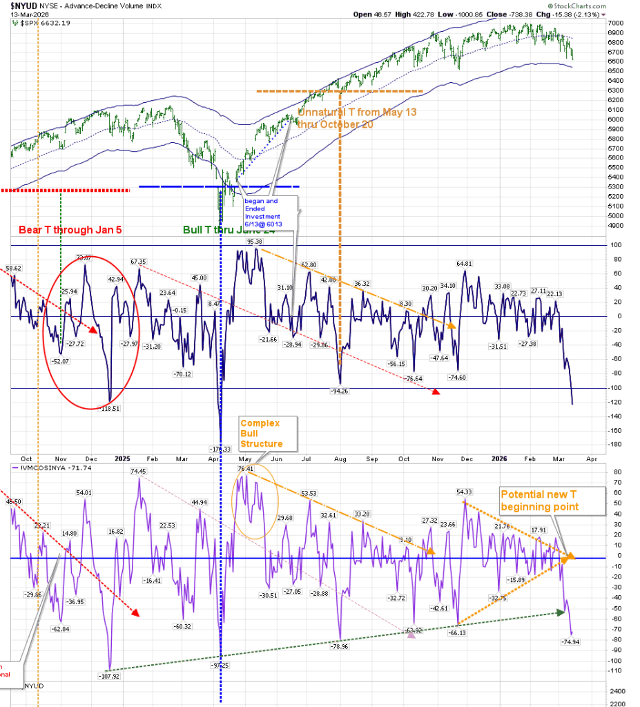
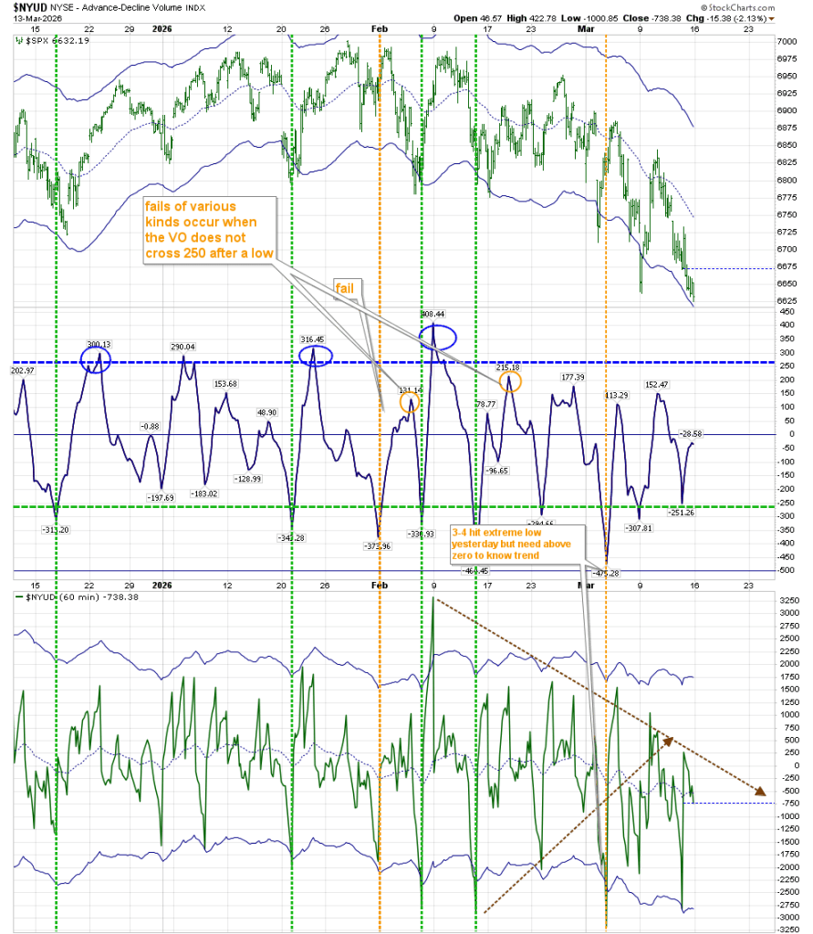
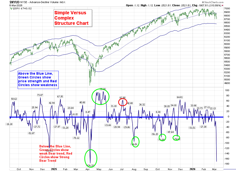
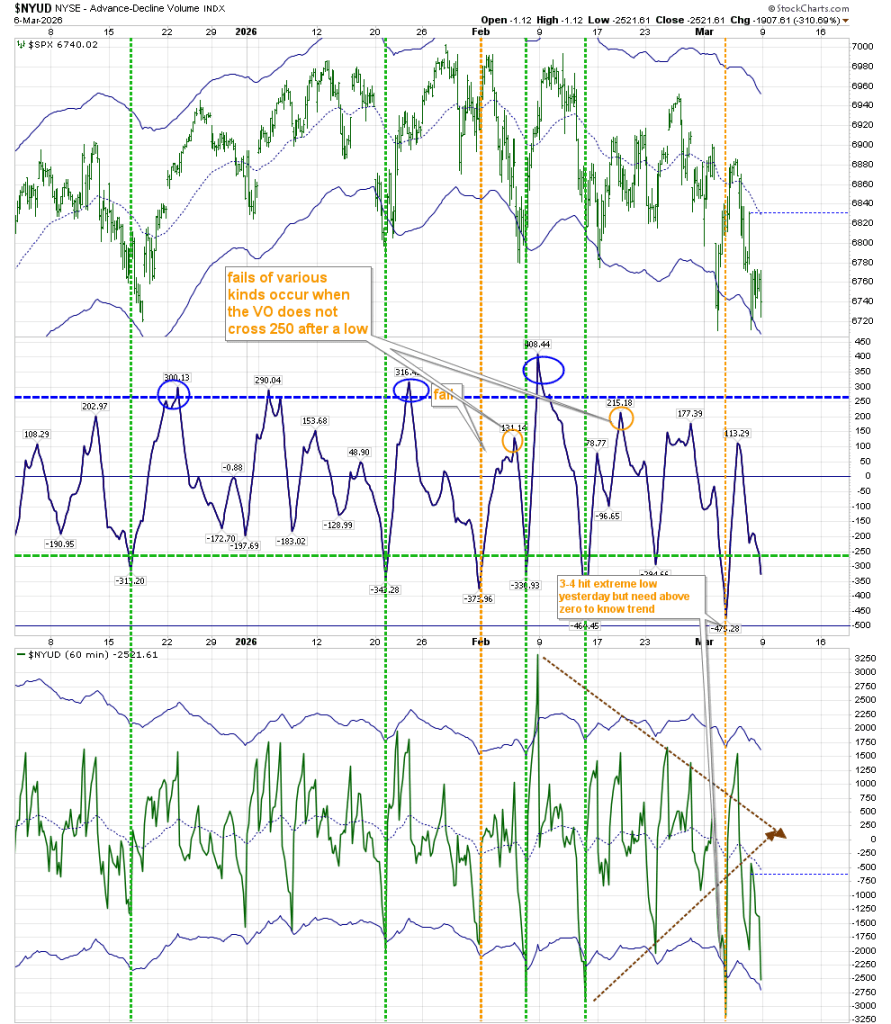
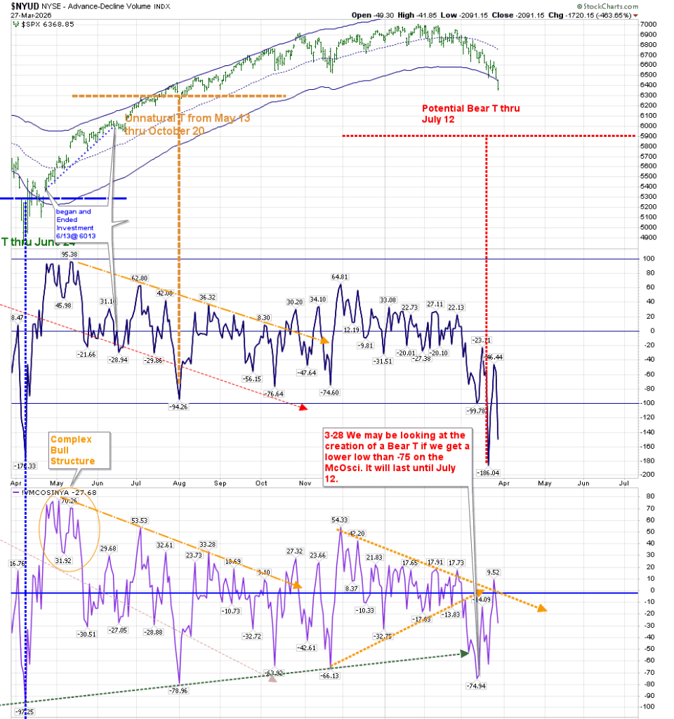
We are facing the possibility of building a Bear T. The Marked T-Theory chart now suggests that we have the possibility of getting a lower low in the Volume Oscillator and McOsci. This would create a Bear T that will extend until July 12.
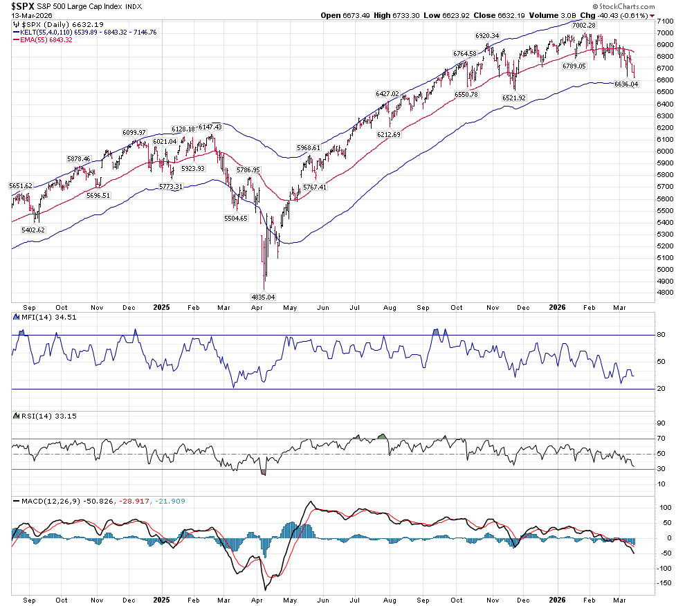
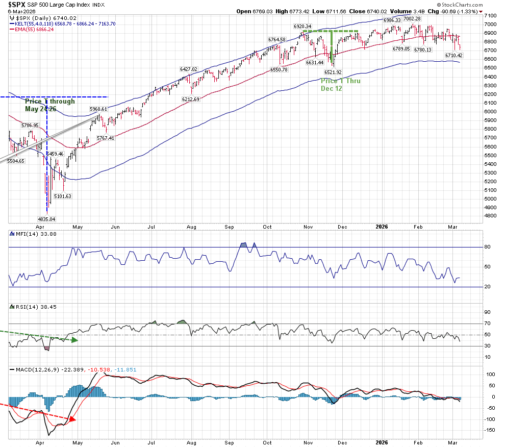
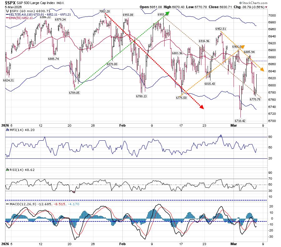
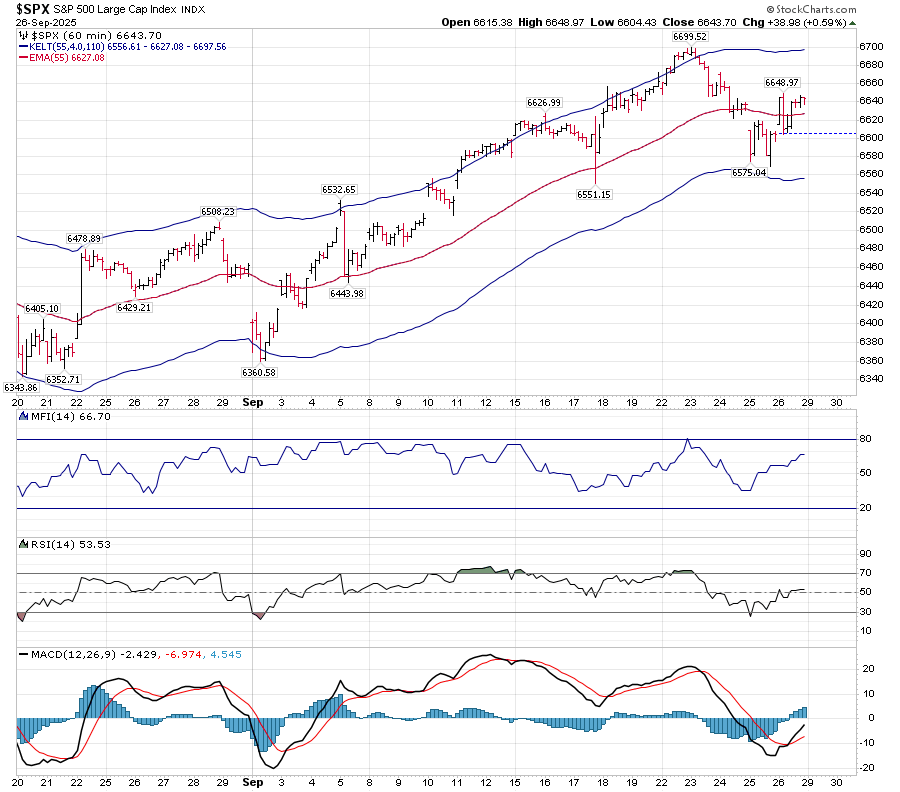
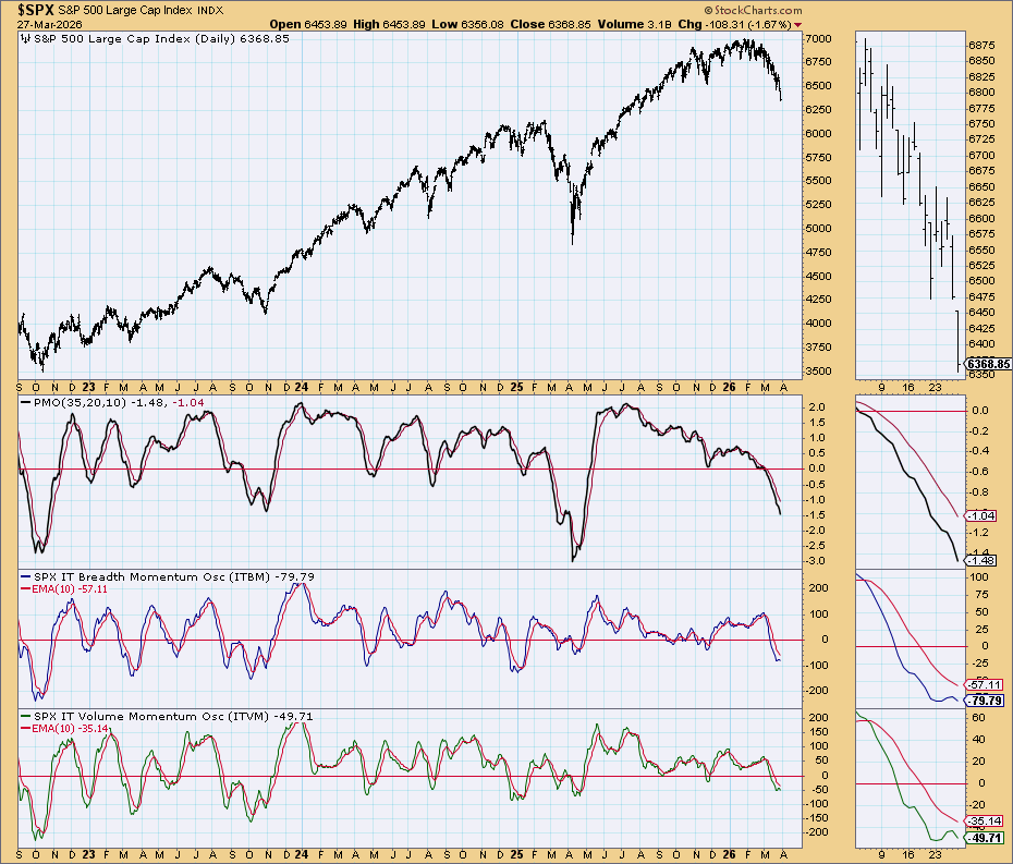
The daily T-Theory Companion chart is posted below. We’ve moved below the lower Keltner band support of 6446.
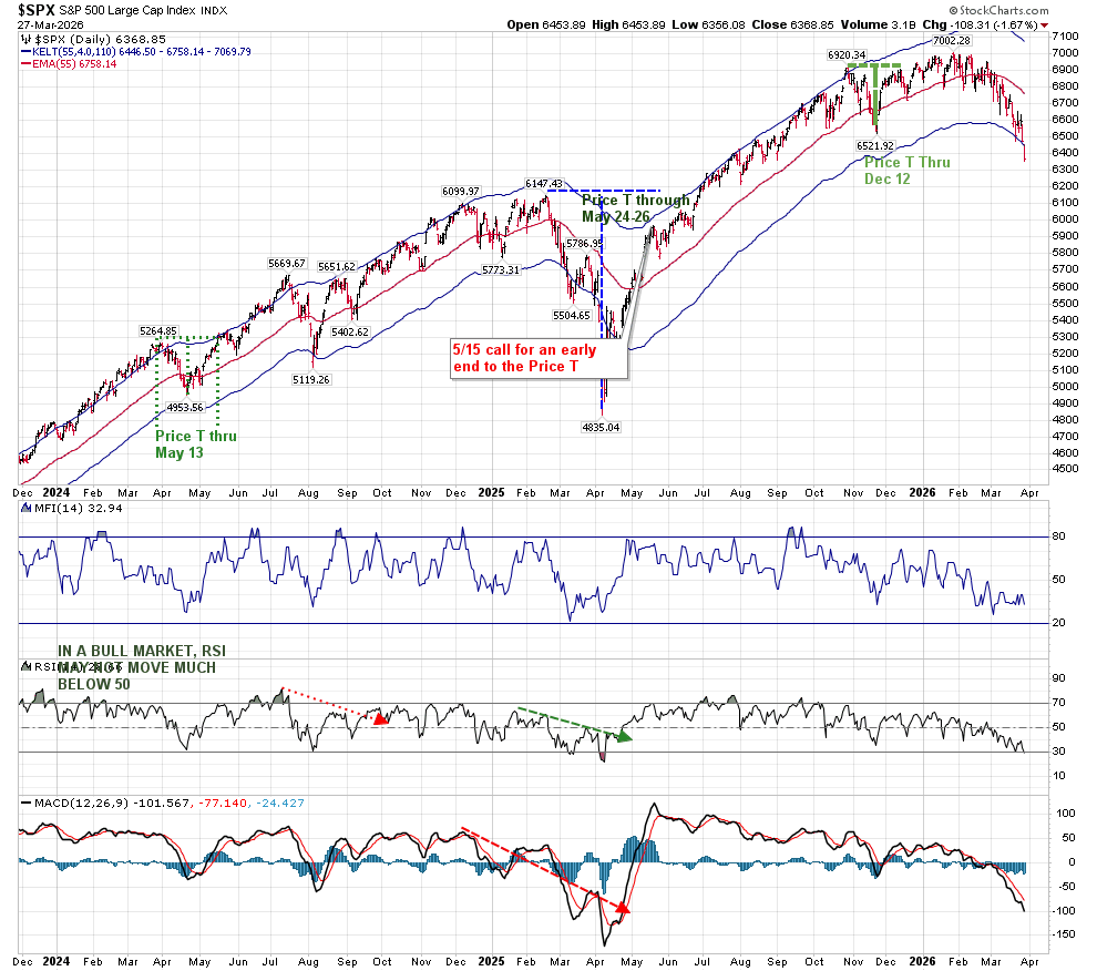
RSI has reached the 30 level, which is barely oversold, while MACD is approaching a low similar to that seen last April. But there is a difference this time–the rate of change is much slower than it was a year ago. In my opinion, this may result in less of a sharp reversal. In fact, neither the MACD of 2020 and 2022 had this slow trend lower as shown below:
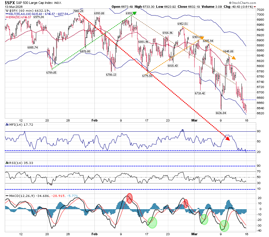
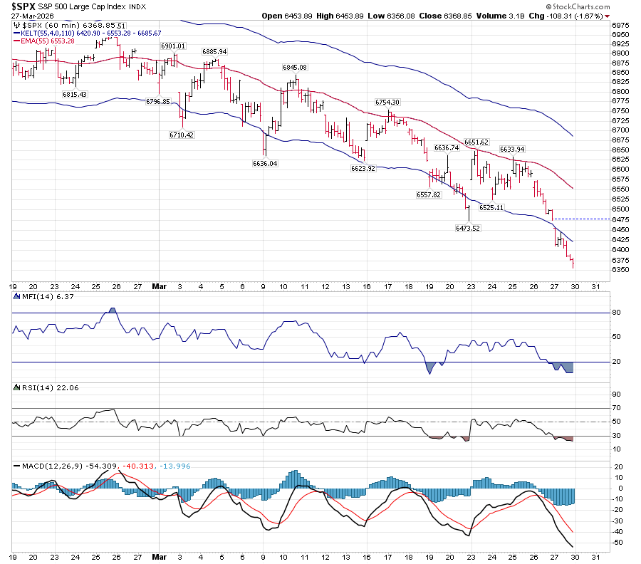
The Hourly chart shows a continuously deterioration of MACD with lower highs and lower lows:
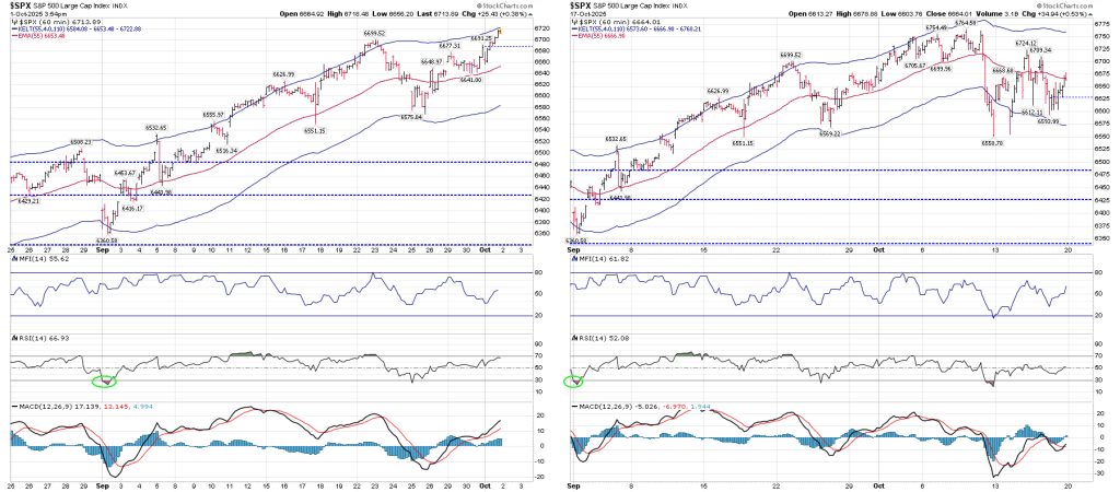
Let’s compare the charts of the March 7 post with today’s:
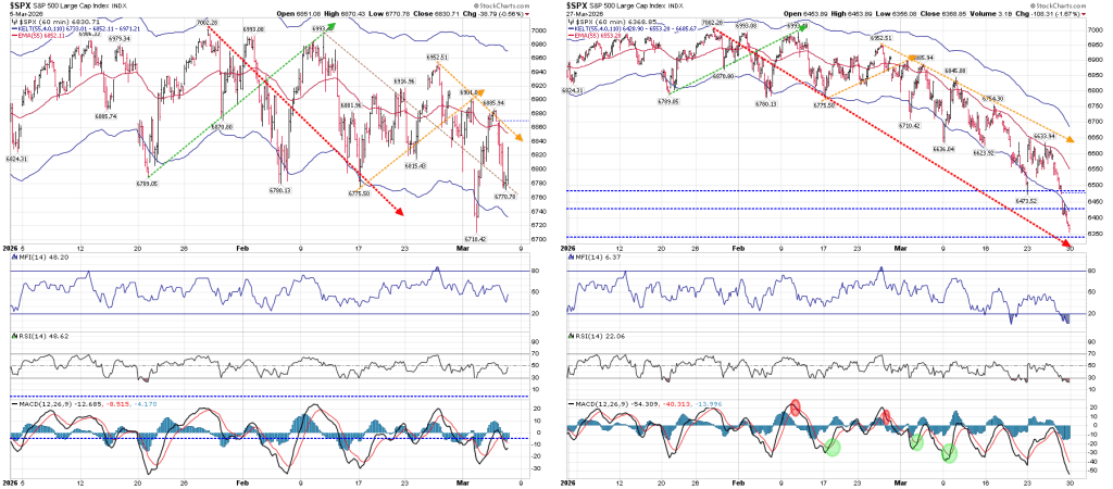
An interesting note is that the dashed blue lines that were showing in the MACD on March 7 were actually lines I drew last August on the Price line of the hourly chart as shown here:
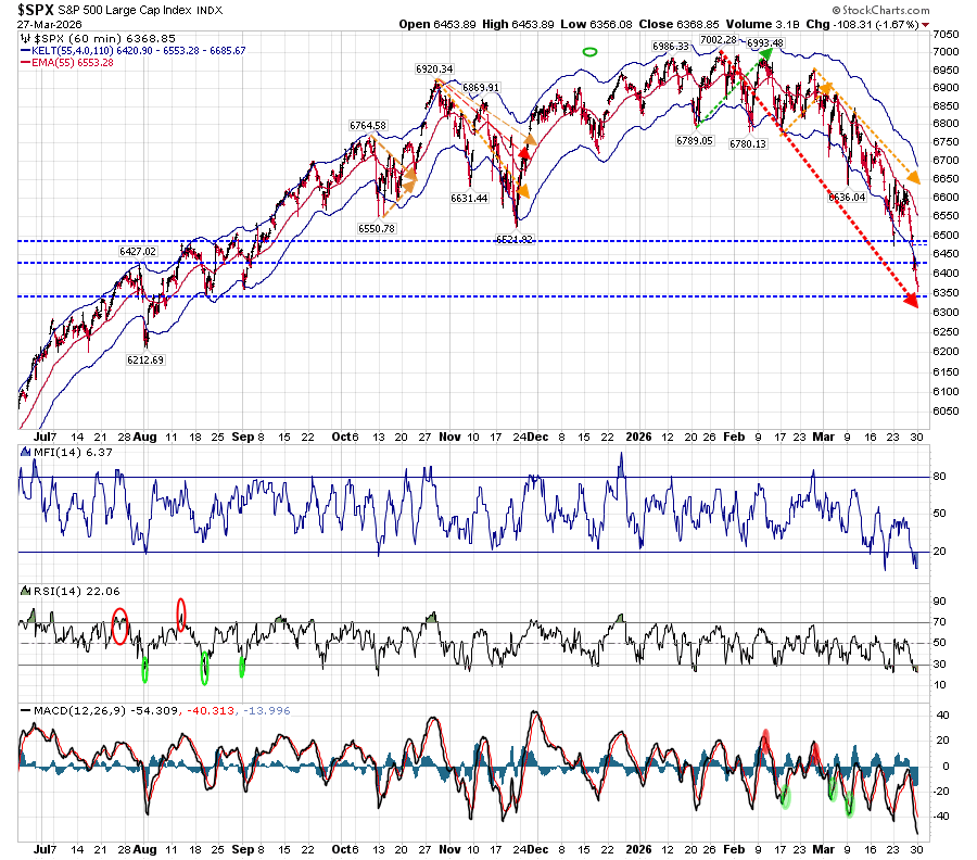
Those blue dashed lines represent what I expected to hold as support and resistance areas at that time. We are now near the lower support line, just as the red dashed line is approaching that same area. Temporarily, I’m expecting this area to be support. The above chart also makes it easier to see how different the recent movement in MACD is to its past.
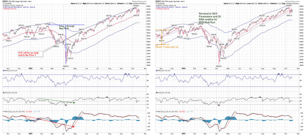
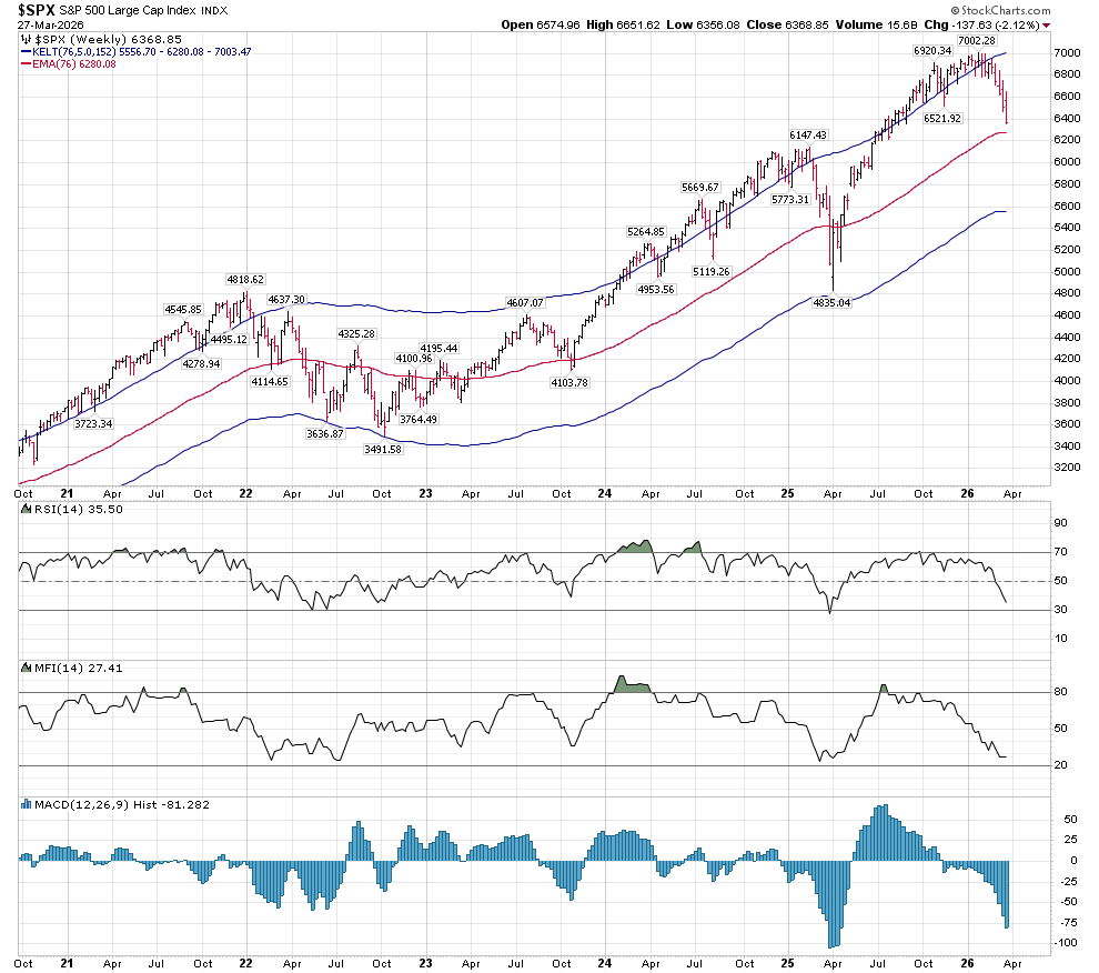
However true support may lie just a bit lower than that at 6280, based on the Weekly Companion Chart that uses Terry Laundry’s 76 EMA Keltner bands:
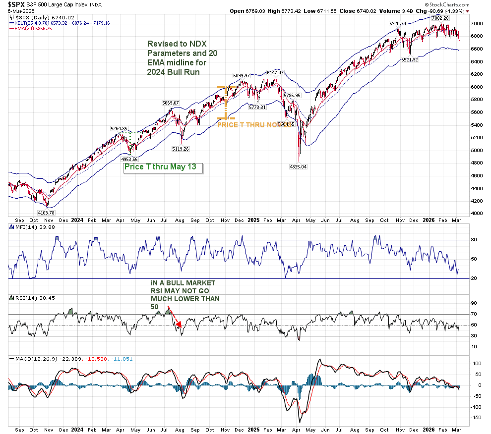
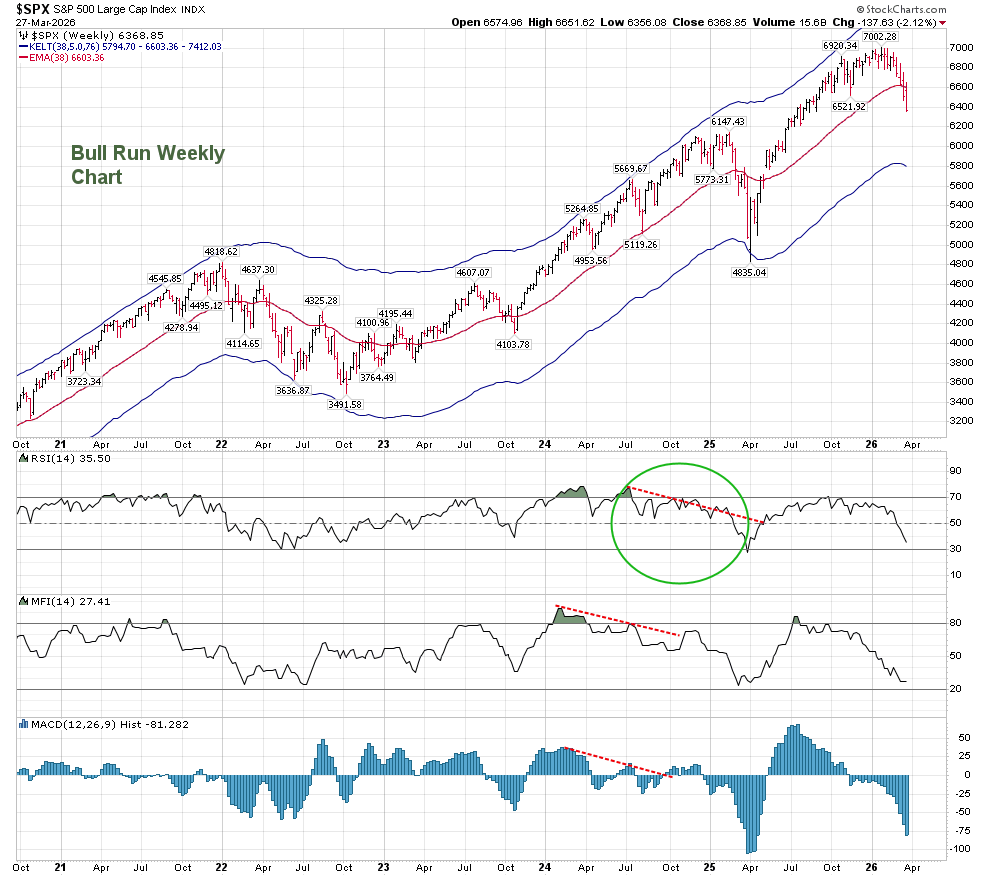
Over the past few years, I have been using different parameters to my Keltner Bands. These were called the “Bull Run” weekly and daily charts. The Keltner parameters for the weekly bull run chart were half of the ones on the above chart. They are no longer valid, unless we are facing a situation where true support lies at 5800:
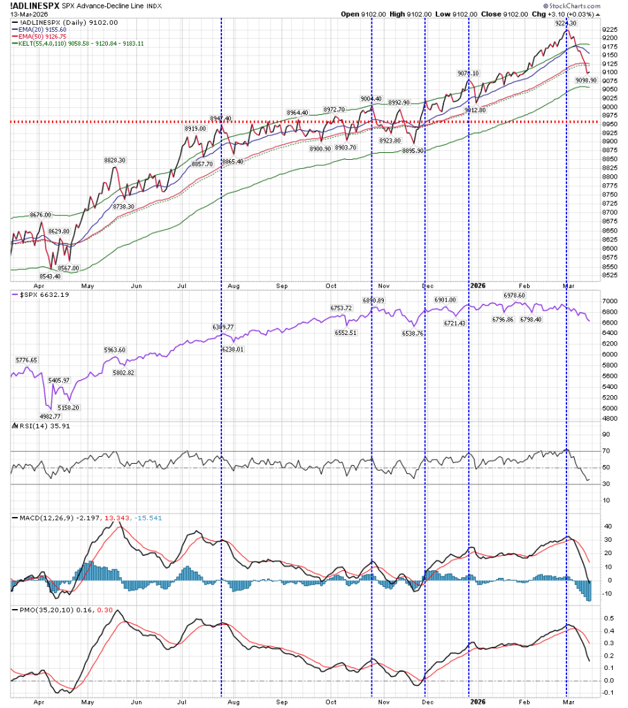
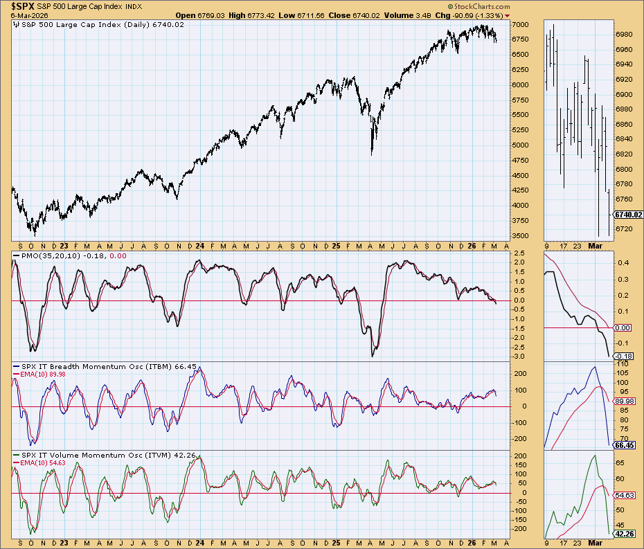
Other charts in my library are not offering an inkling of reversal.
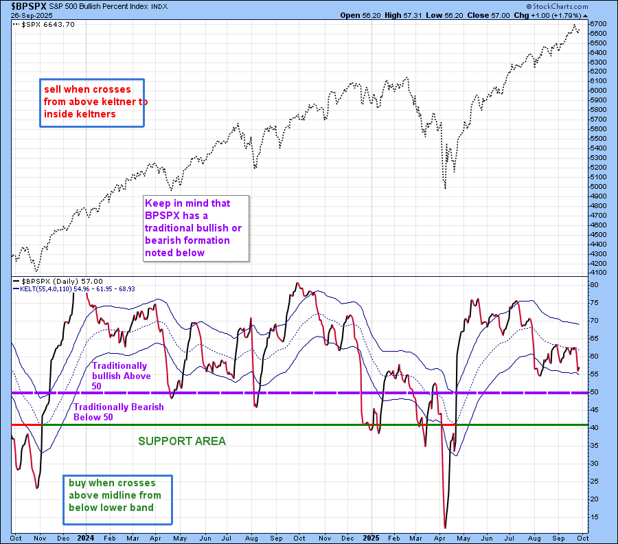
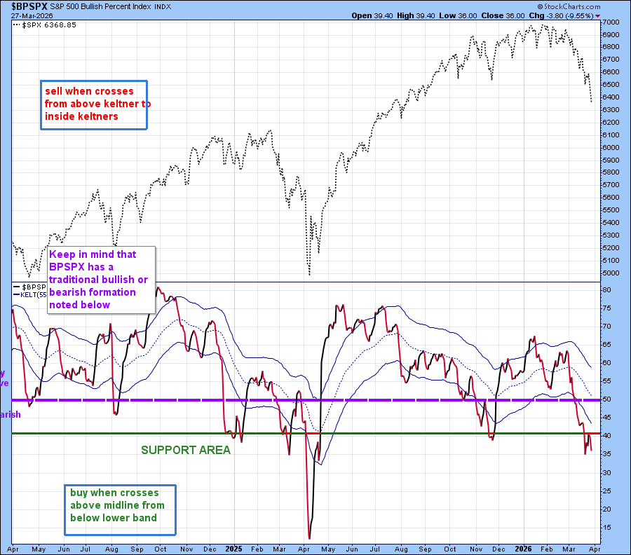
The BPSPX chart declined below 50 (which is its traditional neutral area), and has since tried to reverse from about 35, but was turned lower when it tried to move above 40.
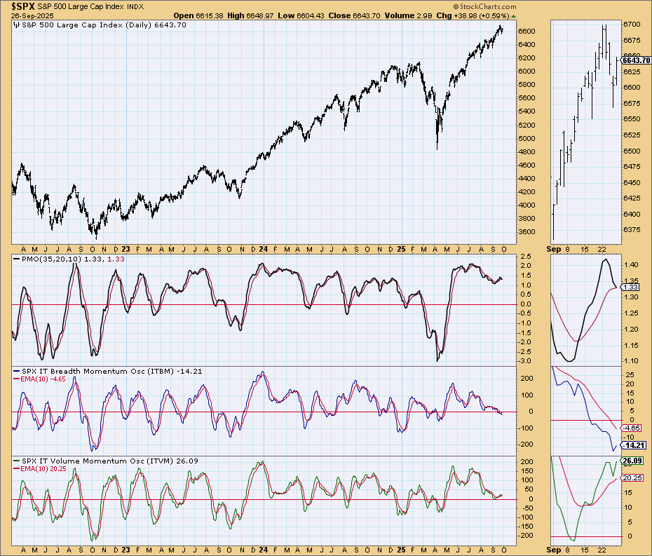
The “Simple Chart” is not showing a change of direction at this time either:
In fact, we have created what I call a Bearish Complex Structure, based on the following chart:
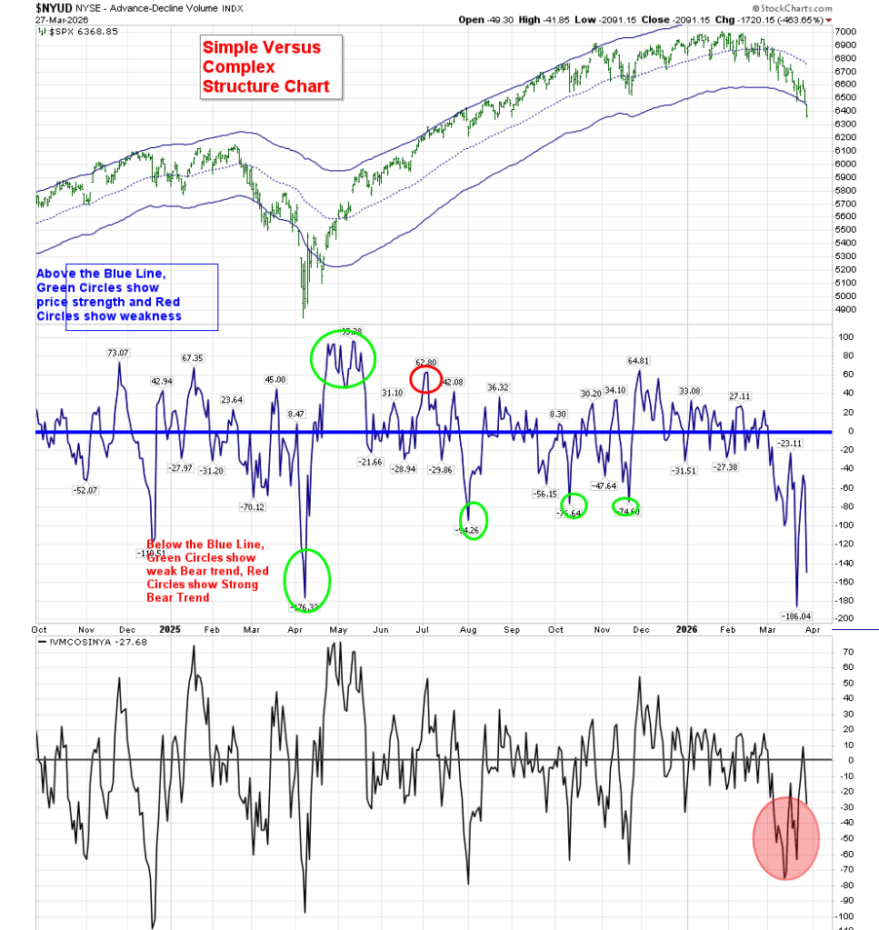
A Simple Structure allows for a quick reversal. A Complex Structure means we can stay in this downtrend longer.
As I’ve pointed out in the past, T-Theory is looking for periods of investment that offer increased strength and positive outcomes. That is not what these charts are showing me. While we may get that “bounce around 6280-6340, the structure of these charts does not make me anxious to put investment funds back to work.
The potential Bear T is a very real outcome at this time. Let’s hope my “artistic” interpretation is wrong.