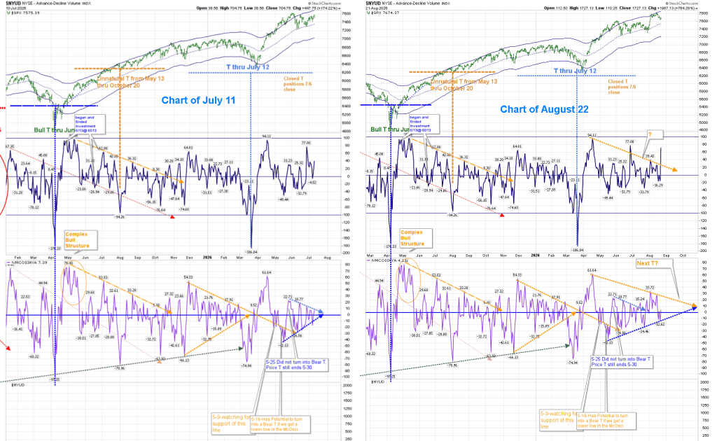
As I pointed out in my post of July 11, we are not in a Volume Oscillator T, and we are waiting for the next one. Sometimes they occur in rapid succession, and other times we can go months without a clear “safe” entry. The charts have moved on in Price and technical indicators since then. Here is a copy of the July 11 chart next to August 22:
As I’ve stated in the past, the most recent Volume Oscillator (VO) is overstated, and won’t be corrected until sometime Monday by Stockcharts. It’s been something I’ve had to live with in the past. I’ve searched for a way to compensate for that, and I may have found a solution that kills two birds with one stone. More on that later.
The Main T-Theory chart shown above (on the right) continues to show that we are not in a T, and it will be a while before we can expect one to form. It could be around the October timeframe. When there is no T, I depend on other indicators regarding future movement.
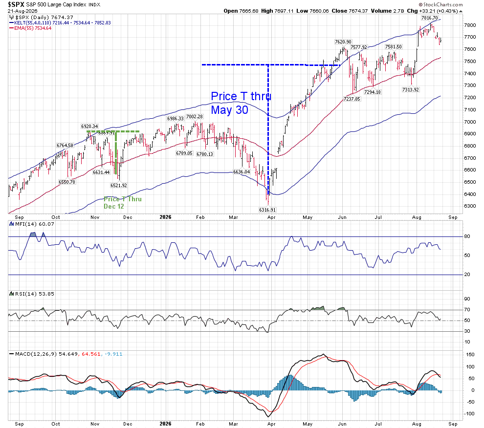
I was expecting a volatility event to occur between July 11-21, and between July 16-29 we fell roughly 250 points, before we exploded higher for 500 points. Since that high, we’ve fallen 150 points:
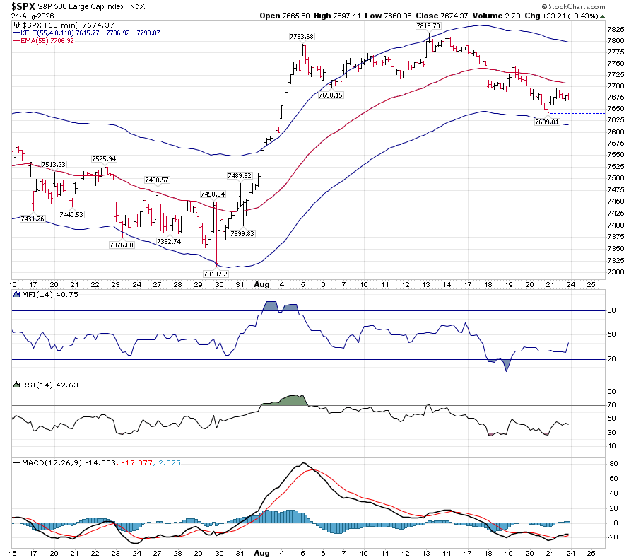
The above chart shows that MACD has just crossed negative, and RSI is at the neutral 50 area. Support is around 7216 on the daily chart. To get there, we would have to break strong hourly support shown below at 7615.
While MFI and RSI are below their neutral levels, MACD crossed positive earlier this week, which would make me suspect that the hourly support will hold, at least for a bounce.
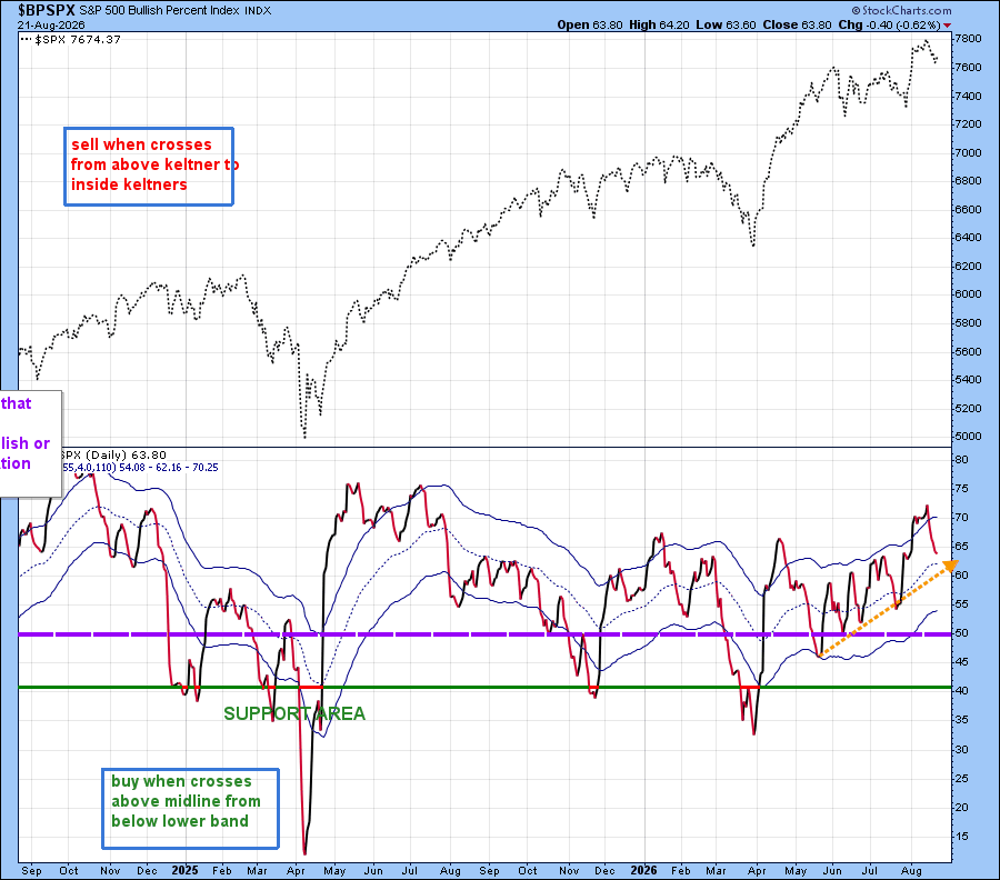
BPSPX is above 50, which is bullish, and it is also above the mid-Keltner line as well as the support drawn with an orange dashed line.
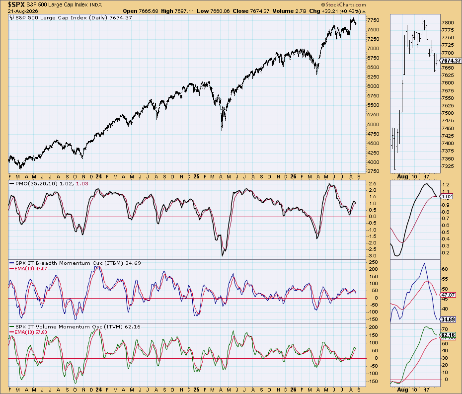
The “Simple” Chart shows poor Breadth momentum, while Volume momentum is about to face a “Kiss or cross” situation. PMO itself is in the same condition. This needs to be watched critically.
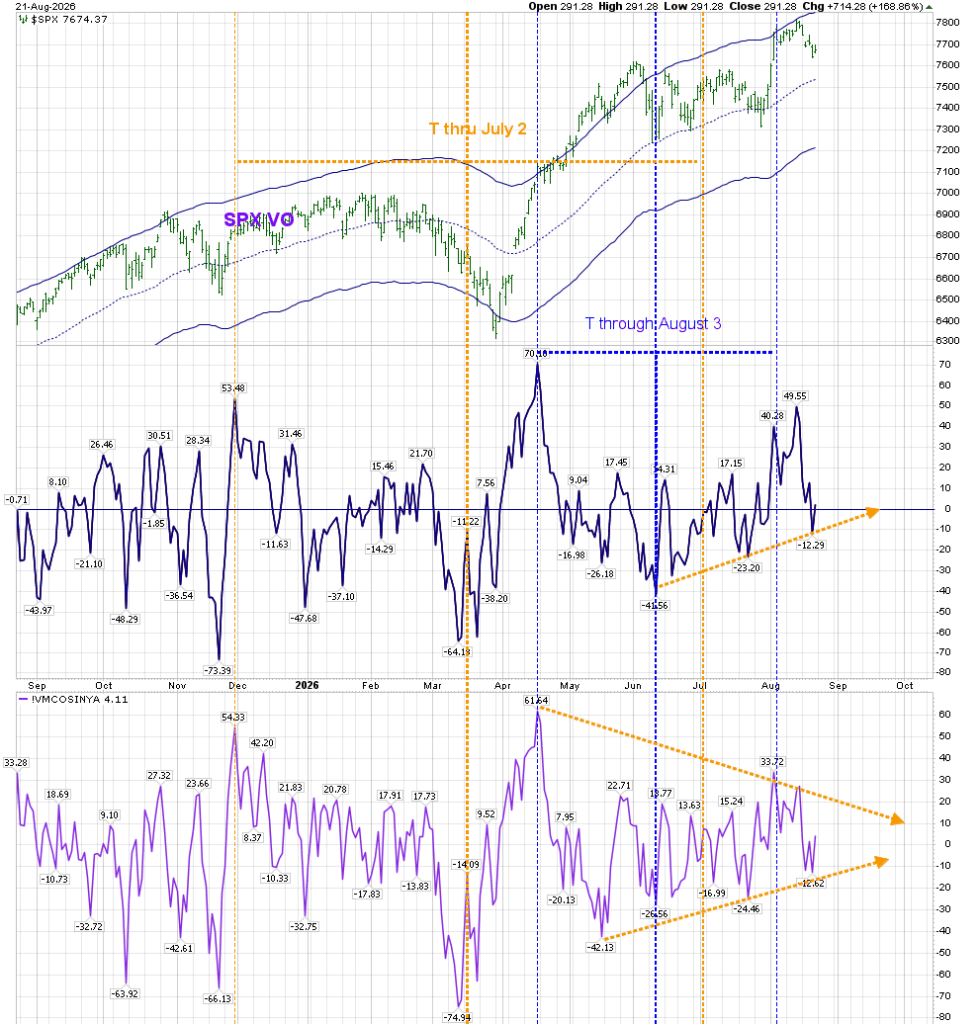
I’m now experimenting with a Volume Oscillator that is based on SPX Up/Down volume.:
The T-Theory VO chart that I have been using not only had inaccuracies based on the most recent readings, it worked on the Up/Down Volume of the NYSE, rather than just the SPX. This new indicator removes a major informational flaw of NYSE–$NYUD contains 3,000 NYSE listings, including bond funds, closed-end funds, and preferred shares. The McOsi (McClellan Oscillator) still offers a view of broad market health, and intermarket liquidity. I will keep monitoring both, as they lead to different outcomes for entry dates. With the markings shown above, it would have ended a T on July 2, instead of July 12. But at the moment, I am not seeing a safe T-Theory entry.
It’s been a while since I discussed long term bonds in my posts. The last time I mentioned it was in June of 2025:
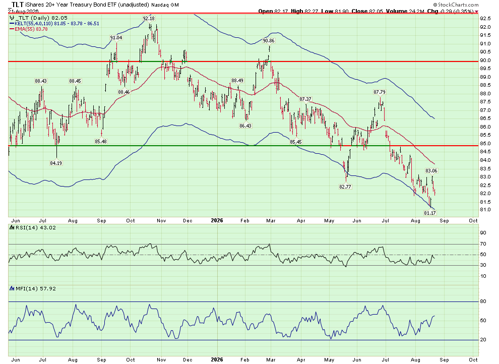
Moving to TLT, the following charts show TLT:
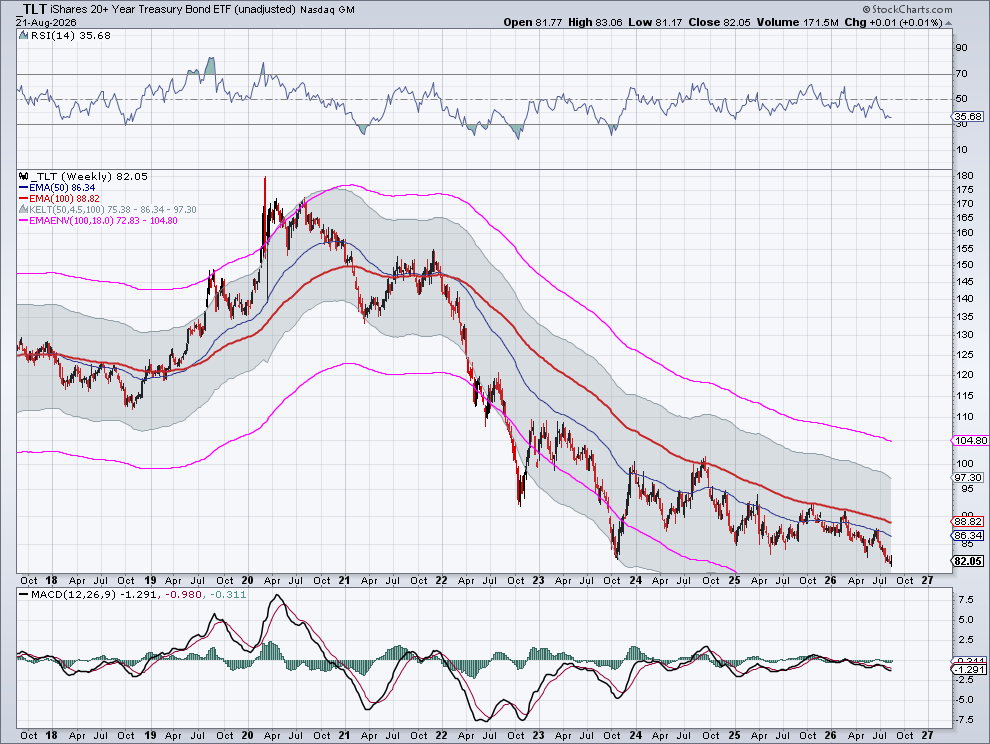
These are not “pretty” charts. The chart on the left represents TLT’s price irrespective of dividend adjustments, and it hasn’t been able to move above its Optimum Moving Average. That’s a negative. At the same time, the chart on the right shows TLT’s price with what I consider to be trendline resistance.
There is still no fear in the bond market.
Fear has finally come to this sector. Part of that fear may be the $40 Trillion debt of the US, but no one wins if that is a real problem. What do bondholders do when debt exceeds a borrower’s ability to pay–they lend them more. More of a problem may be the recent debt needs of AI datacenters, which cost $8 billion for a hyperscaler, and as much as $50 billion for a gigawatt center. $3-5 Trillion has been forecasted to be needed by 2030. That’s competition. You need to look no further than SpaceX 30-year bonds, which are trading at around 90, for a yield of about 7.5%.
Focusing on the technical side, here’s a chart of TLT, unadjusted for dividends:
Terry Laundry used this TLT weekly chart to see if there was life to it, in regards to its Optimum Moving Average.
TLT will have to move above 89 to offer the possibility of T creation.
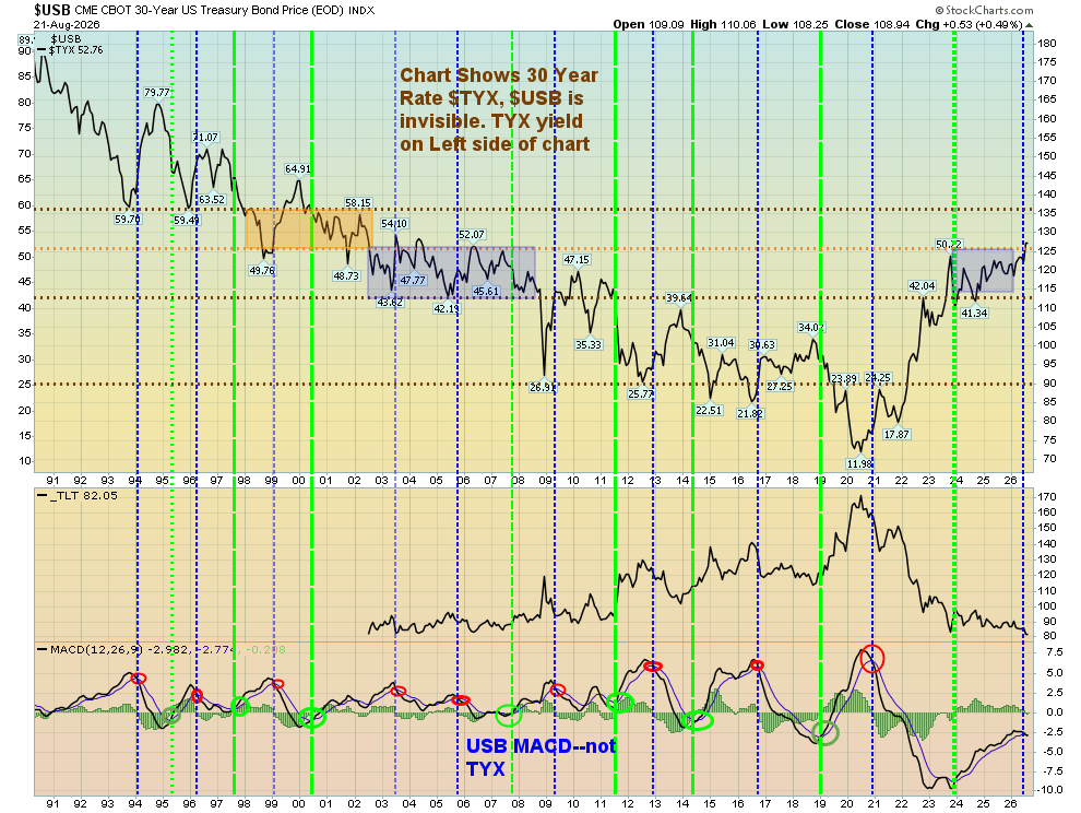
My view of rates has been based on the following chart– when the monthly MACD of USB makes a positive cross from a low, I believe rates should move lower. That was not the case on the move since late 2023. Instead, rates moved up, bringing us from an area supported around 4.1% to above 5%.
That chart has now crossed to a negative MACD reading, which suggests that long term rates will continue their move higher. The above chart showed we were in an area between late 2023 and now that corresponded to where rates were from 2002 -2008. Now we are in a new area that may be bounded between 5.0 and 5.8%, similar to the period from 1999-2002. We’ll need a quick reversal to stop that from being the new normal.




Tks Bunker… always of interest and much appreciated. Another old dog TTheory follower here. Meow…
LikeLike