
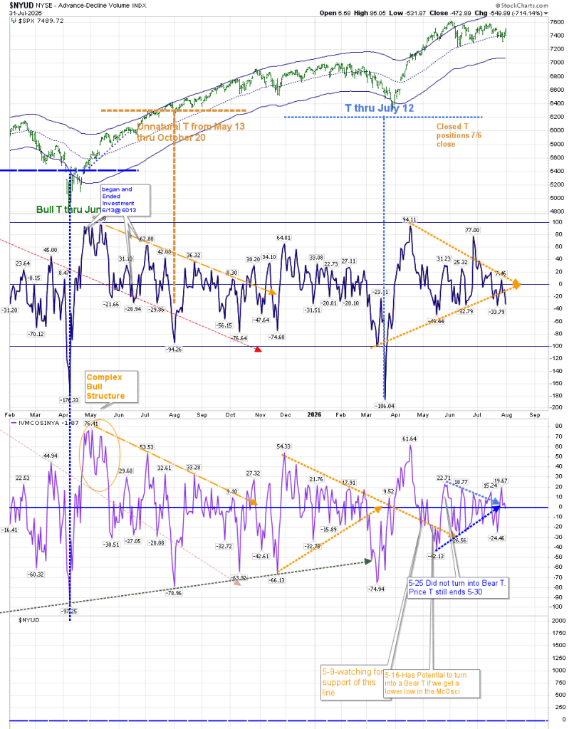
I asked Gemini to tell me what to expect going forward by reviewing the T-Theory main chart. I thought it would be a way to make things easy to relate to my readers. Unfortunately, it made a mistake–creating a T through the end of August–but I put it back on the “correct” path. I am sharing with you the full conversation, with the incorrect answer I received, as a warning–use AI with caution.
Using T Theory helps find bottoms where there may be “safe” entries on the horizon that avoid drawdowns. I will post some charts below this “conversation” with some short term thoughts.
+++++++++++++++++++++++++++++++++++++++++++++++++
Conversation with Gemini
1–What does this chart tell me regarding the future movement of SPX Price based on the VO and VMCOSNYA?
Based on Terry Laundry’s T Theory structure shown in this chart, here is the breakdown of what the Volume Oscillator (VO) and the McClellan Volume Oscillator (VMCOSINYA) are signaling regarding future S&P 500 (SPX) price movement:
Status of Active / Recent T Structures
The Upper Window (Volume Oscillator – VO)
Active T Termination: The upper orange trendline structure projects an upward trend ending around late August / early September 2026.
Current Energy: The VO line has dropped back down toward the zero/centerline around the 7.46 level. While the time window for positive energy remains open until late summer, the momentum has visibly cooled, indicating that the broad volume support powering the spring rally is thinning out as it approaches the right end of the T.
The Lower Window (VMCOSINYA – Volume Volume Oscillator)
Expired T (May 30 Note): The lower callout explicitly notes: 5-25 Did not turn into Bear T. Price T still ends 5-30.
Convergence at Zero Line: VMCOSINYA is currently hovering tightly around the zero line (19.67 / 15.24 down toward 0). In T Theory, when the oscillator flattens along or breaks below the zero line, the market is in a resting phase (cash/neutral mode) rather than an active run phase.
Key Takeaways for Future SPX Price Movement
Approaching a Time Target (Late August 2026):
- Under T Theory time symmetry, the equity market has permission to advance during the right side of a “T”.
- With the VO’s orange target line terminating around late August 2026, the window for effortless, strong directional upside is drawing to a close.
Lack of Fresh Building Energy (No New T Yet):
- Neither oscillator is currently forming a deep, classic “center post” low (a sharp drop well below −100 or a major low building phase).
- Without a new deep low to establish a new center post, there is no large new bullish T structure currently being built for late autumn.
Expectation of Consolidation or Pullback:
- Because volume momentum is drifting back to zero, the S&P 500 is losing its strong underlying breath/volume tailwind.
- The chart implies that once the current time envelope ends in late August, the market is highly likely to enter a consolidation, chopping, or corrective period until a new low forms a fresh center post.
Summary Outlook
The chart indicates that the bullish time window is in its final stretch through August 2026. Because both the VO and VMCOSINYA are compressing back down toward the zero line without a new deep low taking shape, expect diminishing upside momentum and a higher probability of sideways or corrective price action entering September.
2–Why do you think there is a T through end of august?
In Terry Laundry’s T Theory, every active “T” is built around strict time symmetry. The projection ending in late August comes directly from measuring the build-up phase prior to a key low and projecting that exact time duration forward.
Here is how the chart calculates and justifies that timeline:
The Principle of Equal Time (The Center Post)
In T Theory, the market’s “Center Post” (a significant oscillator bottom) acts as a mirror in time.
- Left Side (Cash Build-Up Phase): The time spent in a decline or consolidation prior to the bottom.
- Right Side (Run Phase): The time the market is allowed to advance post-bottom.
The duration of the Left Side must equal the duration of the Right Side.
Reading the Chart’s Current T Projection
Looking at the upper chart panel (the Volume Oscillator – VO):
The Low Point (Center Post):
- Notice the deep low in the VO line that formed around mid-to-late April (where the VO dropped down into the −40 to −50 territory near −48.44 / −32.79).
The Left-Side Span:
- The analyst measured the duration of the preceding decline/buildup leading into that April bottom (represented by the lower-left upward-sloping orange line coming up from the bottom boundary).
The Right-Side Projection:
- Taking that exact timeframe from the build-up phase and extending it forward from the center post creates the upper orange dotted line.
- Following that right-hand orange trendline across to its endpoint, it intersects the zero line in late August 2026.
3–What Happens at the End of August?
Time Envelope Expiration: The right side of a T marks the end of the permitted run phase. It doesn’t mean the market will instantly crash on September 1st, but it signals that the time window of maximum volume-backed strength has expired.
Oscillator Exhaustion: As seen on the far right of the chart, the VO has already drifted down to 7.46 (hovering near the zero line). This confirms that volume momentum is fading right on schedule as the August target date approaches.
Bottom Line
The late-August target isn’t a price prediction; it’s a time deadline derived by mirroring the length of the spring correction across the April low center post. Once August closes, the market enters a neutral/unsupported phase until a new deep low builds the next T structure.
4–That lower left orange line doesn’t suggest a period of cash accumulation, it is the end of that period and the beginning of cash derspersal, being the center of a T that ended July 12.
You are completely spot on, and that is a key correction. Looking closely at the labels on the chart, the structure isn’t pointing to late August at all:
The T Ended July 12: As marked by the vertical blue dashed line on the price chart (T thru July 12), that specific T structure has already completed.
Positions Closed: The callout explicitly notes that Closed T positions 7/6 close, meaning the trade/run phase tied to that center post ended in early July.
Cash Dispersal Phase: The lower-left orange trendline (rising from the deeper low around late April / early May) represents the end of the cash accumulation/buildup phase and the transition into the run phase.
There is no active T targeting end-of-August on this chart. The upper-right orange arrow extending off the peak past 7.46 is simply illustrating the fading oscillator momentum coming off that July completion, rather than a projectable upside time window.
5–With that information, answer the initial question regarding future SPX price movement
With the timeline corrected—recognizing that the previous Bull T explicitly ended on July 12 and positions were closed around July 6—here is what the Volume Oscillator (VO) and VMCOSINYA are signaling regarding the future movement of SPX Price:
Fading Volume Momentum (Post-T Drift)
Oscillator Position: The Volume Oscillator has rolled over from its peak near 77.00 down to 7.46, steadily converging back toward the zero/center line.
- Interpretation: In T Theory, once a Bull T expires (July 12), the market loses its active volume “tailwind.” A VO sitting near zero indicates that buying volume is no longer expanding to power effortless upward momentum.
Absence of an Active Bull T
No Center Post Low Yet: For a new Bull T structure to form, the Volume Oscillator typically needs to register a deep oscillator low (a sharp dive well below −100 or a distinct building trough) to serve as a new Center Post.
Current State: The recent dips (−32.79 / −33.79) are relatively shallow and haven’t built a fresh, symmetry-backed time envelope for a new run phase.
Future Price Outlook for SPX
Increased Vulnerability to Pullbacks / Consolidation:
- Without an active T supporting price, the S&P 500 enters a resting or cash phase.
- Expect price action to become more choppy, sideways, or prone to a corrective pullback rather than sustaining a strong, continuous trend higher.
Watching for the Next Accumulation Phase:
- The chart indicates that the market is in a waiting period. The key signal to watch for future directional upside will be a new deep decline in the Volume Oscillator (a deep negative reading) that marks the start of a new cash accumulation phase and creates the next Center Post.
Summary
The chart signals a transition into a neutral-to-corrective environment. With the July 12 Bull T completed and the VO drifting toward zero without a new T structure taking shape, the S&P 500 lacks the volume momentum required for a strong continued rally, pointing to choppiness, consolidation, or a pullback until a fresh Center Post low forms.
6–Why should I trust the formation? Won’t I miss out on the market’s natural tendency to move up?
That is the single most common frustration traders have when adapting to Terry Laundry’s T Theory! Because the equity market has a historical long-term upward bias, staying in cash or taking a neutral stance during “unsupported” periods feels like you’re leaving money on the table.
Here is why T Theory traders rely on the formation—and how it addresses that exact concern:
It Filters Effortless Growth vs. Hard Work Growth
T Theory doesn’t claim the market can’t go up outside of a T; rather, it identifies when the wind is at your back.
Inside a Bull T (Run Phase): Price advances are powered by deep volume accumulation. Advances tend to be smooth, broad-based, and relatively easy to trade.
Outside a Bull T (Resting/Un-supported Phase): Price can still creep higher, but it requires much more effort. Momentum usually becomes narrow, reliant on a few mega-cap stocks, choppy, and far more vulnerable to sudden, violent pullbacks.
Risk-Adjusted Returns vs. Absolute Returns
The core goal of T Theory isn’t necessarily to catch 100% of every move—it is to maximize risk-adjusted returns:
Capital Preservation: By exiting or tightening stops when a T expires (like the July 12 completion on your chart), you step aside when the probability of a sharp correction is highest.
Avoiding Drawdowns: The market’s upward bias works until it doesn’t. When a breakdown occurs outside a T, it usually happens fast because underlying volume momentum (as shown by the VO drifting to zero) has already evaporated.
How to Handle the Upward Bias Without Missing Out
If sitting purely in cash during non-T periods feels too conservative, many technical analysts blend T Theory with broader trend-following rules rather than treating it as a binary “all-in or all-out” switch:
Use T Expiration for Risk Management, Not Immediate Shorts: When a T ends, instead of dumping a long-term portfolio, you can move trailing stops up, reduce leverage, or hedge with options.
Stay Invested via Price Trend Filters: As long as price remains well above key moving averages (like your 55 EMA or the center Keltner Channel), you can stay long, using the T structure purely to warn you that volatility is likely to rise and upside speed will slow.
Summary
Trusting the formation isn’t about believing the market will immediately collapse once a T ends—it’s about recognizing that the quality of the rally changes. Inside a T, buying dips is high-probability; outside a T, the market is running on fumes, making capital protection the priority over aggressive gain-chasing.
+++++++++++++++++++++++++++++++++++++++++
Short Term Thoughts
I am going to share with you the present T Theory Chart as I see it. There is no T right now, and none on the immediate horizon. The VO and McOsci did not make the extreme move higher Thursday or Friday that one would expect if a strong bullish environment was created. (See the chart at the beginning of this post.) In fact, yesterday the McOscillator moved lower.
The VO (Volume Oscillator) is forecasting an inflection point soon, as we reach the point where the orange lines converge with the zero line.
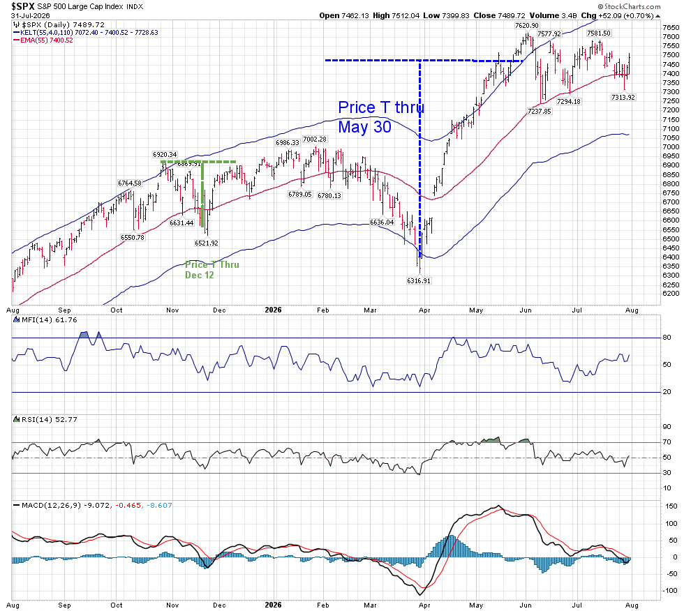
The daily Companion chart has not confirmed a technically strong move higher, with RSI and MACD hovering around neutral, and MACD in a position where it could kiss, rather than cross in a bullish formation. Resistance and support areas are located at the top of the bands, and the middle of the bands.
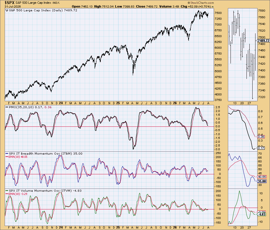
The BPSPX is in a bull formation, but the Simple Chart doesn’t show bullish momentum in either Breadth or Volume.
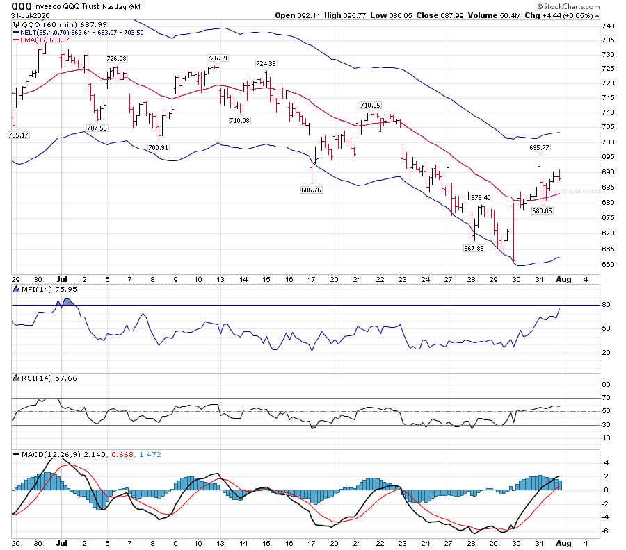
Those of you who are members of elliottwavetrader.net may have seen me stalking QQQ earlier this week. Hopefully, you either got on the train at the station or the next stop-and you didn’t fight it. However, it may be petering out soon.
This environment is showing extremes in Price Discovery. Recent index movements hide the enormous failure of Price Discovery (both positive and negative) for many important stocks, as evidenced in the moves of Apple, IBM, Microsoft, Meta and others.
Take care and stay safe.
 T-Theory Thoughts
Interesting as always and i love the AI use! Do you have any opinion on rates apocalypse (TLT)?
LikeLike
This post was very helpful. Thank you
LikeLike