Let’s begin this week by reviewing the main premise of T-Theory–it is the search to find periods of significant “extra” strength in Price. These are relatively safe entry points for investing funds. As Terry Laundry put it himself in his 1997 paper on T-Theory:
“It takes a special state of mind to “sign up” for a short boat trip, in a flimsy landing craft, to a beach completely controlled by hordes who have anticipated your arrival and have set up every imaginable way to do you in. Buying into major market opportunities presents a similarly discouraging picture. You may have good reason to anticipate profits, but if a great opportunity does indeed exist, nearly everyone will be against you, including your friends, and the predominant opinion expressed by your peers, including people you respect, will be that you are embarking on a foolhardy enterprise.”
Have we reached such a point at this time? Price is indicating we are near major support, while many internal technical indicators have resisted bottoming, and may move deeper before we find a meaningful low.
We’ve reached the period in Time where I have been expecting to see the formation of a new T, as shown on the main T-Theory chart:
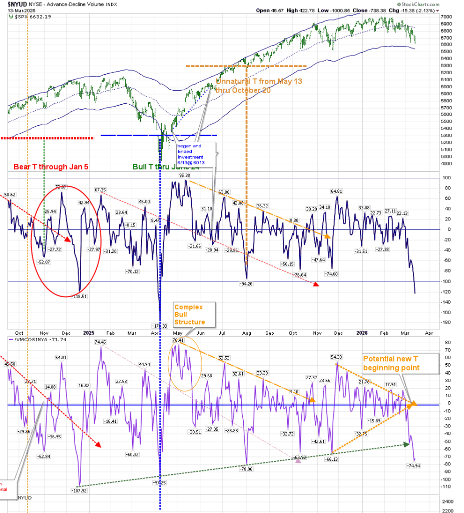
It should be evident that when we have reached levels this low in the Volume Oscillator and McClellan Oscillator (McOsci) in the past, we should expect a rally.
In last week’s post, I noted that the McOsci had reached the extended green dashed line, and it might coincide with a turning point. The following Monday was the start of a 200 point rise off the low, only to fail later in the week. You can see what a minimal event that was to the McOsci as one day later it reversed course lower.
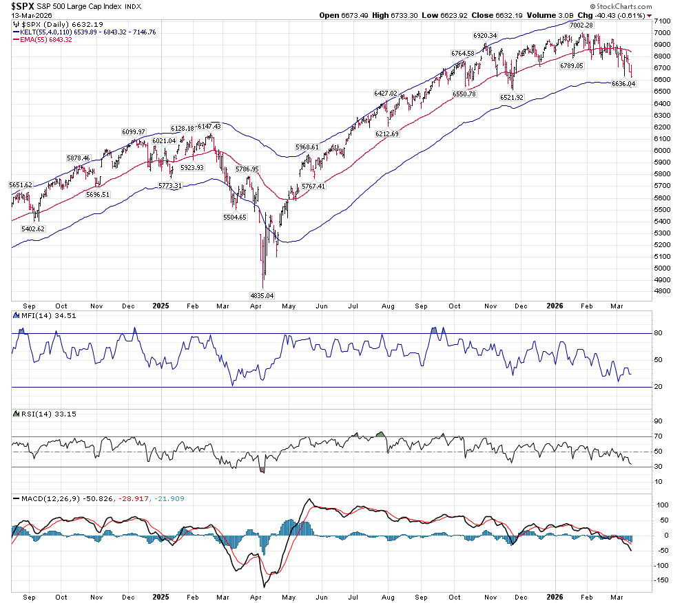
The unmarked version of the SPX Companion Chart shows us to be approaching major support at 6540. RSI has room to go a bit lower, should Price decide to move to that major support. MACD has not reached the extreme levels we saw at the significant bottom of last April, and it may not make it down that low before it reverses. But it isn’t giving an inkling of turning up at this point.
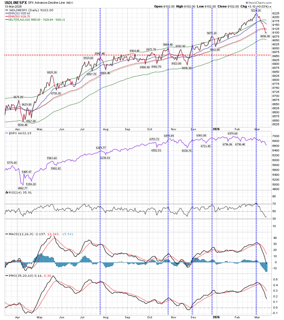
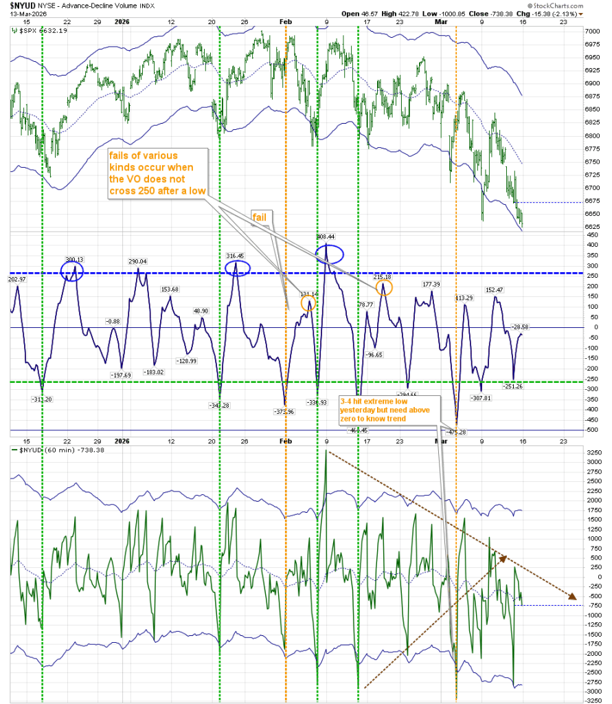
I am also watching the Advance/Decline line. We’ve barreled through support of the 20 and 50 EMA, and are heading to the lower end of support. It should be noted that this lower Keltner band line of support held during last April’s SPX low in Price. The red dashed line represents old resistance, which I now consider to be support.
On the SPX Hourly chart, RSI is at 35. A reading below 30 followed by a rise above 30 should give us a good indication of a change of direction. MACD on this shorter time period chart seems to be ready to turn up as well:
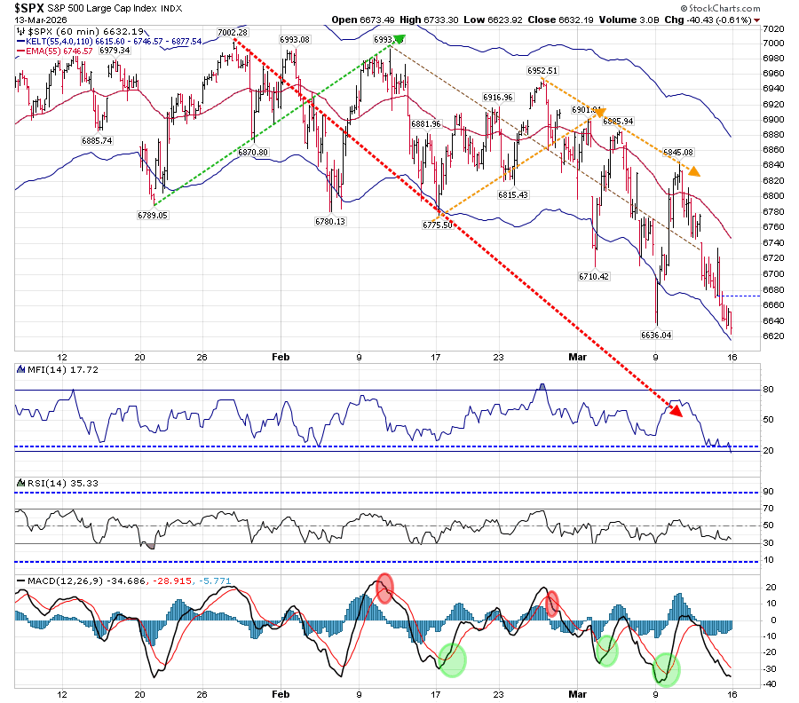
Keep in mind Terry Laundry’s notion of “frog jumping”. If we have set our envelope properly (in this instance Keltner Bands at 55, rather than the standard–based on the Optimum Moving Average), we can expect a change in direction to lead us to at least the mid-line. While we are not there yet, it is something we should be on the lookout for. As noted above, last Monday’s morning low created that “frog jump” to the mid-line before reversing right where Price had resistance.
I have had to revise the placement of the upper brown dashed line on the hourly Volume Oscillator chart. The resistance level has been moved up, which means the timing of resolution here has extended to the last week of March. At the same time, it broke through the support of the lower brown dashed line. It is another thing giving pause to making that “short boat trip in a flimsy craft.”
As I won’t be posting next week, you can find the Daily McOscillator at McClellan’s site: https://www.mcoscillator.com/market_breadth_data/
You can get most of the other information from many chart programs.
While some things on the above charts may be fairly evident, there are points that are clearly my critical interpretation. Timewise, we should see an investable low very soon. Watch those shorter term technical indicators for confirmation.
