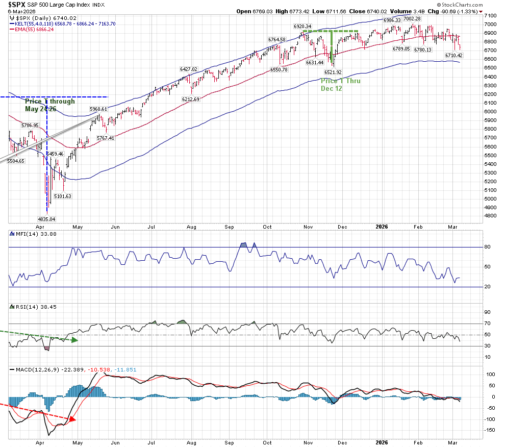
My last post was published October 18 of last year, a few days before the “Unnatural T” ended October 20. It ended with the SPX at 6735. For those who followed my postings on elliotwavetrader.net, we had a Price T that ended on December 12, at 6827. Depending on one’s point of view, either very little or very much has occurred since those two T’s ended. We now sit at 6840 on the SPX.
On February 23, I posted the following chart which looked for a new Volume Oscillator T to begin roughly around the present time period.
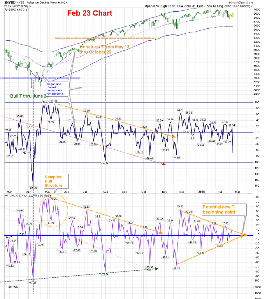
The present T-Theory chart looks like this:
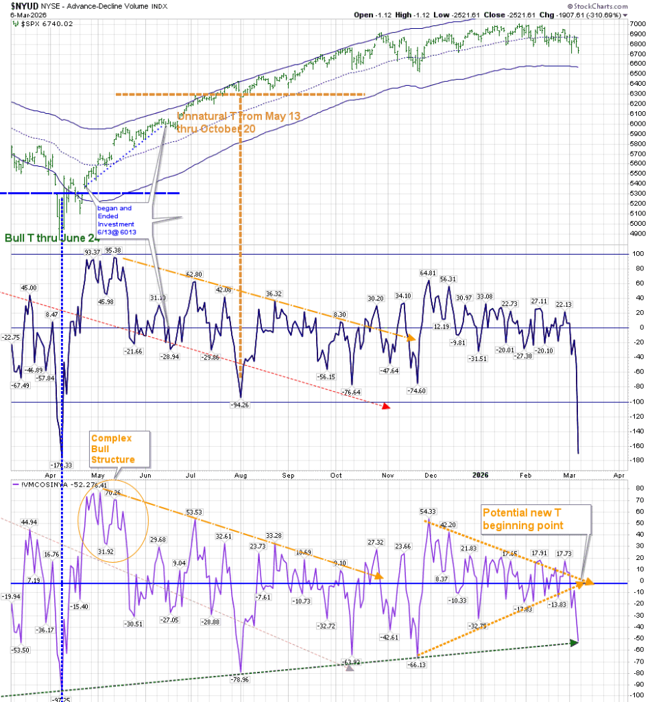
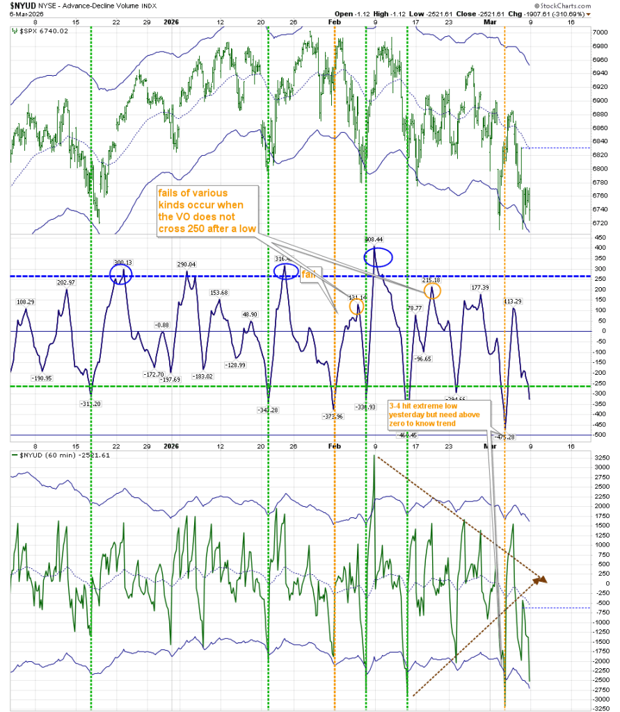
As you can see, we have definitively broken below the zero line, and are heading for that new low. It can come at any time now, and should produce a swing trade low that will last for approximately 3 months. I’ve extended the green dashed line which first appeared last October at the bottom of the chart to the present day, and it coincides with where the McOsci is today. That in itself could be a turning point.
We can see on the following chart that lows below -60 on this chart usually lead to at least a short term bounce. We are presently at -52:
I am going to forego a deep discussion regarding the workings of T-Theory, other than to offer a link to the page on my website reviewing T-Theory Concepts. And to re-confirm one point:
T-Theory is looking for safe lows to invest in that occur after an extended period of weakness.
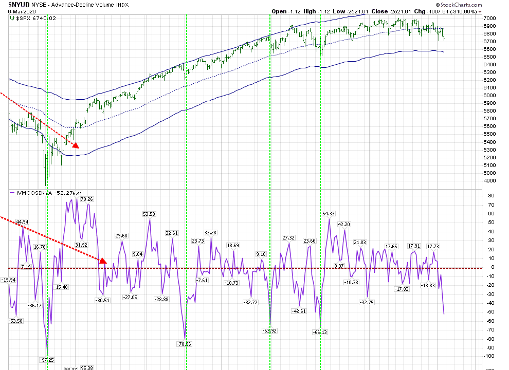
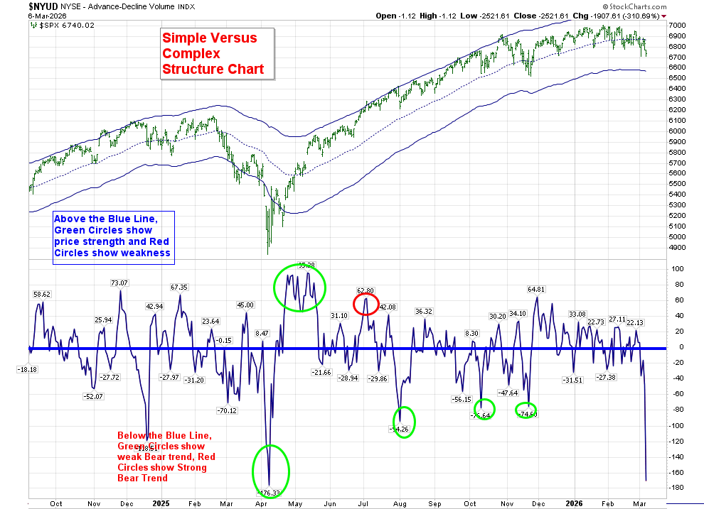
A concept to keep in mind at this time is that of “Simple vs Complex Structures” on the Volume Oscillator. When we have a quick turn around in the VO from a high or low, we create a “Simple” structure that can reverse Price. Should the VO create a “Complex” structure, Price can continue in the same direction as the most recent reversal.
We don’t know whether the recent move lower will create a simple or complex structure. Additionally, the VO will be adjusted Monday afternoon, and should create a picture that emulates the McOsci’s less negative view of Friday’s Price action.
The chart shown below tells us that MACD has been receding over the last 9+ months after a huge positive surge. RSI tells the same story, although unlike MACD, it has receded below neutral. Neither of these has reached an oversold reading. MFI is closer to arriving at that oversold reading.
Those who have been reading my posts for a few years may remember that in order to adapt the Optimum Moving Average to the Bull Market that was created at the end of 2022, I created a chart with a revision of the SPX OMA to the natural NDX parameters of 35, versus the SPX OMA shown above of 55:
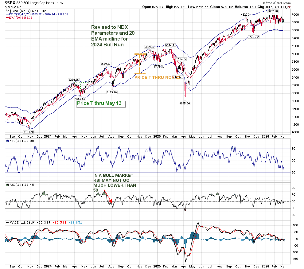
The critical comment regarding RSI has important implications as it has waned, and has remained in a neutral area for the last few months. “IN A BULL MARKET RSI MAY NOT GO MUCH LOWER THAN 50” may no longer be relevant to the present market stance. And using the Bull OMA of 35 has definitely created resistance at the midline in a movement that appears to be foreshadowing a longer period without that internal strength.
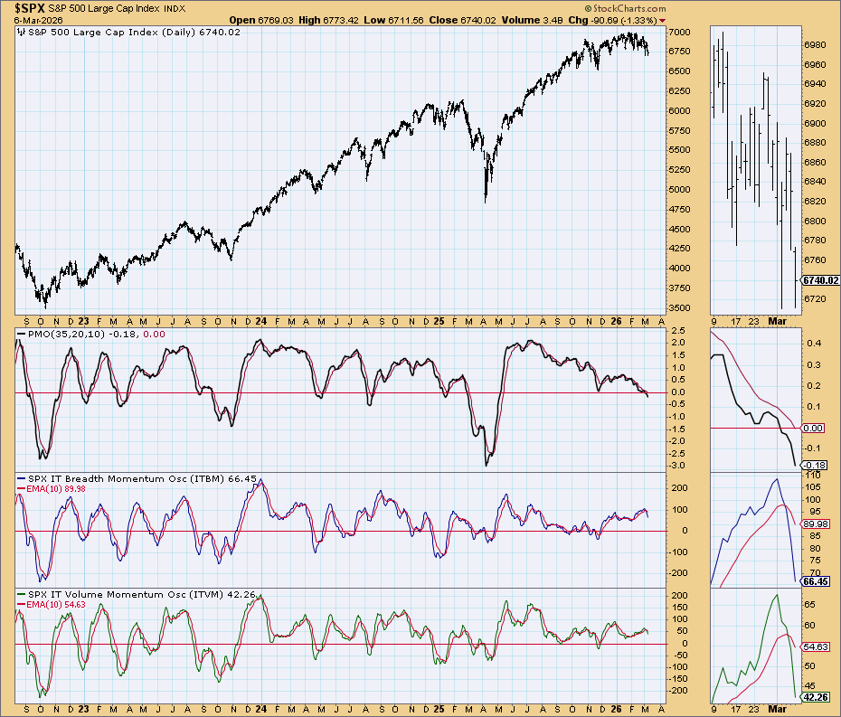
The “Simple Chart” is looking lower:
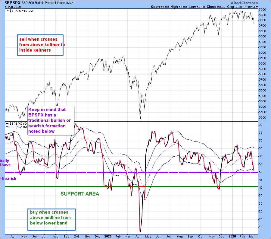
The BPSPX chart is just reaching the 50 line, which in traditional terms means that it is neutral. However my personal reading of this is that it needs to cross above the midline from below the lower Keltner band to create an area of strength. That appears to be on the horizon soon:
By this point, you may be wondering what this post has to do with it’s title, and you rightfully can have that question. One can look these charts over and see the potential for a positive future based on being near goals in Time, or one can look at them seeing the overall technical view of the market as having deteriorated. You’re both right. We have deteriorated, but we have the ability to create a buying opportunity soon.
We’ve just about reached that point in time where we should get a positive outcome. But we need the technical signs to show us that we have actually arrived there. Be on the lookout for that low.
I’ll leave you with hourly charts that may help you make your decisions:
The Hourly VO–look for the creation of Complex Positive Structures:
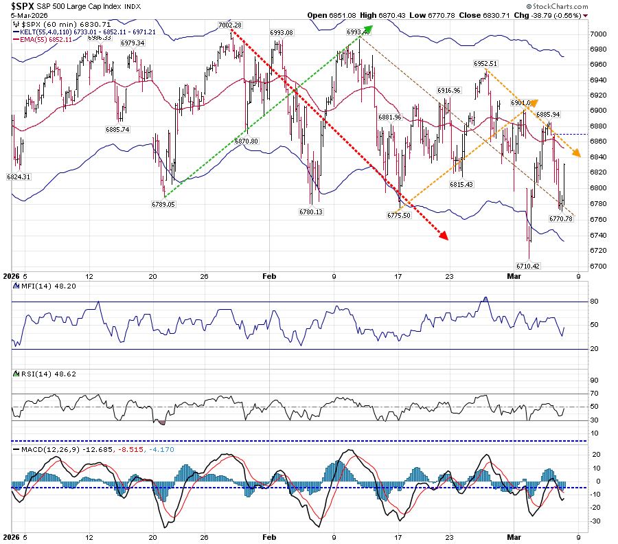
The Hourly Companion Chart. Look for breaks of support and resistance:
In closing, take a look at your personal technical indicators with a view of when they pointed to a change of direction, and be open to the fact that change is an inevitable process.
Stay Safe
