We’ve stayed in a quite tight range since my report of June 7. (Last week, I only offered a short update as I was only armed with my phone.) The June 7 report was posted after a close of 6000 on the SPX. Since then, we’ve remained within 1% of the close on June 6. That followed a May 25 report, where I noted how there might be a resting period after the sharp move in April, but how the T should continue on through June 24. We climbed another 250 points after that before breaking down.
I can report Volume Oscillator (VO) T’s to the best of my ability, but I don’t make the rules. This was clearly a Bullish T, and hopefully some of my readers caught the undercurrent of the titles to my recent posts to hold firm–Opening the Door to Truth, Stumbling Within the Larger T, Sometimes a Cigar is Just a Cigar. This year has had very clearly observed Bullish and Bearish T-Theory outcomes.
Terry Laundry (as I remember his rules), felt that the best returns were to be made from remaining invested through a T’s end–with the best moves slated for the beginning of the T and ending of a T. Personally, I broke with the second rule, based on my additional tools of the “Simple Chart” and the BPSPX. They both turned negative on June 13.


So what happens next? When there is no T, Terry did not expect the market to outperform the 10 year Treasury. And that Treasury is not outperforming the 3 month Treasury, so there is no incentive to put money in long term bonds (as will be discussed below).
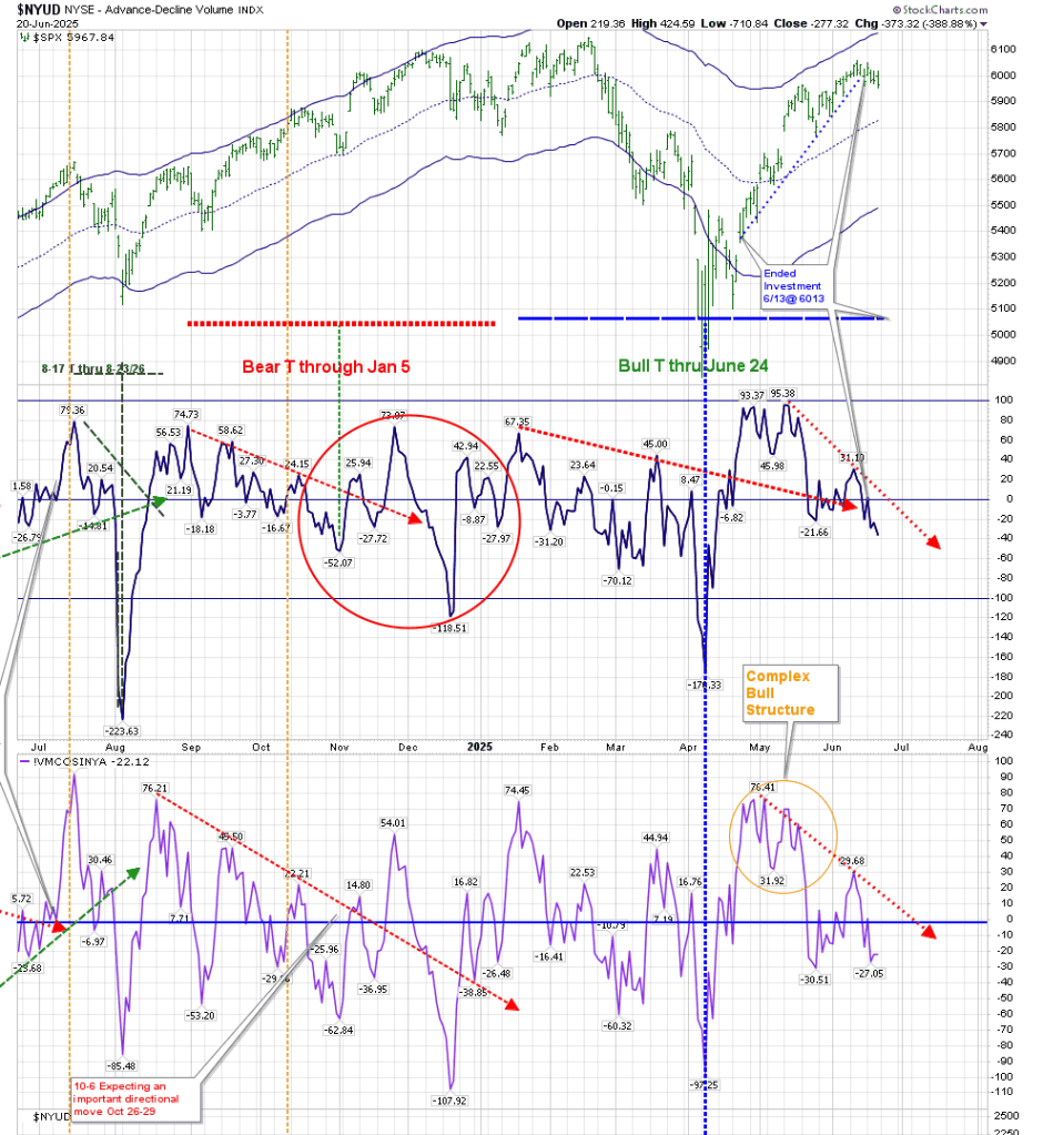
The above chart shows us the potential for a new T to begin next month, but it’s much too early to confirm that. We would need to see a lower low in the VO and the McOsci–preferably below -100 on each. The VO would then have to rise above 32 at a minimum to create the next period of strength.
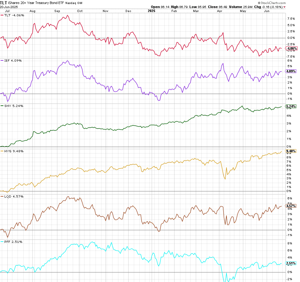
Moving to TLT, the following charts show TLT:

These are not “pretty” charts. The chart on the left represents TLT’s price irrespective of dividend adjustments, and it hasn’t been able to move above its Optimum Moving Average. That’s a negative. At the same time, the chart on the right shows TLT’s price with what I consider to be trendline resistance.
There is still no fear in the bond market. The following chart shows the annualized return of major bond ETFs for the last year. The clear winner is still High Yield. That should always be the case, but perhaps it’s a little sideways right now, as volatility should show more damage to junk bonds at this point, in my opinion.
Have a good week.
