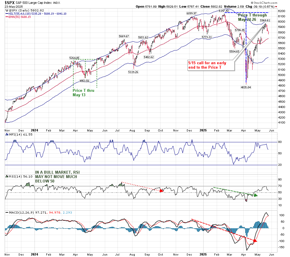
In last weekend’s update, I reviewed an early end to the Price T (which was due to end May 23) within the context of the larger Bullish Volume Oscillator T (that exists until June 24). I discussed my expectation for that early end to the Price T, based on technicals.
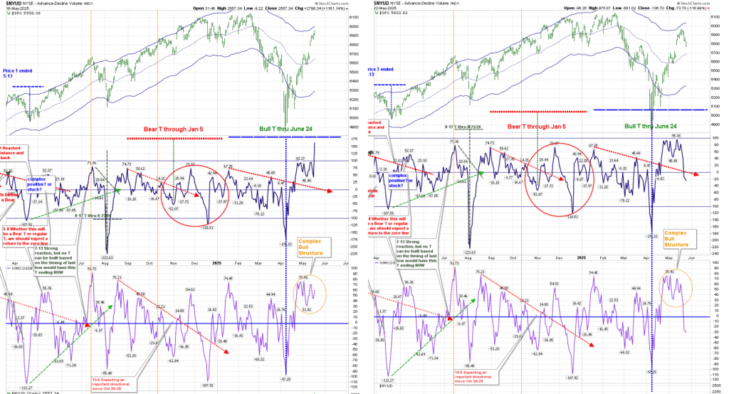
We normally expect a return to the Volume Oscillator zero line on the right hand side of the T to occur much earlier than occurred in this instance. I believe that the Complex Bull Structure (shown with an orange circle) delayed that return to zero, but it has finally taken place.
Interesting on its own is the fact that this return to the zero line happened when the red line denoting the lower peaks in the VO crossed the zero line. (That is normally a point at which I expect the formation of a new T.) Those who have been following my posts here (April 18) and on elliottwavetrader.net may remember that my initial thought was that I expected weakness to last until now–the middle of May. That was based on where this red line was due to cross the zero line. While that premise was incorrect based on how the VO T developed, the Price T did end (for all practical purposes) at that Time.
It would be extremely difficult for this VO T to become a Bear T. To do that, the VO would have to break down below -176, and the McOsci would have to move below -98. This is not my base case. We are traveling within the lower half of the hourly Keltner Bands:
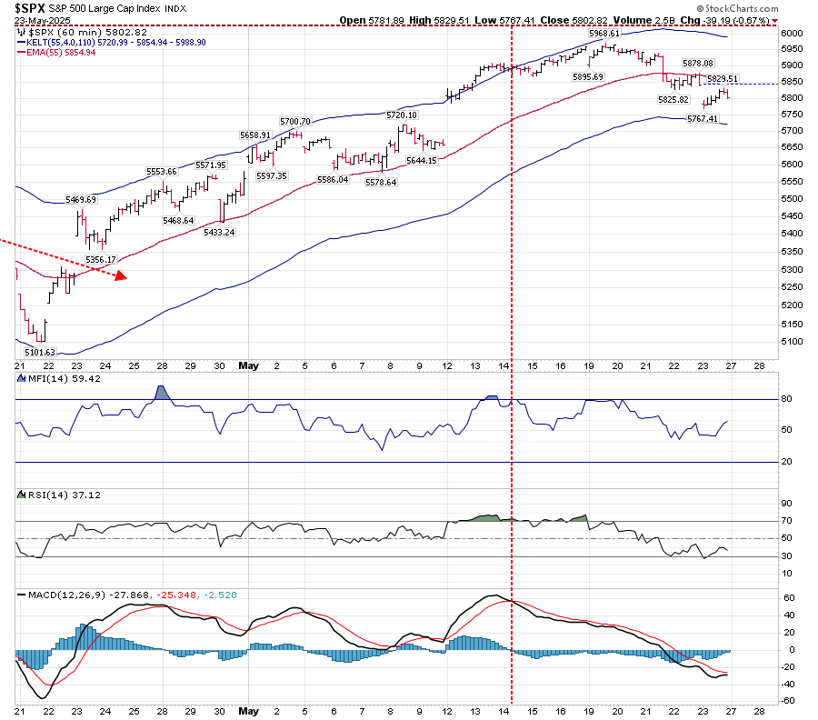
This may be considered as a resting period from the sharp move up in April, as we are nearing support in RSI. MACD appears to be ready to either cross positively, or just kiss, and continue to move down.
On the other hand, the Daily T Companion chart shown above shows MACD approaching a critical crossover or kissing point. As I mentioned in a post on elliottwavetrader.net, the relative height of the MACD is immaterial. MACD is a momentum indicator, and until the fast line crosses the slower red line, MACD is showing a positive trend. I also pointed out that because of its incredibly quick ascent, it wouldn’t take much to create a negative MACD–it’s like a roller coaster at its peak. Support here is 5688, as shown by the middle line inside the Keltner bands. Price needs to continue to close above this line to support the VO T.
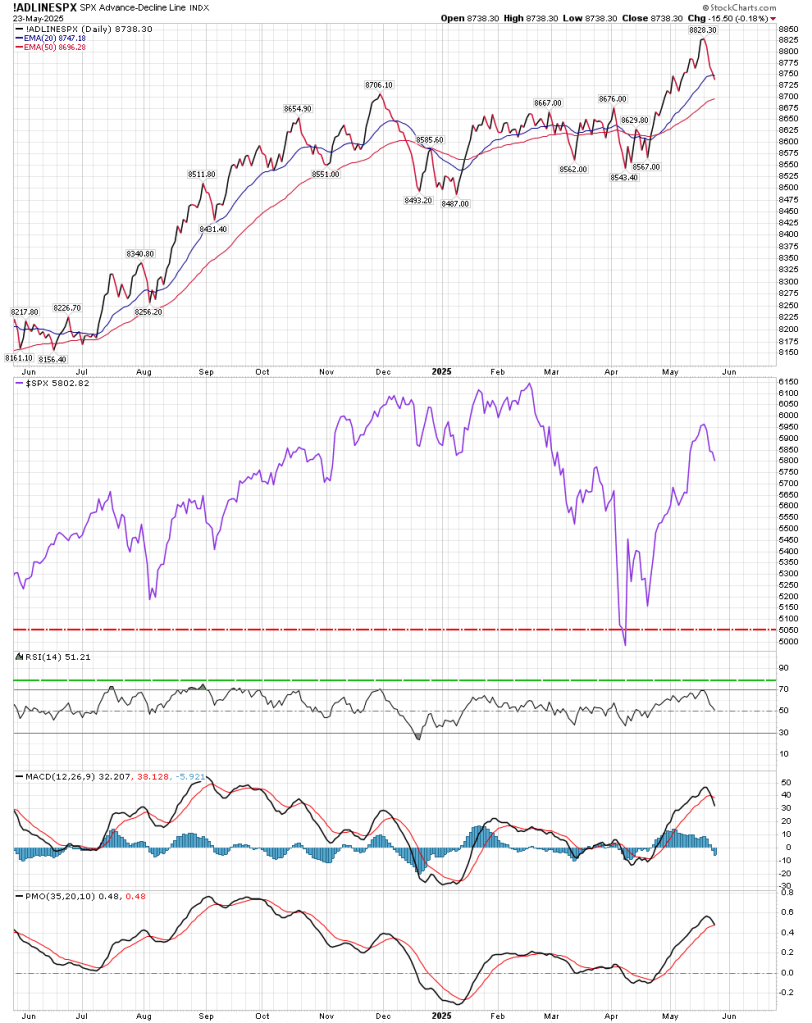
Outside of the standard T-Theory view, the “Simple” chart has turned negative in the intermediate term on both Breadth and Volume. That is concerning. The BPSPX (Bullish Percentage SPX) chart has turned down, but it is still above the upper Keltner Band. Until it crosses below from above that upper band, it is a positive. It is also reading 69%, and any reading above 50 represents a positive outlook. I will also point out that the A/D line has passed below the 20 EMA, and needs to hold the 50 EMA:
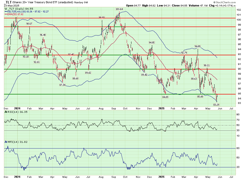
TLT moved down about 2% this week. While it did bounce off the lower Keltner band (now at 83.36), I’m not looking for a sharp reversal at this time (I use the green background to denote this chart doesn’t include dividends):
The high on $TYX this week was 5.113%, but it closed at 5.031%–up from last week’s 4.899%. We have an administration whose answer to Moody’s downgrade of US Treasury Bonds was “Who Cares?” Evidently the bond market did care.
I would like to apologize for a typo in last week’s report. It should have read as follows:
At this point (versus 2011), long term rates as visualized with TLT have not been “static”. They are pointing HIGHER.
(Please note this was corrected online from lower—5/19).
I’m not planning weekly posts, but might do so if conditions warrant.

Thanks Bunker,
You always bring valuable analysis. You are thorough of course, and the value of it as being different than standard EWT is stimulative and refreshing to my perspective.
Bonne chance!
LikeLike
Thanks for your time and outlook, much appreciated!
LikeLike
awesome! Thx bunker
LikeLike
Thank you as always Bunker!
LikeLike