This site is dedicated to Terry Laundry, and his investment concept known as “T-Theory”. Terry Laundry discovered Magic T-Theory almost 50 years ago. I became aware of Terry’s T-Theory in the early 2000’s, and was a member of his public and private forums until his death in 2012, at which time I began practicing it on my own. Terry was very open in discussing his investment concepts, offering both advice and constructive criticism to those willing to listen and discuss T-Theory. His background as a graduate of MIT, and a Marine made for a unique soul who was willing to take risks while moving constantly forward.
Quoting from his 1997 paper on T-Theory:
“It takes a special state of mind to “sign up” for a short boat trip, in a flimsy landing craft, to a beach completely controlled by hordes who have anticipated your arrival and have set up every imaginable way to do you in. Buying into major market opportunities presents a similarly discouraging picture. You may have good reason to anticipate profits, but if a great opportunity does indeed exist, nearly everyone will be against you, including your friends, and the predominant opinion expressed by your peers, including people you respect, will be that you are embarking on a foolhardy enterprise.”
I have taken some of Terry Laundry’s concepts for my own investment strategy (as well as some others I’ve picked up on my own), and in this section, I will discuss some of the basic concepts that I use in my methodology.
**********************************************************************************************
The main concept of T-Theory deals with the Magic T, a concept which Terry suggested may be a natural law. Magic T’s offer a cash buildup period, followed by a period of equal time that provides market strength. The equal periods of Weakness followed by Strength can be visualized by the two sides of the ‘magic’ letter T. The left side of a T represents cash being taken out of the market, and the right side of the T represents the equal amount of time showing strength. Since the market historically goes up 70% of the time, finding these “50%” heightened gain periods can be very rewarding. During that strength, cash is being put to use in a cash distribution. When a T ends, expect the period of strength to end, and for the return on equities not to exceed that of the ten year Treasury.
The period of cash buildup may show different types of weakness–it may be in price itself, or it may be in a divergence between price (which can continue to move up) and technical indicators which show themselves to be the forerunner of weakness.
This is the difference between a Price T (where price move lower during cash buildup as it shows weakness until it reaches the center post or bottom of the T, and then rises up for an equal amount of time in strength), to a Volume Oscillator T (which may show a weakening in the Volume Up/Volume Down MACD while price continues to move higher, lower, or flat before reaching that vertical center line of a new period of strength).
Terry Laundry explained in his “A 1997 Introduction to T Theory” (which unfortunately is no longer available in the menu) the concept of Magic T’s progressed from Price T’s to Advance/Decline T’s. When Price T’s began giving less information for shorter or longer term investments, he moved on to Volume Oscillator T’s. But all these different Equivalent Time concepts have value on their own.
Volume Oscillator T
The Volume Oscillator of a VO T is a derived technical indicator. It is based on the MACD of NYSE Advance/Decline Volume. I supplement this chart with data from this mcoscillator.com page as it gives a better view of the most recent entry, and provides confirmation of any new T’s. (The most recent daily entry of the VO on the Stockcharts’ chart has been fairly inaccurate since the Wall Street Journal changed its market data page a few years ago.)
VO T’s became important after Price T’s stretched into longer bull and bear markets. I believe that Terry was searching for a way to fine tune the visibility of T’s to increase their profitability by finding shorter T’s within larger ones.
These VO T’s also use Keltner bands to define standards that an asset should remain within. The mid Keltner line becomes an important part of this structure because it should lie on the Optimum Moving Average. (This Optimum Moving Average is the Moving Average which is most often tagged by Price.) In a positive trending market, there should be many bounces off of this line. In a negative trending market, the mid-Keltner is resistance. Using this as a buy point in an up-trending market allows one to be prepared with an entry point, just as using a move above the upper Keltner or envelope band in order to wait for a reversal back to the midline can help protect profits, while waiting to see what the future may bring.
If my memory serves me correctly, Terry believed that you could only have smaller T’s on the right side of a larger T. (More on this below.) These shorter term T’s should find great support at a mid-Keltner line. The following chart shows the major T that had its center point around mid June of 2021.

While that major T was my base case, the following chart shows the smaller T’s that existed on the right side of the above T:

Price T
An example of a Price T can be found using the chart in my post Unbelieveable of October 3, 2020. The chart attached to that post shows the creation of a T with an end date of October 16. This price T existed even though there was no Volume Oscillator T, but recognition was based on the fact that the VO had recovered the zero line from -115, and that price had recovered from a move below the mid-Keltner line.
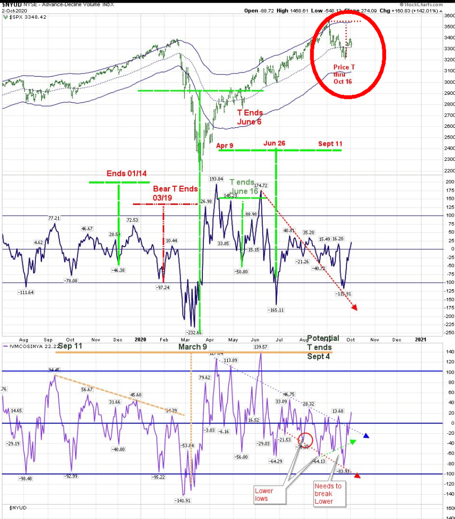
Removing longs on October 12 from Oct 5 led to a gain of roughly 150 SPX points.
Additional Concepts
I am a conservative investor. In order to protect capital, I have created some of my own rules. One is that I like to see at least a 100 point difference between the last high peak of a descending VO to the new center point of a T. I tend to avoid T’s that don’t show this much of a cash buildup.
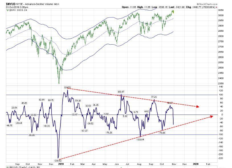
One of the most important concepts that Terry offered was preparing to enter a trade as close to the center post as possible. Indeed, finding that center post is the Holy Grail. By drawing trend lines of descending peaks and ascending support on the VO, you hope to work out when the next advance will begin. An example of this was the chart posted on Halloween of 2019, when I became aware that there would be an event around mid February of 2020.
I have been asked how I recognize new T’s inside of larger T’s. This is part of the ‘art’ of T-Theory. I believe in the Elephant concept of creating art–how do you carve an elephant from a block of clay? You remove everything that doesn’t look like an elephant. It’s valuable to take a fresh look at your charts by removing past annotations to get a fresh point of view. Has the forecasted future maintained its relevance to present price? Clear the decks every few months.
Defining a new T is a bit of an art, but one that gets easier with use. They need to be recognized, but they also need to be confirmed by the movement of price and the Volume Oscillator itself. New T’s are best when they have made a solid move below the zero line. Once you reach a low in the VO of -100 and move above the zero line, you have more than 50% chance to being inside a new T. New T’s are fully confirmed when the Volume Oscillator moves below the zero line, and then moves above the last descending high prior to moving below the zero line.
The T that was moving forward until January 6 2021 was confirmed in early October 2020. The VO moved from about +40 in July, went below the zero line in September, and on October 9 made a new high.
Once a new T is confirmed, it is very likely that there will be a secondary entry point. Usually, after the VO makes its first new recovery high, it will once more at least tap the zero line, if not go through it as it has in the above formation. If you want to use an alternative concept of price, consider this move lower after an initial move up as an Elliott wave 2. It gives you the opportunity to profit from waves 3 and 5. As you can see in the ‘new T Formation’ illustration above, the fact that the VO maintained a higher low is a positive right now. And it also confirms that this is a smaller T within the larger T.
Bear T
Bear T’s are rare, especially in a Bull Market environment. They collapse, but have a rally from hell near its end before one final collapse. That is what happened in March of 2020. We had a Bear T that was scheduled to end March 19, and that was followed by an important low a few days later. Looking at the chart in the above example, it will become a Bear T only if the Volume Oscillator breaks below its last low of -64, and heads down from there.
Optimum Moving Average
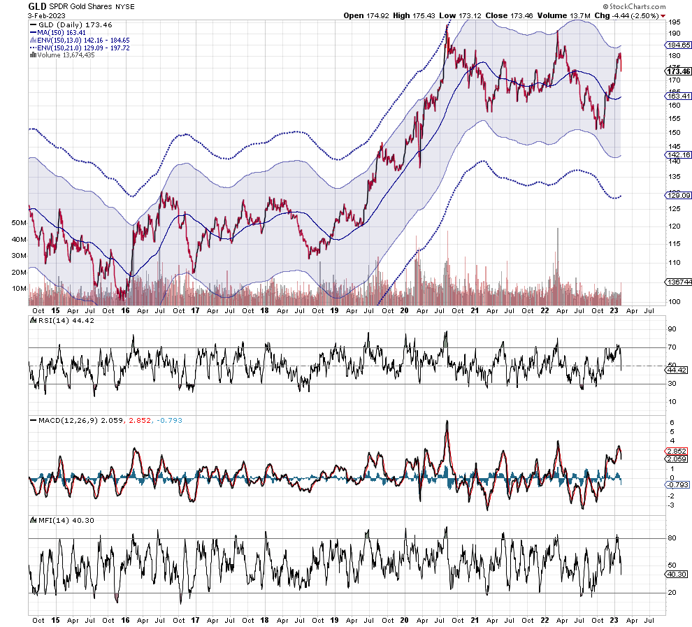
One of Terry Laundry’s last additions to his T-Theory concept was finding the Optimum Moving Average for an asset class. The OMA can be found for any asset class by changing the parameters of the Simple Moving Average so that the MA gets the most hits by price.
When an asset stays above its OMA, it is in a bullish phase, and will find support at the OMA. When it is below its OMA, it faces resistance at that OMA. The example below shows the OMA for gold (150 days). Each asset class has its own OMA.
Using Historical T Information
added July 8, 2023 2 Minutes
The Historical Chart page on this site is not there to vindicate how T Theory has succeeded in the past. It gives clues as to how analysis moved along with Price and the main tool of T Theory–the Volume Oscillator to change direction as a T progressed. Let’s review the following Historical Chart from 2012-2016:
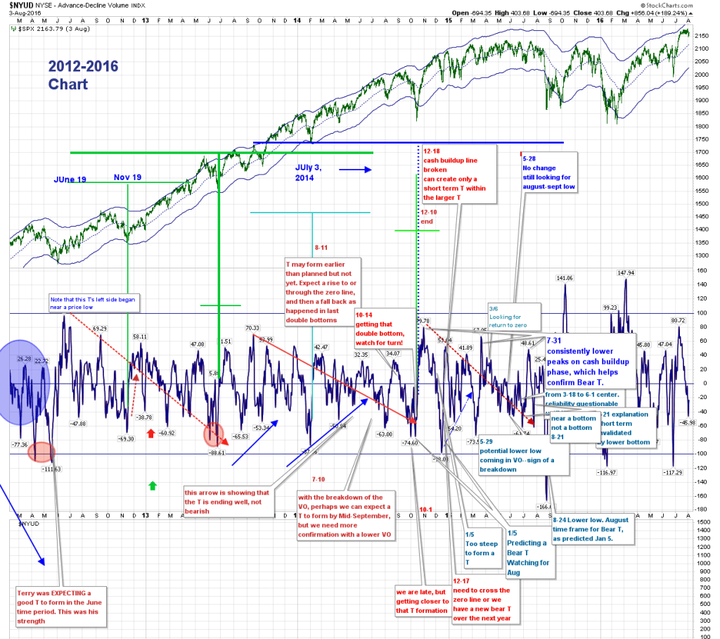
The above chart shows the major and minor T’s that I discovered during that period. The major T’s were June 2012, with a center point a year later, ending in July of 2014, followed by a T beginning in September 2013, with a center point in October 2014, and a conclusion in early October of 2015. There is one major similarity in these T’s–as noted in blue on the first of these T’s–“Note that this T’s left side began near a Price low”. In other words, price moved higher at the beginning of the left side of a T, while cash was being removed from the market. This means that Price doesn’t have to fall as the Cash Buildup period begins.
Inside these two major T’s, shorter term T’s developed. For the most part, these shorter term T’s did not go lower than the mid-Keltner area. These shorter term T’s offered periods to remove oneself from equities while the market reset technicals inside the larger formation. The chart also includes notations as to why some periods did not create a short term T, such as the note on January 5, 2015 which states that the move back above the zero line which would normally create a T was too swift to create a lasting T–Price vindicated that note as we spent the next month waffling around the mid-Keltner area. An additional note on January 5 pointed out the potential that the larger T scheduled to end in October was going to be a Bear T. This was followed on July 31 with a notation that this second large T was going to conclude as a Bear T, which indeed it did 2 weeks later. The Bear T ended as most do, with a drop followed by a “rally from hell”, only to collapse again.
(If you have trouble viewing the chart in this post, the link to it is noted here: https://schrts.co/NnNFIhND )
What can be learned from the above chart that is relevant at any future point in T creation? The primary point of course is to keep an open mind, and not expect every T to continue on a straight trajectory. We must be open to the changing dynamics on shorter time frames.
Theory of Complex Versus Simple Structures in Oscillators
added 2-28-2021
I have recently come across an article that will put a new weapon in the T-Theory arsenal. I believe Tom McClellan is on to something important in this article. It is the Theory of Complex Versus Simple Structures in Oscillators.
The concept of Complex formations showing strength, and Simple formations showing weakness is extremely powerful. Removing all the Volume Oscillator T’s from the chart, I have circled areas showing the Complex (Green) and Simple (Red) Structures. Let’s consider the area above the VO zero line to be a positive, bullish environment. If you have a Complex Structure in that area, you have a “true” bullish environment. If you have a (red) Simple Structure, you have a weak bullish environment, one that has the potential for price to reverse lower. On the other hand, in the area below the VO zero line, a (red) Simple Structure means that you have a move lower that can reverse higher imminently, while a (green) Complex Structure means price can continue lower. It appears that a Complex Structure that is moving higher from below the zero line can also portend higher prices, but I am not ready to fully concede this point. And I am not unaware that the December 2019 Simple Structure did not create a similar move in price. There are no 100% indicators.
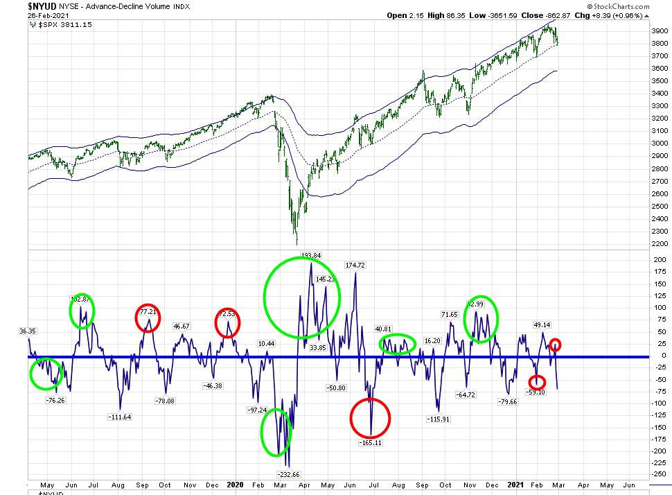
Right now, we have what looks like a weak bearish move downwards. If it continues straight down without creating a complex bottom, this could be a short lived reversible low. But we need to reverse in the next few days.

I have added this chart to the Menu.
Using Short Term T’s for Trading
In addition to the way that Terry Laundry used T’s for investment assets, you can create short term T’s for trades. In fact, Marty Schwartz, AKA as the trader Pitbull, used T’s in that manner. I don’t recall Terry ever using T’s to short an asset class. He would recognize a T and the type of T it was (bullish or bearish), but he would wait for the opportunity to invest in assets that had arrived at the centerpost of a T.
The basic premise of T-Theory is that an asset will spend as much time moving up as it has spent in the past moving down. The idea, as he wrote about it, was to be prepared to do what your friends will think you crazy for doing. I again point you to this quote from his 1997 paper:
“It takes a special state of mind to “sign up” for a short boat trip, in a flimsy landing craft, to a beach completely controlled by hordes who have anticipated your arrival and have set up every imaginable way to do you in. Buying into major market opportunities presents a similarly discouraging picture. You may have good reason to anticipate profits, but if a great opportunity does indeed exist, nearly everyone will be against you, including your friends, and the predominant opinion expressed by your peers, including people you respect, will be that you are embarking on a foolhardy enterprise.”
Let’s put that into a simple practical thought. If you consider that the positive effect of price moving lower is creating a cash buildup, then the negative effect of price moving higher is the depletion of that cash buildup.
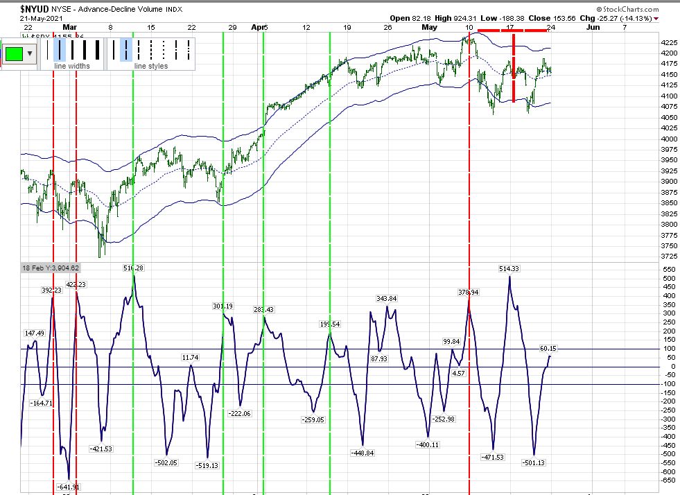
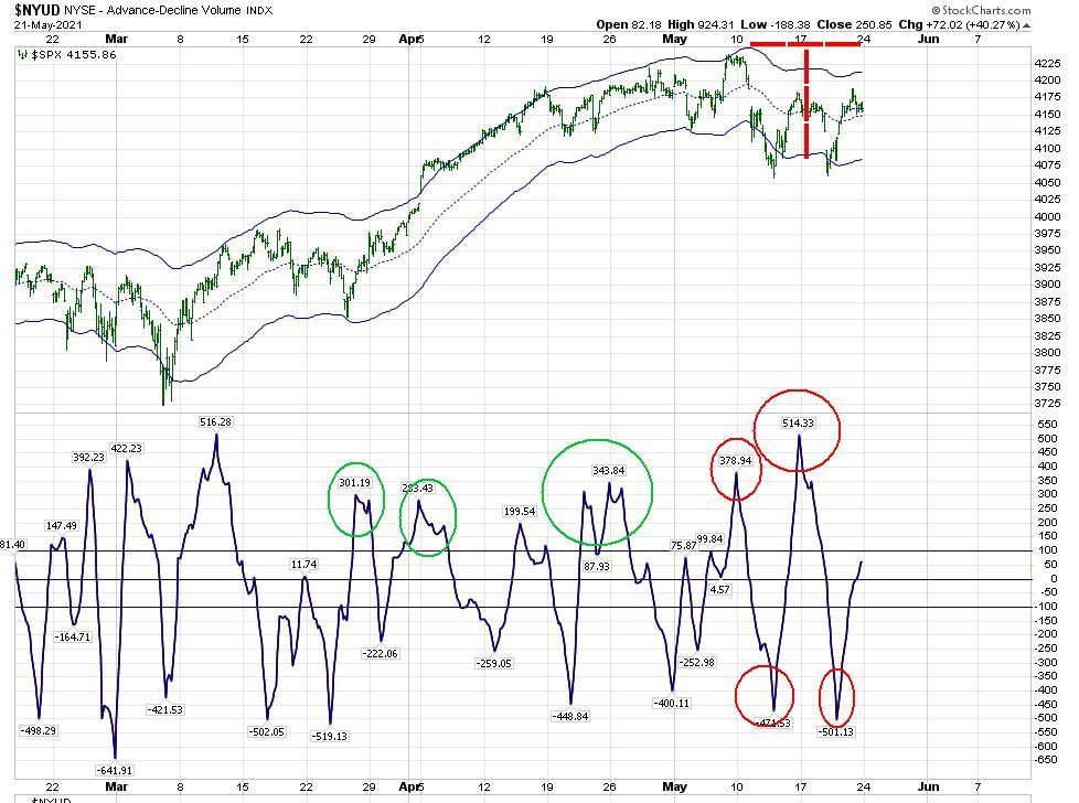
But you can use what you learn about T’s to trade on a short term basis. Let’s take a look at an hourly chart of Price and the Volume Oscillator on Friday morning:

The above chart shows a short term price T that is ending. Its left end is May 10, and it lasts for 14 days. We take the spike high of 514 as the center point for this short term T, if we are looking at it on Friday morning. This is a higher peak than 378 and that confirmed the T. But we should not expect a good outcome for this T because we had a lower low of -501 on May 20. On Friday morning, I posted this chart on elliottwavetrader.net with the warning that this T would end either Friday or Monday. Looking at an unmarked Volume Oscillator gives you an opportunity to judge the VO’s relationship to price more easily. That live hourly chart can be found here.
Let’s take a closer look at this same chart in regards to what happens at the end of a peak. A good T will have price continue to rise after a VO peak, but that is not always the case:
You can also review these peaks in the VO using the Complex versus Simple Structures concept:
In addition to the VO chart, there is an hourly companion chart that can be reviewed as well. The best opportunities for long trades occur with lows in MFI and RSI:
+++++++++++++++++++++++++++++++++++++++++++++++++++++++++++++++++++++++++
In addition to the above T-Theory work, I’ve added a few tools of my own. Some of them are in the above menu under “Bunker’s Charts”. Others may be found inside some of the older posts, such as “Inverse” T’s like the one I detected on rates. (You can find some of these in the menu under “Recent Completed T’s”.)
BULLISH PERCENTAGE SPX INDEX
BPSPX. It is a hybrid of T-Theory and Breadth. BPSPX was invented in the 1950’s by Abe Cohen. I have taken BPSPX and surrounded it with Terry Laundry’s daily equity Keltner Bands. A buy signal occurs when the index moves from below the Keltner Bands to above the mid-line. A sell signal occurs when the index moves from above the Keltner Bands back within the Keltners.

A shorter term version of it is also in the menu, as shown below:

I’ve learned quite a bit from watching charts supplied by Carl Swenlin of Decision Point. (There is a link to his charts in the menu.) I’ve named the following chart “simple”, as it gives informative Breadth information:
Added 2-10-2023
The Hopping Frog
February 10, 2023 3 Minutes
One of the later additions to Terry Laundry’s T-Theory was the concept of the “Hopping Frog”.
At a seminar he hosted in his hometown of Nantucket in 2011, he told a story about a frog who could jump from lilypad to lilypad, but very rarely landed between the pads and sank. Of course, the frog wouldn’t drown, but he didn’t want to get wet either. In regards to the market, the lilypads represent the three lines on Terry’s chart–his upper Keltner band, the mid-channel, and the lower channel.
If one creates channels, bands, or envelopes using the correct Optimum Moving Average as a mid-channel, one can theorize that the frog will jump up from the lower band to the mid-channel. At this point, the dilemma is whether or not he moves further up or returns to the lower band.
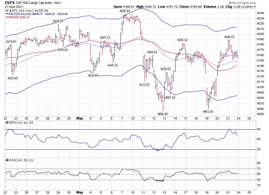
We can see that in the following charts of SPX.
Looking at the hourly chart, we can see that for the most part the “frog” has been jumping between the upper and mid-channels since the start of this year. this is exactly the performance that we would like to see, since we were in an equity T period of strength, . Until this week, there were only 2 instances where the mid-channel was severely penetrated, but didn’t make its way to the bottom “pad”. That’s still a characteristic of an equity T.

You can see that since the T ended, we have slipped below the mid-channel, but as the day progresses we are heading back up to put our head above water.

The following daily chart of SPX during the 2020-2021 Bull market shows similar tendencies. (Keep in mind that the T that accompanied this chart lasted until January 2022).

Over the last year, we have spent most of our time within the lower to mid-channel. And with the last move above the mid-channel we made it all the way to the top of the channel (again, during the T that ended February 8). Where will the frog jump next? This post is about frogs, not the future.

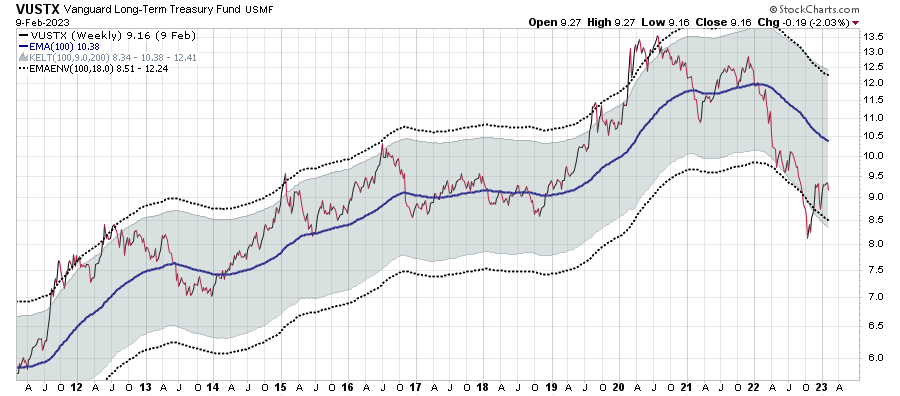
Having the correct Optimum Moving Average for an asset class allows you to construct envelopes that work in similar fashion. For long term Treasuries, Terry used VUSTX as his vehicle. The weekly chart shows that for the most part, it lived between the mid-channel and the upper level. At the beginning of 2022, it decisively moved below the mid-channel, and has been hugging the lower band. The move below that band, followed by a move above it should lead to a hit of the mid-channel.
I’ve moved away from VUSTX, and use TLT instead. In posts discussing TLT, I suggested to Terry that for me the OMA is not 100 but rather 50, as it received more hits:
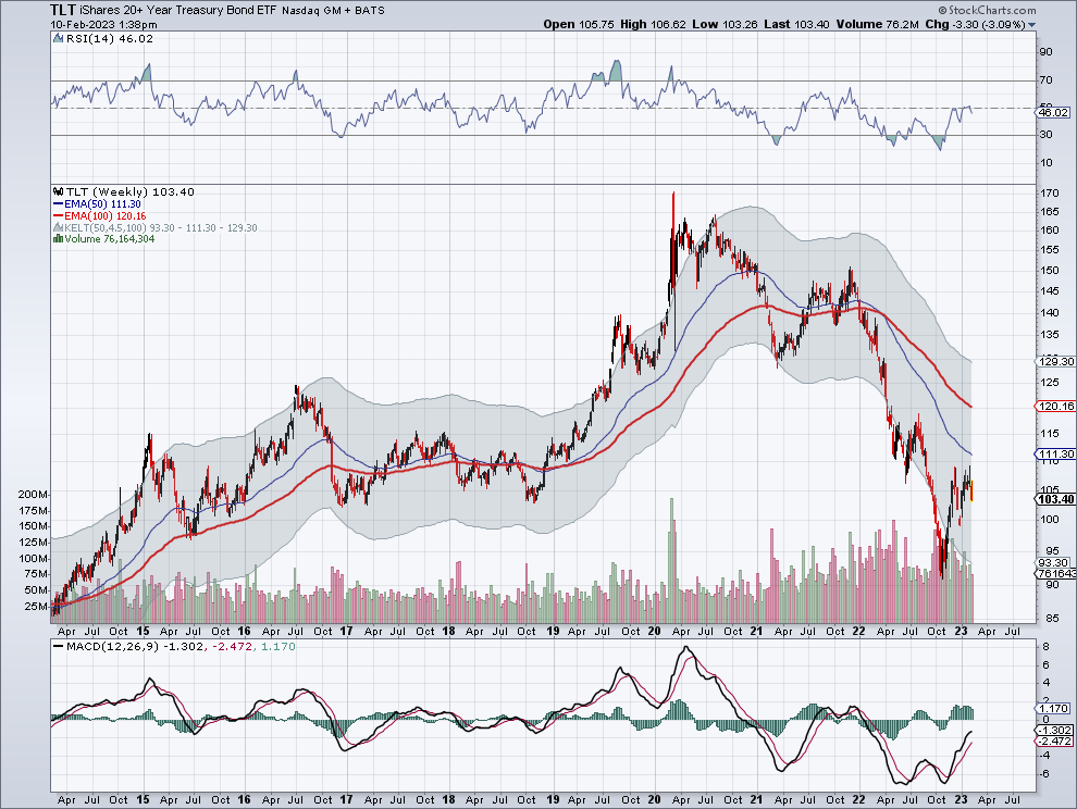
Mid-channel support broke in 2022, and TLT made a new home below the channels. Once it moved back inside the channels, the frog attempted to go back to the middle channel. It came close to hitting the 111 (reaching a high of 109.35 before moving lower again). The middle channel is moving lower, and at some point the frog will make another attempt to cross that middle channel. It doesn’t appear to be anytime soon.
On the daily chart, the frog has just slipped off the mid-channel, and needs to recover quickly to continue its recent strength (which is still within the weakness shown above by the weekly chart).

The QQQ, a different asset class, seems to live inside the more standard settings for the Keltner Bands. They are noted on the chart:

A move above or below the Keltner bands followed by a move back within them seems to insure a move back to the middle Keltner, where the frog must again decide which way to go.
For more information on the envelopes used by Terry Laundry, you can find his public charts located on Stockcharts. The site is kept up by Paula Burke, who used to work with Terry. Here is the link:
